Want to build trust and look professional? Infographics boost content experience and engage your audience. Today, we’ll explore what an infographic is and share best practices for creating one.
What is Infographic?
Infographics boost content experience and build strong connections with customers. They visually represent data and ideas, making complex information easy to understand at a glance. By blending visuals, data, and minimal text, infographics tell compelling stories and engage audiences. Next, let's explore the key elements of visual design that make infographics effective.
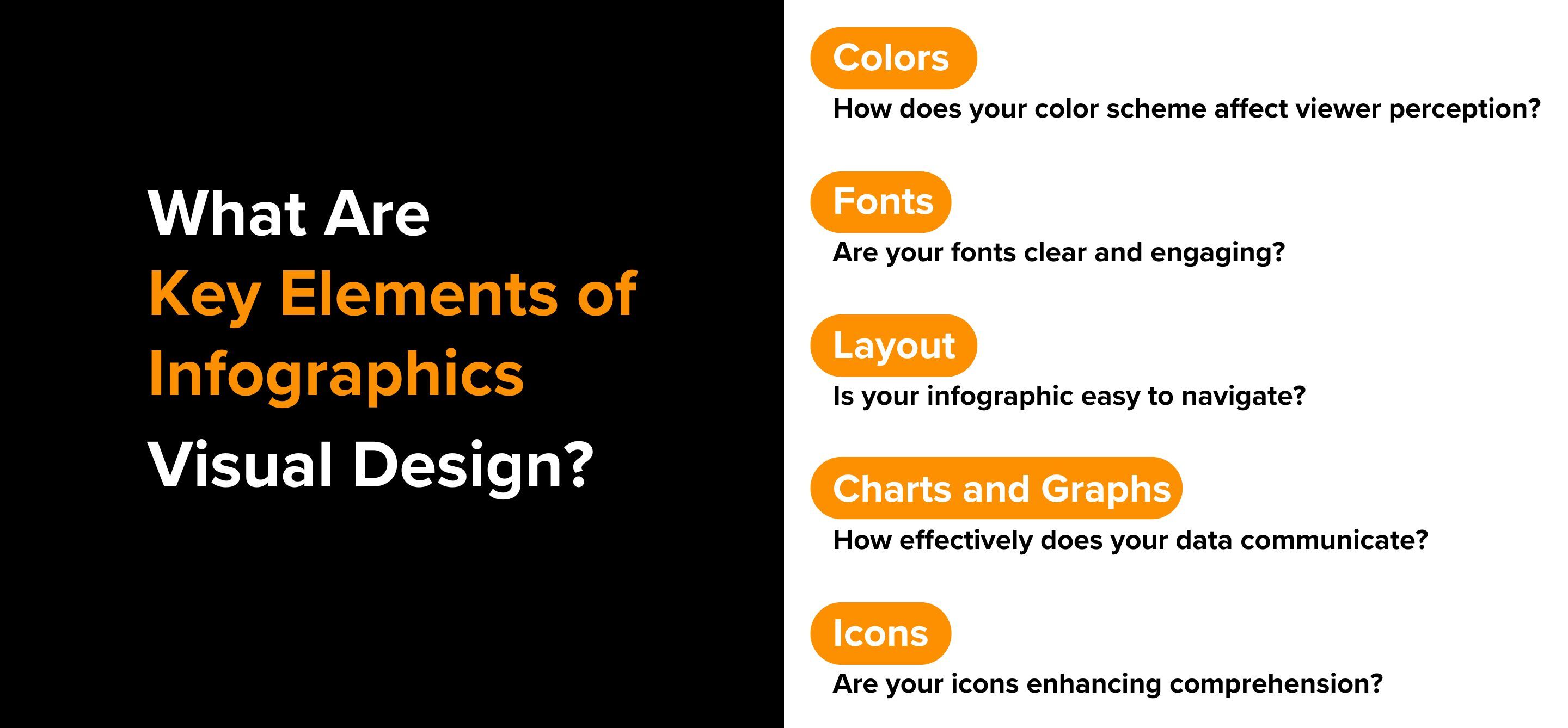
What Are the Key Elements of Infographics Visual Design?
Are your infographics capturing the attention they deserve? One major factor that can make or break their effectiveness is visual design. For a marketer, understanding the core elements of infographic design is important in creating content that not only looks appealing but also drives engagement effectively.
Colors
How does your color scheme affect viewer perception? Selecting a bold and cohesive color palette is essential. Apply the 60-30-10 rule—60% primary color, 30% secondary, and 10% accent—to create visual balance. Colors should reflect the message and stimulate the desired emotional response. For instance, blue can convey trust, while yellow can add optimism. Consistency with your brand colors enhances recognition and recall.
Fonts
Are your fonts clear and engaging? Opt for clean, sans-serif fonts like Arial or Helvetica for readability. Limit yourself to two complementary fonts—one for headlines and one for body text—to maintain harmony. Ensure the text is legible, with a minimum size of 16px for easy reading.
Layout
Is your infographic easy to navigate? A well-structured layout helps viewers easily find and digest information. Arrange content logically, guiding the eye from the most important sections to the least. Use lines and shapes to group related content, enhancing overall readability and user experience.
Charts and Graphs
How effectively does your data communicate? Incorporate charts and graphs to provide a clear snapshot of statistics. Use bar graphs for comparisons and pie charts for distribution insights. Vibrant annotations can highlight key data points, making complex information more digestible.
Icons
Are your icons enhancing comprehension? Icons can simplify text and add visual interest. Use them to replace or supplement headings and labels, making your infographic more engaging and easier to understand.

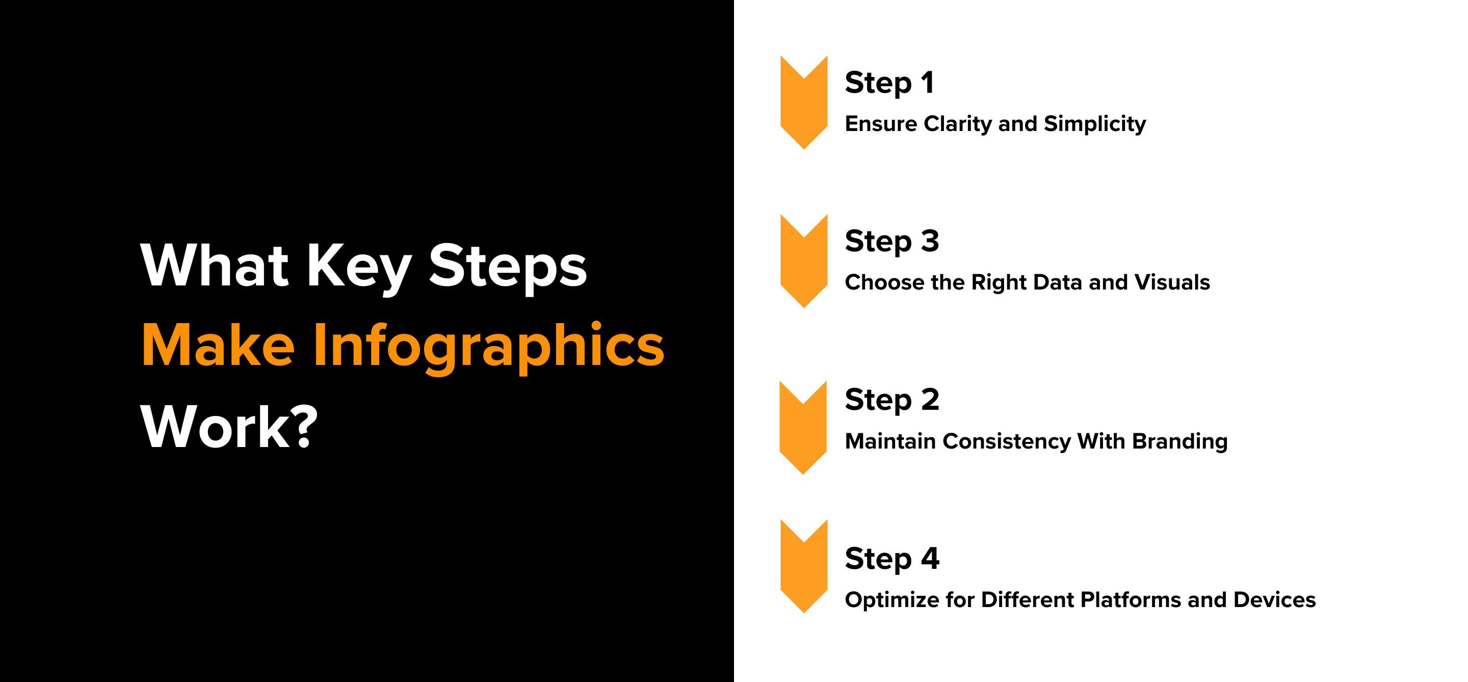
What Are the Best Practices for Creating Effective Infographics?
Are your infographics truly making an impact? Creating effective infographics involves more than just good design—it requires strategic planning to ensure they achieve your content goals and measure their impact. Follow these best practices to make your infographics stand out:
Step 1: Ensure Clarity and Simplicity
Start with a clear subject and a concise story. Your infographic should deliver its message quickly and efficiently. Avoid clutter by keeping the design simple and focusing on key information. Use a layout that enhances comprehension, breaking down complex data into digestible chunks. Stick to a size range of 5000-8000 pixels in length and 735 pixels wide to maintain visual clarity. Limit text to six to eight words per line to keep your audience engaged without overwhelming them.
Step 2: Choose the Right Data and Visuals
Combine relevant visuals, accurate data, and concise text. Ensure the data you present is valuable to your target audience and properly attributed using APA format. Select a topic that answers their questions or solves a problem. Use eye-catching graphics to highlight the most important facts, making them stand out with unique formatting like bold text or increased font size.
Step 3: Maintain Consistency With Branding
Align your color scheme with your brand's identity to create a cohesive look. Consistent branding helps with recognition and reinforces your message. Choose colors and styles that reflect your brand’s personality and the story you’re telling through the infographic.
Step 4: Optimize for Different Platforms and Devices
Consider where and how your infographic will be shared. Different platforms may require different sizes and formats. Ensure readability on all devices by using a minimum font size of 16px. Test your design on various screens and browsers to confirm that it looks good and functions well everywhere.

In sum, effective infographics are crucial for content curation and lead generation. By ensuring clarity, choosing the right data, maintaining brand consistency, and optimizing for all platforms, you can enhance your content's impact.
Ready to master content experience? Start using RELAYTO to personalize your infographics— Try RELAYTO or Book a Demo today!
Author 
The fastest way to build digital experiences. We empower businesses to convert PDFs, presentations and other content into interactive experiences & webpages with instant branding, analytics & more.