Advanced styles in RELAYTO go beyond basic text formatting like font and color. They allow you to define reusable styles for various elements within your presentation.
Finding the Settings
Experience Level
Step 1
Click the "Settings" button in the top right corner.
.png)
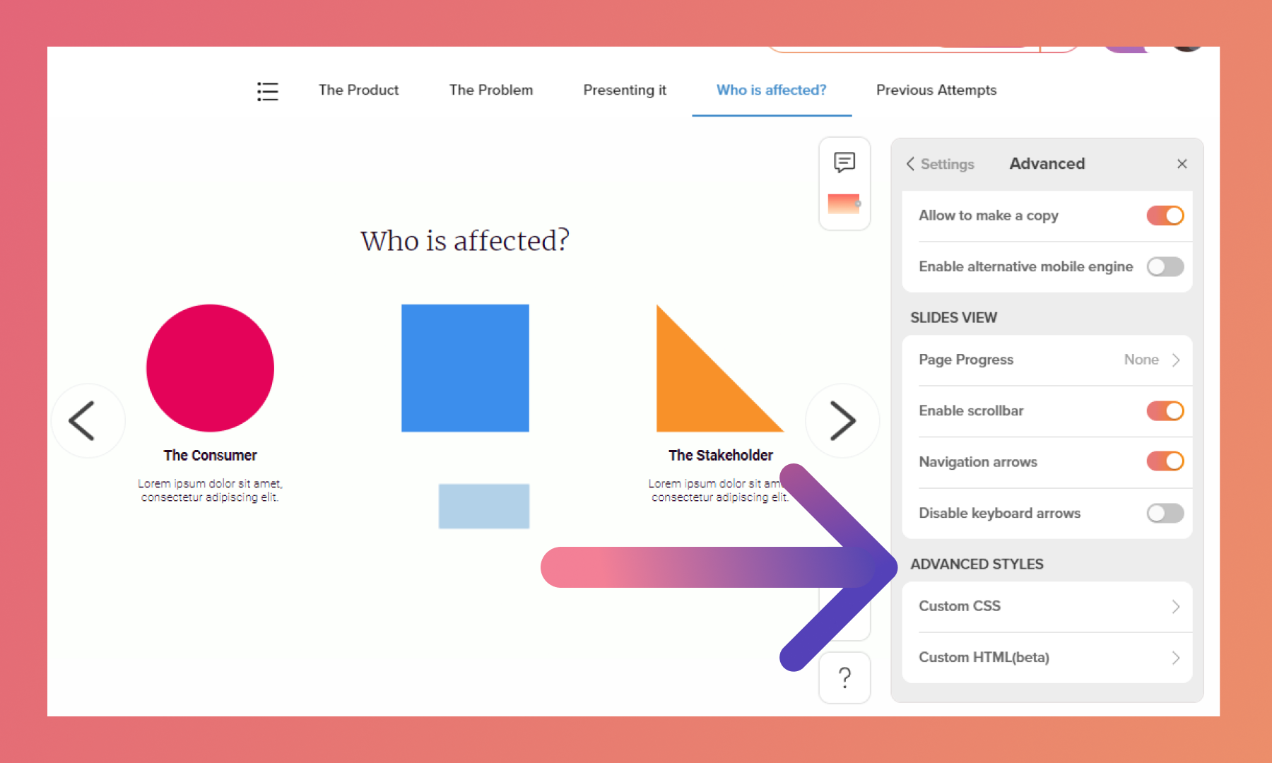
Step 2
Scroll the menu until you find the "Advanced" button, then click on it.
.png)
Step 3
Scroll to the "Advanced Styles" settings.
Domain Level
Step 1
On your dashboard, click "Settings" on the right corner.
.png)
Step 2
Scroll until you find the "Custom CSS" options.
.png)
Custom CSS
With custom CSS, you can inject your own CSS code to fine-tune the appearance of almost any element within your RELAYTO experience.
💡Important Note: The comments within the code (/* Replace with primary brand color */) highlight sections where you should replace the provided color code with your actual brand color to achieve a consistent visual identity.
Default Brand CSS
This code can be applied as default to the subdomain, by adding it inside dashboard settings. By applying this custom CSS, you can significantly alter the appearance of a RELAYTO presentation, making it visually align with your brand guidelines and potentially creating a more streamlined user experience.
.rt-sidebar, rt-left-sidebar {
  background: #5FD9F1; /* Replace with primary brand color */
}
.md-button.md-primary:not([disabled]) md-icon, .md-button.md-primary, button.md-primary, .rt-menu md-tabs .md-tab.md-active, md-icon.md-primary, .md-button.md-primary:not(.md-raised) {
  color: #5FD9F1; /* Replace with primary brand color */
}
.bg-primary, .video-js .vjs-big-play-button:active, .video-js .vjs-big-play-button:focus, .video-js:hover .vjs-big-play-button, .md-button.md-fab, .video-js .vjs-play-progress, .video-js .vjs-volume-level, .md-button.md-primary.md-raised, .rt-menu-item-conteiner.md-button:not([disabled]):hover, .rt-menu-link.md-button:not([disabled]):hover {
background-color: #5FD9F1; /* Replace with primary brand color */
}
md-icon.md-accent, .md-button.md-accent:not([disabled]) md-icon, .md-button.md-accent, button.md-accent {
color: #5FD9F1; /* Replace with primary brand color */
}
.md_ink_bar, md-nav-bar md-nav-ink-bar {
color: #5FD9F1 !important; /* Replace with primary brand color */
}

.md-button.md-primary.md-raised:hover {
background-color: #000000 !important; /* Replace with secondary brand color */
}

.video-js .vjs-play-progress, .video-js .vjs-volume-level {
background-color: #5FD9F1 !important; /* Replace with primary brand color */
}
Change Sidebar Navigation Colors
In essence, this code snippet ensures that the document toolbar and the text within the right sidebar content wrapper have the color you desire. This creates a high-contrast look, potentially ideal for presentations with a dark background. Don't forget to replace the hex value!
.rt-right-sidebar-wrapper {
    background-color: #fff !important;
    /* Change this to your desired color */
}

/* Change background color of the sidebar navigation group */
.rt-sidebar-navigation-group {
    background-color: #fff !important;
    /* Replace with your desired color */
}

/* Change background color of the slide toc button */
.rt-slide-toc-btn {
    background-color: #f1f1f1 !important;
    /* Replace with your desired color */
}


/* Target all node content wrappers to change text color in navigation */
.node-content-wrapper {
    color: #000 !important;
    /* Change to your desired text color */
}
.png)
Change Topbar Navigation Active Color
By following these steps, you can add a subtle but impactful touch to your RELAYTO navigation bar, making it easier for viewers to track their progress within your presentation.
.md-button.md-primary:not([disabled]) md-icon,
.md-button.md-primary,
button.md-primary,
.rt-menu md-tabs .md-tab.md-active,
md-icon.md-primary,
.md-button.md-primary:not(.md-raised) {
    color: #COLOR_CODE;
    /* Replace with primary brand color */
}
.png)
Change Topbar Navigation Background Color
You can easily adjust the background color to match your brand or design preferences.
.rt-menu-item-conteiner.md-button:not([disabled]):hover, .rt-menu-link.md-button:not([disabled]):hover {
background-color: #COLOR_CODE;
color: #COLOR_CODE;
} /* Replace with primary brand color */
.png)
Round Video Corners
The code sets a border-radius of 12px. This value determines the curvature of the corners. Higher values create more rounded corners, while lower values create a subtler effect. Experiment with different values to achieve your preferred look.
.rt-hotspot-video {
   border-radius: 12px !important;
   overflow: hidden !important;
}
.png)
Round Embeds
Rounds the embeds that are placed directly onto the page. Use this CSS for the main document, NOT in the embed document CSS.
To find the embed you would like to round, open inspect mode on browser. Once the code is pulled up, do CTRL-F to pull up a search bar. Type “htsp” and use the up and down arrows to navigate through the code to find the correct hotspot id (you will see the element have a blue highlight when you find the correct id).
/* Replace with embed id */
#htsp60893d2678880a07a98db153 {
border-radius: 20px;
overflow: hidden;
}
Custom HTML
You can leverage custom HTML to embed code snippets and create unique functionalities.
✅Embedding custom forms: Create interactive forms for collecting user input that go beyond RELAYTO's built-in options.
✅ Integrating widgets or third-party applications: Embed functionalities from external services that enhance your presentation's capabilities.
✅ Adding custom animations or effects: Utilize JavaScript or CSS animations to create unique visual elements that are not achievable with standard RELAYTO features.
💡 Tips: To learn more, explore our Integrations.
.png)
Related Articles:
📥 A Complete Guide on Downloading Features
Thank you for joining us in this tutorial! If you have any questions or need help, feel free to email us at support@relayto.com or book a call here.