RELAYTO/ Design Best Practices
Best Practices for Live Presentations, Leave Behinds, Self-Paced Guides, Proposals & more
Create great content optimized for RELAYTO Best Practices for Live Presentations, Leave Behinds, Self-Paced Guides, Proposals & more so that your content becomes interactive out-of-the-box with RELAYTO
Guide structure Navigation Layouts Interactivity Optimization Home Page Large Fonts Immersive Hyperlinks Remove Footers Persistent Navigation Text Heavy Slides Web-link Buttons Animate in RELAYTO Internal Links Gradients on Slides Widgets No Flat Images Divider Slides Video Slides Build-On-Click Transitions Split Presentations Video Background Compress Images Scroll View
Navigation Layouts Interactivity Optimization
Add Home Page Add a home page/slide to PPT from which end users will navigate to the right parts of the presentation.
Use Persistent Do not add persistent navigation on Navigation in every slide. RELAYTO will create a responsive & mobile friendly persistent RELAYTO vs PPT navigation for your presentation. Wrong PPT with persistent navigation on every slide PPT without persistent navigation
Add Internals Links in PPT WHY? HOW? WHEN? Internal links help you intelligently structure complex content and allow your readers to browse comfortably.
Add Internals Links in PPT WHY? HOW? WHEN?
Add Internals Links in PPT WHY? HOW? WHEN? Use when you have a lot of content for the same topic which could be structured.
Add Divider When users are browsing linearly, Slides divider slides help readers understand where they are in the flow. RELAYTO makes your divider slides stand out. YOUR SECTION TITLE Wrong Large visual background with large fonts
Navigation Layouts Interactivity Optimization
Use Large Using a larger font will enable your audience to read your content without having to constantly zoom in on pages. Fonts Although this will reduce the amount of text that can be on each page, your readers will thank you for their easy reading. Wrong Recommended minimum font size is 18px
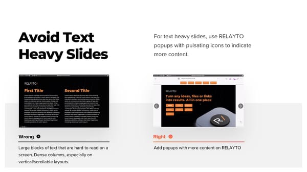
Avoid Text For text heavy slides, use RELAYTO popups with pulsating icons to indicate Heavy Slides more content. Wrong Large blocks of text that are hard to read on a Add popups with more content on RELAYTO screen. Dense columns, especially on vertical/scrollable layouts.
Using Gradients 1 on Slides RELAYTO has a limited support for elements with radial gradients. 2 1 Export the gradient as an image, import it in the PDF or your RELAYTO document 2 Use only linear gradient type
Create Video Slides Watch Year in Overview Wrong Whole slide is the video thumbnail with play For video slides keep the title / background on button the slide to provide context for the video - you can design thumbnail images in PPT, too
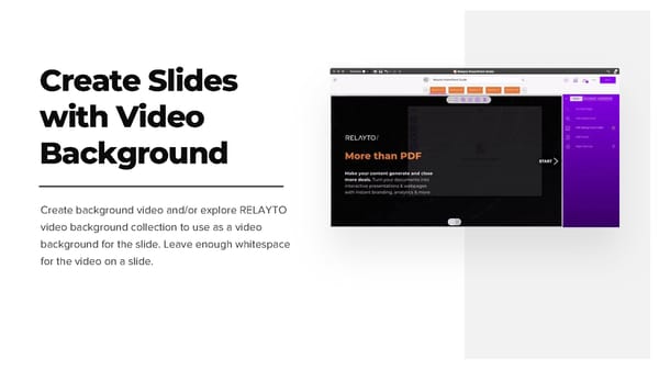
Create Slides with Video Background Create background video and/or explore RELAYTO video background collection to use as a video background for the slide. Leave enough whitespace for the video on a slide.
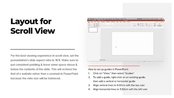
Layout for Scroll View For the best viewing experience in scroll view, set the presentation’s slide aspect ratio to 16:9. Make sure to put consistent padding & leave some space above & below the contents of the slide. This will achieve the How to set up guides in PowerPoint: feel of a website rather than a zoomed in PowerPoint 1. Click on “View,” then select “Guides” because the ratio size will be balanced. 2. To add a guide, right-click on an existing guide, then add a vertical or horizontal guide 3. Align vertical lines to 9.00cm with the top ruler 4. Align horizontal lines to 5.50cm with the left ruler
Navigation Layouts Interactivity Optimization
Add Hyperlinks to Generate Immersive Experiences Hyperlinked thumbnails to external resources Do add hyperlinks to videos, articles and other websites. RELAYTO will automatically create an immersive preview or full screen experience for for select links.
Design Web-like Wrong Default shares, fonts, no highlight Buttons / Actions CONTACT US LEARN MORE EXPLORE When creating hyperlinks and call-to-actions, make them feel like Web buttons, not like an average PowerPoint shape. They need whitespace, color & size contrast to generate desired behaviors. Rounded corners, Gradients, Shadows CONTACT US LEARN MORE EXPLORE
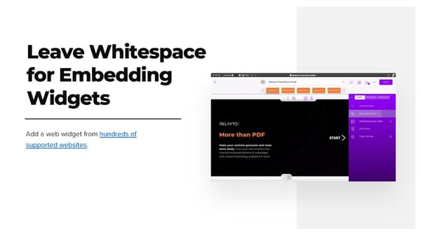
Leave Whitespace for Embedding Widgets Add a web widget from hundreds of supported websites.
Create Build-On-Click Transitions Build-On-Click transitions help to gradually reveal complex processes. Do not use PPT animations to create Build-On-Click Transitions.
Create Build-On-Click Transitions Build-On-Click transitions help to gradually reveal complex processes. Create multiple slides for Do not use PPT animations to every build stage. create Build-On-Click Transitions. Create placeholders to build content.
Create Build-On-Click Transitions Build-On-Click transitions help to gradually reveal complex processes. Create multiple slides for Do not use PPT animations to every build stage. In RELAYTO settings, set create Build-On-Click Slides transition to “Fade In” Transitions. Create placeholders to build content.
Navigation Layouts Interactivity Optimization
Remove Footers with Copyright & Page Numbers 2021 Copyright RELAYTO 25
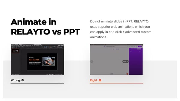
Animate in Do not animate slides in PPT. RELAYTO uses superior web animations which you RELAYTO vs PPT can apply in one click + advanced custom animations. Wrong
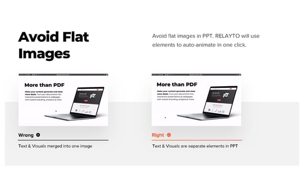
Avoid Flat Avoid flat images in PPT. RELAYTO will use Images elements to auto-animate in one click. Wrong Text & Visuals merged into one image Text & Visuals are separate elements in PPT
Split Long Presentations with multiple decks Split one master deck into multiple decks and place them into a RELAYTO hub for better navigation and sharing.
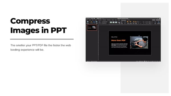
Compress Images in PPT The smaller your PPT/PDF file the faster the web loading experience will be.
