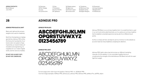
ADIDAS RUNTASTIC Brand Manual June 2022 1A Overview 1B Perf. Badge 1C Logo 1D Construction 1E Size 1F Violations 2A Color Palette 2B Typefaces 3A Digital avatars 3B App Icons 4A Product Logos 4B Construction 4C Violations 4D Minimum Size 5A Digital Sizing 5B Digital Margins & Placement 6A Visual Guidance 6B Application 6C References ABCDEFGHIJKLMN OPQRSTUVWXYZ 0123456789 ABCDEFGHIJKLMN OPQRSTUVWXYZ 0123456789 2B ADINEUE PRO ADINEUE PRO BLACK & LIGHT Black and Light are the primary weights to be used for headlines. Built from the backbone of adidas geometries, Adineue PRO unifies the Consumer touchpoints of our brand under one system of type. Inspired by our brands history of innovation and engineering, its a typeface for our modern digital world, and the next era of adidas. DO NOT USE AS BODY COPY. DO NOT USE LOWERCASE. Adineue PRO Black is our primary headline font. It is a bold font that is used in our print and online advertisements, so it is used as our primary headline font to establish a branded experience across all of our different touch points. As this is a heavy set font, we keep its use to a minimum on the website so as not to have too many headlines competing for attention. Adineue PRO Light is also a key font across our different marketing channels. On the website, it is our secondary headline font as it compliments the strength of the bold Adineue PRO Black font with its super light font-weight. Correct Usage when referring to the typeface: Adineue PRO -or- ADINEUE PRO Incorrect Usage examples: AdiNeue PRO, adineue pro, adineue PRO, ADIneue PRO, adiNeue Pro, adiPRO, adipro ADINEUE PRO BLACK ADINEUE PRO LIGHT
 ADIDAS Running Brand Book Page 12 Page 14