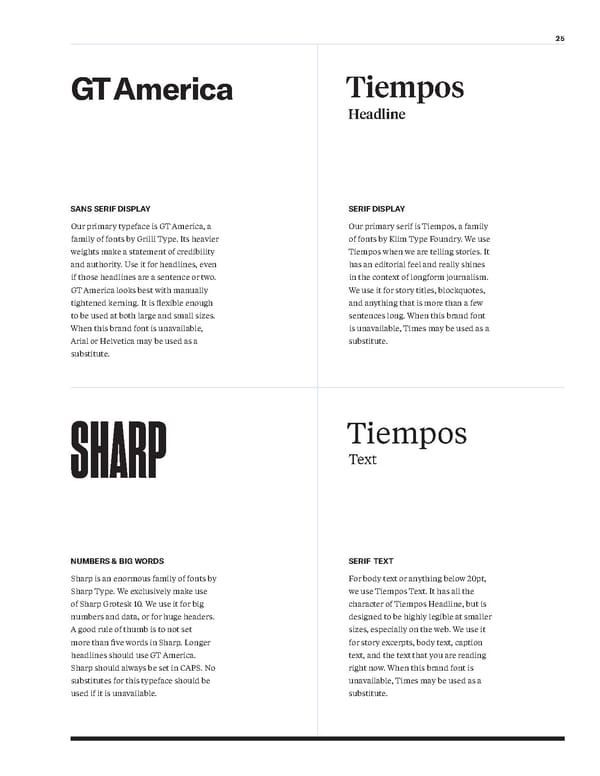
25 GT America Tiempos Headline Tiempos Text SHARP Our primary typeface is GT America, a family of fonts by Grilli Type. Its heavier weights make a statement of credibility and authority. Use it for headlines, even if those headlines are a sentence or two. GT America looks best with manually tightened kerning. It is flexible enough to be used at both large and small sizes. When this brand font is unavailable, Arial or Helvetica may be used as a substitute. Sharp is an enormous family of fonts by Sharp Type. We exclusively make use of Sharp Grotesk 10. We use it for big numbers and data, or for huge headers. A good rule of thumb is to not set more than five words in Sharp. Longer headlines should use GT America. Sharp should always be set in CAPS. No substitutes for this typeface should be used if it is unavailable. Our primary serif is Tiempos, a family of fonts by Klim Type Foundry. We use Tiempos when we are telling stories. It has an editorial feel and really shines in the context of longform journalism. We use it for story titles, blockquotes, and anything that is more than a few sentences long. When this brand font is unavailable, Times may be used as a substitute. For body text or anything below 20pt, we use Tiempos Text. It has all the character of Tiempos Headline, but is designed to be highly legible at smaller sizes, especially on the web. We use it for story excerpts, body text, caption text, and the text that you are reading right now. When this brand font is unavailable, Times may be used as a substitute. SANS SERIF DISPLAY NUMBERS & BIG WORDS SERIF DISPLAY SERIF TEXT
 Arnold Ventures Brand Book Page 24 Page 26