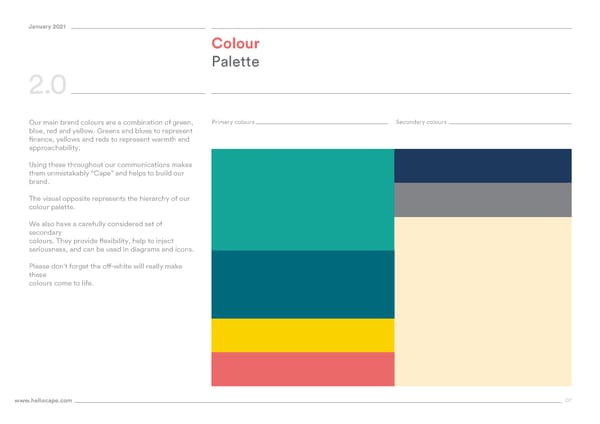
January 2021 Colour Palette 2.0 Primary colours Secondary colours Our main brand colours are a combination of green, blue, red and yellow. Greens and blues to represent finance, yellows and reds to represent warmth and approachability. Using these throughout our communications makes them unmistakably “Cape” and helps to build our brand. The visual opposite represents the hierarchy of our colour palette. We also have a carefully considered set of secondary colours. They provide flexibility, help to inject seriousness, and can be used in diagrams and icons. Please don’t forget the off-white will really make these colours come to life. www.hellocape.com 07
 Cape Brand Book Page 6 Page 8