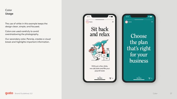
Gusto 09:19 Sit back and relax With just a few clicks, we calculate and file your payroll taxes Gusto 09:19 Choose the plan that’s rig ht for your busin ess Color Usage The use of white in this example keeps the design clean, simple, and focused. Colors are used carefully to avoid overshadowing the photography. Our secondary color, Parsnip, creates a visual break and highlights important information. 27 Color Brand Guidelines 3.0
 Gusto Brand Book Page 26 Page 28