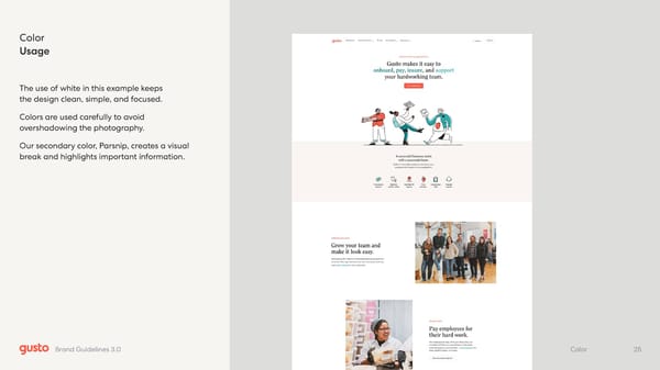
Color Usage The use of white in this example keeps the design clean, simple, and focused. Colors are used carefully to avoid overshadowing the photography. Our secondary color, Parsnip, creates a visual break and highlights important information. 25 Color Brand Guidelines 3.0
 Gusto Brand Book Page 24 Page 26