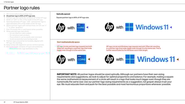
4. Partner logos Partner logo rules 1. HP comes before the partner logo. Optically spaced 2. All partner logo is 90% of HP logo size. Square partner logo is 90% of HP logo size. 3. Partner logo are vertically centered off of the HP logo. 4. Width of “with” is 75% of the width of the HP logo. 5. Spacing between HP logo, “with,” and partner logo is approximately 25% of the width of the HP logo. 6. Space partner logos with vertical lines. Do not use “x” “—” or other “graphics.” with with 7. Film: Fit lockup into a ruled layout when possible. 8. When placing logo over photo: • Do not obstruct vital content. • Do not place over product. • Place where it can be easily seen and read. • Avoid excessively busy backgrounds. 9. Partner logos should be horizontally aligned with Don’t mathematically space HP logo. No stacking. 10. Keep lockup left aligned in narrow vertical spaces. HP logo (circle) and Intel logo (square) are both HP logo (circle) and Windows logo (square) are both 135px tall, resulting 11. Monochromatic versions of logos are preferred. 135px tall, resulting in a partner logo that looks in a partner logo that looks bigger even though it is the same size. This is • Monochromatic logo examples in situ. bigger even though it is the same size. further exacerbated by the Windows word mark length. with with IMPORTANT NOTE: All partner logos should be sized optically. Although our partners have their own sizing requirements and suggestions, we look to adjust for optimal proportions and balance. For example, making a square the same mathematical measurement of a circle will result in a logo that looks much bigger even though they are numerically the same size. Use our partner logo sizing requirements as a suggestion, not gospel; always trust your eye. We must educate them and push for the best possible and most harmonious proportions whenever possible. 37 HP Visual Identity 2022
 HP Brand Book Page 36 Page 38