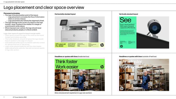
2. Logo placement and clear space Logo placement and clear space overview Placement principles Horizontally stacked layout Vertically stacked layout • The logo is the punctuation point of the layout. › Logo placement concludes the flow of information down or across a layout. › Logo placement also follows the alignment of text. • The logo belongs in the corner of a layout or the logo module—never floating in the middle of a margin or unanchored in white space. • When imposed over a photo, the logo should never obscure products, people, or critical content. Logo clear space is equal to layout margin width • Clear space around the logo is the same as the layout margin (and module spacing). • This is the minimum amount of space the logo should have in relation to the edge of a layout. • Add additional white space as need to optically correct for spaces that look or feel wrong. • Logos when placed inside the text box may require slight adjustments optically. See size and place explain in logo size section. Headlines or quotes with lines (inside text box) Headlines or quotes with lines (outside of text box) (Size and placement explained in Logo size section) 7 HP Visual Identity 2022
 HP Brand Book Page 6 Page 8