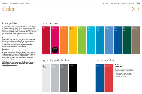
contentS > how we Look > coLor > paLette back forward Skip to next chapter 30 Color 3.3 Color palette Dominant colors to ensure that color is consistently applied, we’ve chosen hp hp hp hp hp hp hp hp hp hp hp a 17-color palette for use in all hp communications. the red MaGenta oranGe yeLLow Green LiGht MediuM purpLe dark dark brown palette is separated into dominant colors, supporting neutral bLue bLue bLue Green colors and corporate colors. combined with photography and ample white space, one dominant color holds a communications piece together. Choosing a color take advantage of the full range of colors in the palette by varying the dominant color of your communications pieces. choose a dominant color that enhances the acompanying photography and content to create a unified message suited to your audience. restrictions do not colors should not be segmented by customer or used uSe in GerMany to create sub-identities within the brand—doing so would not be consistent with our unified brand identity. do not use colors other than those in the hp palette. colors should never be tinted back, gradated or combined to create new colors. Supporting neutral colors Corporate colors NOTE: based on legal agreement with Deutsche Telecom, HP has agreed to not use HP Magenta in any German HP blue and marketing communications. hp hp hp bLack hp coMpaQ Compaq red LiGht MediuM dark bLue red Gray Gray Gray hp blue is used only in corporate communications such as stationery, business cards and signage. compaq red is used only for compaq pc communications in the consumer market.
 HP Brand Book Page 30 Page 32