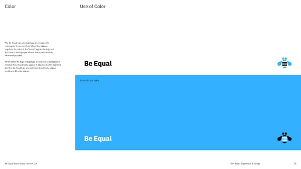
Color Use of Color The Be Equal logo and logotype are designed to correspond to one another. When they appear together, the color of the “equal” sign in the logo and the color of the logotype should match one another, whenever possible. When either the logo or logotype are used on a background of color, they should only appear in black and white contrast. And the Be Equal logo and logotype should only appear on 60 and 40 color values. 60 or 40 Color Value Be Equal Brand Guide, Version 2.0 IBM Brand Experience & Design 26
 IBM Brand Book Page 25 Page 27