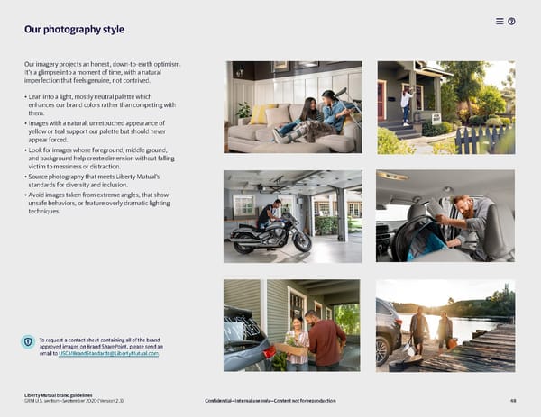
Our photography style Our imagery projects an honest, down-to-earth optimism. It’s a glimpse into a moment of time, with a natural imperfection that feels genuine, not contrived. • Lean into a light, mostly neutral palette which enhances our brand colors rather than competing with them. • Images with a natural, unretouched appearance of yellow or teal support our palette but should never appear forced. • Look for images whose foreground, middle ground, and background help create dimension without falling victim to messiness or distraction. • Source photography that meets Liberty Mutual’s standards for diversity and inclusion. • Avoid images taken from extreme angles, that show unsafe behaviors, or feature overly dramatic lighting techniques. To request a contact sheet containing all of the brand approved images on Brand SharePoint, please send an email to USCMBrandStandards@LibertyMutual.com. Liberty Mutual brand guidelines GRM U.S. section—September 2020 (Version 2.3) Confidential—Internal use only—Content not for reproduction 48
 Liberty Mutual Brand Book Page 47 Page 49