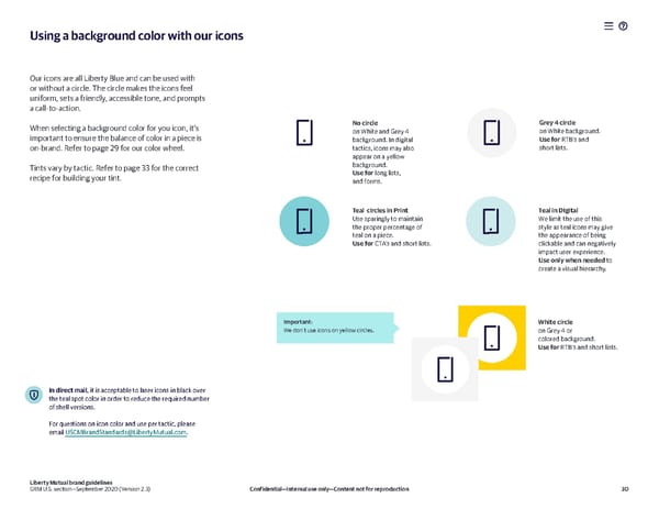
Using a background color with our icons Our icons are all Liberty Blue and can be used with or without a circle. The circle makes the icons feel uniform, sets a friendly, accessible tone, and prompts a call-to-action. When selecting a background color for you icon, it’s No circle Grey 4 circle important to ensure the balance of color in a piece is on White and Grey 4 on White background. background. In digital Use for RTB’s and on-brand. Refer to page 29 for our color wheel. tactics, icons may also short lists. appear on a yellow Tints vary by tactic. Refer to page 33 for the correct background. recipe for building your tint. Use for long lists, and forms. Teal circles in Print Teal in DIgital Use sparingly to maintain We limit the use of this the proper percentage of style as teal icons may give teal on a piece. the appearance of being Use for CTA’s and short lists. clickable and can negatively impact user experience. Use only when needed to create a visual hierarchy. Important: White circle We don’t use icons on yellow circles. on Grey 4 or colored background. Use for RTB’s and short lists. In direct mail, it is acceptable to laser icons in black over the teal spot color in order to reduce the required number of shell versions. For questions on icon color and use per tactic, please email USCMBrandStandards@LibertyMutual.com. Liberty Mutual brand guidelines GRM U.S. section—September 2020 (Version 2.3) Confidential—Internal use only—Content not for reproduction 30
 Liberty Mutual Brand Book Page 29 Page 31