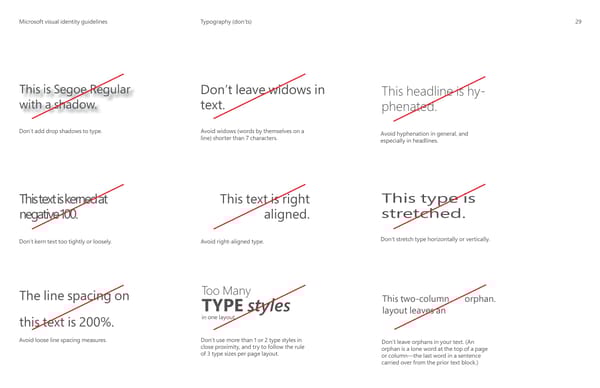
MicrMicrosoosofft visual identity guidelinest visual identity guidelines Typography (don’ts) 29 This is Segoe Regular Don’t leave widows in This headline is hy- with a shadow. text. phenated. Don’t add drop shadows to type. Avoid widows (words by themselves on a Avoid hyphenation in general, and line) shorter than 7 characters. especially in headlines. This type is This text is kerned at This text is right stretched. negative 100. aligned. Don’t stretch type horizontally or vertically. Don’t kern text too tightly or loosely. Avoid right-aligned type. Too Many The line spacing on TYPE styles This two-column orphan. layout leaves an in one layout this text is 200%. Avoid loose line spacing measures. Don’t use more than 1 or 2 type styles in Don’t leave orphans in your text. (An close proximity, and try to follow the rule orphan is a lone word at the top of a page of 3 type sizes per page layout. or column—the last word in a sentence carried over from the prior text block.)
 Microsoft Brand Book Page 31 Page 33