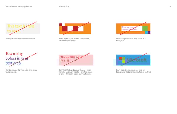
MicrMicrosoosofft visual identity guidelinest visual identity guidelines Color (don’ts) 37 This text is hard There are too many colors in this design. to read. Avoid low-contrast color combinations. Don’t repeat colors in ways that create a Avoid using more than three colors in a “checkerboard” effect. tile layout. Too many This is a 20% tint of colors in one Red 185. text area Don’t tint the brand colors. Choose a color Don’t place the logo over any color or Don’t use more than two colors in a single from the secondary palette—or white, black, background that provides insuf昀椀cient contrast. text grouping. or gray—if the core colors aren’t suf昀椀cient.
 Microsoft Brand Book Page 39 Page 41