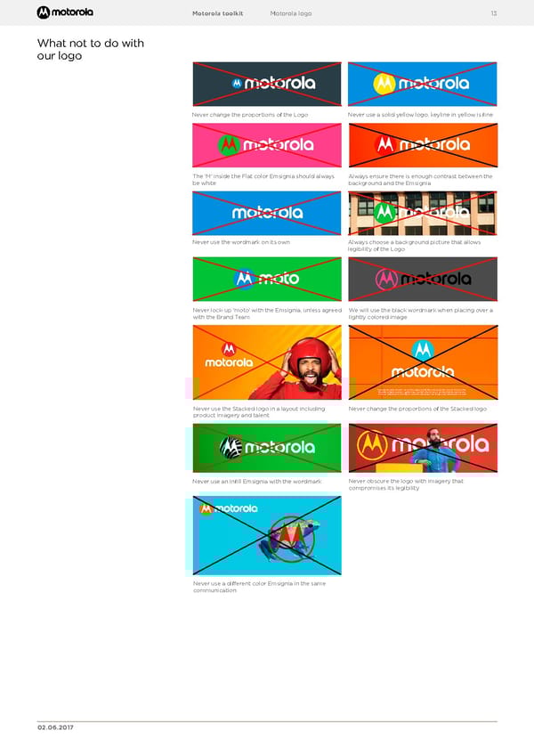
Motorola toolkit Motorola logo 13 02.06.2017 Never change the proportions of the Logo Always ensure there is enough contrast between the background and the Emsignia Always choose a background picture that allows legibility of the Logo Never use a solid yellow logo, keyline in yellow is fine Never use an Infill Emsignia with the wordmark Never use the wordmark on its own The ‘M’ inside the Flat color Emsignia should always be white Never lock-up ‘moto’ with the Emsignia, unless agreed with the Brand Team We will use the black wordmark when placing over a lightly colored image What not to do with our logo Never use the Stacked logo in a layout including product imagery and talent Never change the proportions of the Stacked logo Lorem ipsum dolor sit amet, consectetur adipiscing elit. Duis vitae justo nibh. Aenean et ornare felis. Curabitur in ligula maximus, sagittis neque sit amet, ultricies massa. Sed lorem tortor, placerat quis viverra id, sollicitudin at enim. Donec nisl dolor, ullamcorper non tempus eget, ullamcorper nec dolo Never obscure the logo with imagery that compromises its legibility Never use a different color Emsignia in the same communication
 Motorola Brand Book Page 12 Page 14