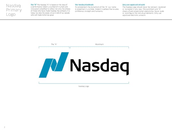
7 The “N” The Nasdaq “N” Is based on the idea of a performance ribbon; a symbol of triumph and innovation simplified to reflect not only the ethose of those who have made Nasdaq the company it is today, but also the power, drive & skill of our people who will make tomorrow great. The Nasdaq Wordmark To complement the dynamism of the “N”, our name is presented in a simple, modern typeface that exudes confidence, strength and humanity. Only use approved artwork The Nasdaq Logo should never be redrawn, recolored or recreated in any way. The wordmark and “N” share a fixed proportional relationship. Never scale or reconfigure the individual elements. Only use approved electronic artwork. Nasdaq Primary Logo The “N” Wordmark Nasdaq Logo
 Nasdaq Brand Book Page 6 Page 8