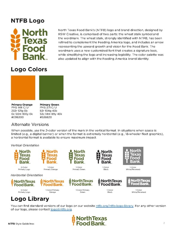
NTFB Logo North Texas Food Bank’s (NTFB) logo and brand direction, designed by RSW Creative, is comprised of two parts: the wheat stalk symbol and the wordmark. The wheat stalk, strongly identified with NTFB, has been refined to complement the Feeding America logo, and includes an arrow representing the upward growth and vision for the Food Bank. The wordmark uses a new customized font that creates a signature look, while simplifying the logo and increasing legibility. The color palette was also updated to align with the Feeding America brand identity. Logo Colors Primary Orange Primary Green PMS 144 C/U PMS 371 C/U 233r 121g 0b 83r 104g 43b 0c 50m 100y 0k 53c 14m 89y 43k #E98300 #53682B Alternate Versions When possible, use the 2-color version of the mark in the vertical format. In situations when space is limited (e.g., a digital banner) or when the format is extremely horizontal (e.g., 18-wheeler fleet graphics), a horizontal format is available to ensure maximum impact. Vertical Orientation 2-Color 1-Color 1-Color 1-Color 1-Color Primary Logo Primary Orange Primary Green Black White/Reversed Horizontal Orientation 2-Color 1-Color Primary 1-Color Primary 1-Color 1-Color Primary Logo Orange Green Black White/Reversed Logo Library You can find standard versions of our logo on our website ntfb.org/ntfb-logo-library. For any other version of our logo, please contact logo@ntfb.org. NTFB Style Guidelines 2
 North Texas Food Bank Page 1 Page 3