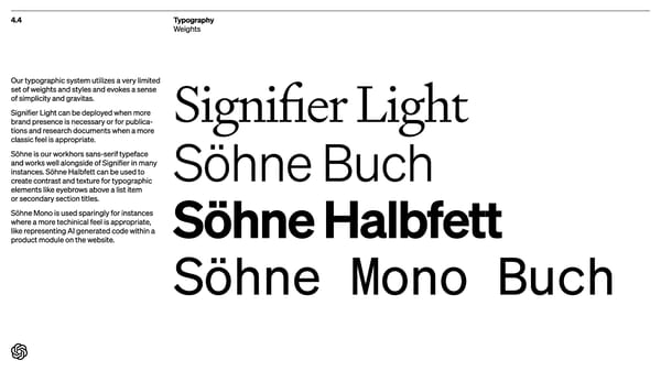
4.4 Typography Weights Signifier Light Söhne Buch Söhne Halbfett Söhne Mono Buch Our typographic system utilizes a very limited set of weights and styles and evokes a sense of simplicity and gravitas. Signifier Light can be deployed when more brand presence is necessary or for publica- tions and research documents when a more classic feel is appropriate. Söhne is our workhors sans-serif typeface and works well alongside of Signifier in many instances. Söhne Halbfett can be used to create contrast and texture for typographic elements like eyebrows above a list item or secondary section titles. Söhne Mono is used sparingly for instances where a more techinical feel is appropriate, like representing AI generated code within a product module on the website.
 Open AI Brand Book Page 58 Page 60