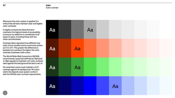
3.7 Color Color contrast Aa Aa Aa Aa Aa Aa Aa Aa Whenever the color system is applied it is critical that all texts maintain clear and legible color contrasts. In digital contexts the OpenAI brand maintains the highest levels of accessibility to ensure our platform is considerate of all types of users, including those with low vision and blindness. Contrast ratios represent how different one color is from another and is commonly written as 1:2 or 21:1. The greater the difference is between the numbers the higher the color contrast is between both colors. The World Wide Web Consortium (WCAG) recommends Large text (defined as 14pt bold or 18pt regular) to maintain a 3:1 color contrast ratio against the background the text is set on. For small text colors must maintain a 4.5:1 contrast against its background. All colors within the OpenAI color system conform with the WCAG color contrast requirements.
 Open AI Brand Book Page 35 Page 37