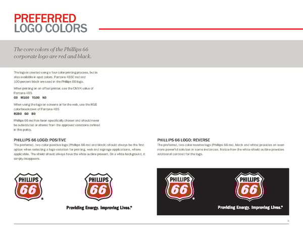
6 PREFERRED LOGO COLORS The core colors of the Phillips 66 corporate logo are red and black. The logo is created using a four-color printing process, but is also available in spot colors. Pantone 485C red and 100 percent black are used in the Phillips 66 logo. When printing on an offset printer, use the CMYK value of Pantone 485 C0 M100 Y100 K0 When using the logo on screens or for the web, use the RGB color breakdown of Pantone 485 R250 G0 B0 Phillips 66 red has been specifically chosen and should never be substituted or altered from the approved variations defined in this policy. PHILLIPS 66 LOGO: REVERSE The preferred, two-color reverse logo (Phillips 66 red, black and white) provides an even more powerful solution in some instances. Notice how the white shield outline provides additional contrast for the logo. PHILLIPS 66 LOGO: POSITIVE The preferred, two-color positive logo (Phillips 66 red and black) should always be the first option when selecting a logo variation for printing, web and signage applications, where applicable. The shield should always have the white outline present. On a white background, it simply disappears.
 Phillips66 Brand Book Page 5 Page 7