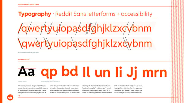
24 Typography · Reddit Sans letterforms + accessibility /qwertyuiopasdfghjklzxcvbnm qp Aa bd Il un Ii Jj mrn \ qwertyuiopasdfghjklzxcvbnm ACCESSIBILITY/ TALL X-HEIGHT 67.5º FOUNDATIONAL SLASH ANGLE DISAMBIGUATED LETTERFORMS We connect people of all ages and abilities, so special attention was paid to accessibility features of Reddit Sans. In particular, we choose a large x-height make characters easily legible even at small sizes, and included rounded bowls to make characters like o, p, d, and p easily recognizable when scanning text. To aid character recognition further for people with dyslexia, we made sure to disambiguate characters that can be easily con - fused, such as capital ‘I’ and lowercase ‘l’ as well as ensuring that characters like ‘b’ and ‘d’ or ‘u’ and ‘n' are not simply rotated or flipped variations. Dots on characters like ‘I’ and ‘j’ are fully round, helping differentiate them from the uppercase. And Reddit Sans’ unique ‘r’ shape ensures that the ‘rn’ pairing is not easily mistaken for an ‘m’. REDDIT BRAND GUIDELINES
 Reddit Brand Book Page 23 Page 25