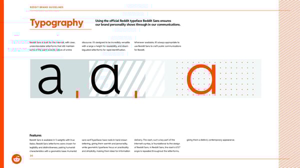
Reddit Sans is built for the Internet, with clear, understandable letterforms that still maintain some of the warm eclectic nature of online Typography 20 discourse. It’s designed to be incredibly versatile with a large x-height for readability, and disam- biguated letterforms for rapid identification. Whenever available, it’s always appropriate to use Reddit Sans to craft public communications for Reddit. Reddit Sans is available in 5 weights with true italics. Reddit Sans letterforms were chosen for legibility and distinctiveness, pairing humanist characteristics with a geometric base. Humanist sans-serif typefaces have roots in hand drawn lettering, giving them warmth and personality, while geometric typefaces focus on practicality and simplicity, making them ideal for information delivery. The slash, such a key part of the internet's syntax, is foundational to the design of Reddit Sans. In Reddit Sans, the slash's 67.5º angle is repeated throughout the letterforms, giving them a distinct, contemporary appearance. Using the official Reddit typeface Reddit Sans ensures our brand personality shows through in our communications. Features REDDIT BRAND GUIDELINES
 Reddit Brand Book Page 19 Page 21