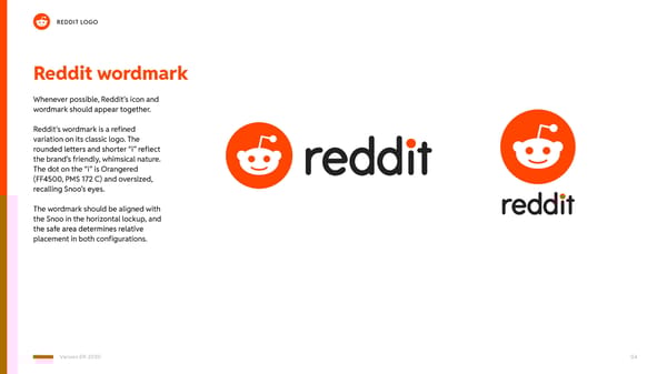
Reddit wordmark Whenever possible, Reddit’s icon and wordmark should appear together. Reddit’s wordmark is a refined variation on its classic logo. The rounded letters and shorter “i” reflect the brand’s friendly, whimsical nature. The dot on the “i” is Orangered (FF4500, PMS 172 C) and oversized, recalling Snoo’s eyes. The wordmark should be aligned with the Snoo in the horizontal lockup, and the safe area determines relative placement in both configurations. REDDIT LOGO Version 09-2020 04
 Reddit Brand Book Page 3 Page 5