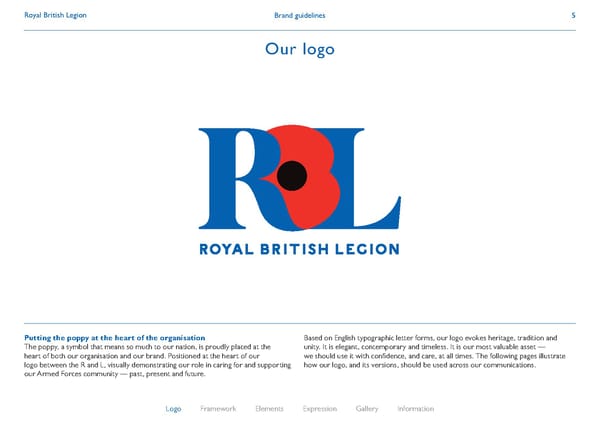
Brand guidelines Royal British Legion 5 Our logo Putting the poppy at the heart of the organisation The poppy, a symbol that means so much to our nation, is proudly placed at the heart of both our organisation and our brand. Positioned at the heart of our logo between the R and L, visually demonstrating our role in caring for and supporting our Armed Forces community — past, present and future. Based on English typographic letter forms, our logo evokes heritage, tradition and unity. It is elegant, contemporary and timeless. It is our most valuable asset — we should use it with confidence, and care, at all times. The following pages illustrate how our logo, and its versions, should be used across our communications. Logo Framework Elements Expression Gallery Information
 Royal British Legion Brand Book Page 4 Page 6