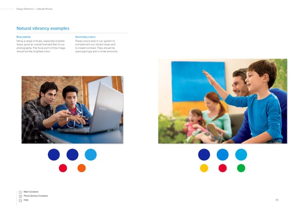
65 Lifestyle Photos | Design Elements Blue palette Using a range of blues, especially brighter blues, gives an overall branded feel to our photography. The focal point of the image should be the brightest color. Secondary colors These colors exist in our system to complement our vibrant blues and to create contrast. They should be used sparingly and in small amounts. Natural vibrancy examples
 Samsung Brand Book Page 31 Page 33