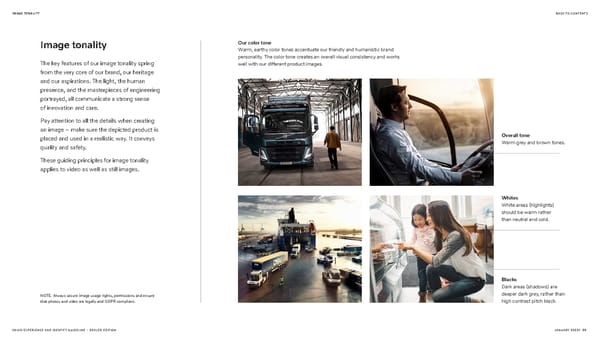
IMAGE TONALITY BACK TO CONTENTS Image tonality Our color tone Warm, earthy color tones accentuate our friendly and humanistic brand personality. The color tone creates an overall visual consistency and works The key features of our image tonality spring well with our different product images. from the very core of our brand, our heritage and our aspirations. The light, the human presence, and the masterpieces of engineering portrayed, all communicate a strong sense of innovation and care. Pay attention to all the details when creating an image – make sure the depicted product is placed and used in a realistic way. It conveys Overall tone quality and safety. Warm grey and brown tones. These guiding principles for image tonality applies to video as well as still images. Whites White areas (highlights) should be warm rather than neutral and cold. Blacks Dark areas (shadows) are NOTE: Always secure image usage rights, permissions and ensure deeper dark grey, rather than that photos and video are legally and GDPR compliant. high contrast pitch black. VOLVO EXPERIENCE AND IDENTITY GUIDELINE – DEALER EDITION JANUARY 20221 35
 Volvo Brand Book Page 34 Page 36