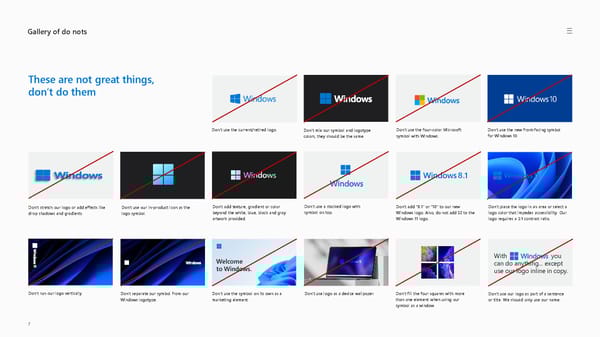
Gallery of do nots These are not great things, don’t do them Don’t use the four -color Microsoft symbol with Windows. Don't use the new front -facing symbol for Windows 10. Don't separate our symbol from our Windows logotype. Don't use the symbol on its own as a marketing element. Welcome to Windows. Don’t place the logo in an area or select a logo color that impedes accessibility. Our logo requires a 3:1 contrast ratio. Don’t add “8.1” or “10” to our new Windows logo. Also, do not add SE to the Windows 11 logo. 8.1 Don’t add texture, gradient or color beyond the white, blue, black and gray artwork provided. 7 Don’t use logo as a device wallpaper. Don’t use the current/retired logo. Don’t mix our symbol and logotype colors, they should be the same. With you can do anything... except use our logo inline in copy. Don’t use our logo as part of a sentence or title. We should only use our name. Don’t stretch our logo or add effects like drop shadows and gradients. Don’t use our in- product icon as the logo symbol. Don't use a stacked logo with symbol on top. Don’t fill the four squares with more than one element when using our symbol as a window. Don’t run our logo vertically.
 Windows Brand Book Page 6 Page 8