Pluralsight Brand Book
Pluralsight is a leading platform for technology skill development, offering courses and tools to help individuals and teams stay ahead in the digital age. It empowers learners to achieve career growth through expert-led video training and hands-on practice.
Pluralsight Brand Guidelines
BRAND BOOK

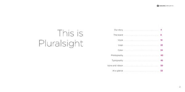
BRAND GUIDELINES Our story . . . . . . . . . . . . . . . . . . . . . . . . . . . . . . . . . . . . 4 This is The brand . . . . . . . . . . . . . . . . . . . . . . . . . . . . . . . . . . . . 8 Voice . . . . . . . . . . . . . . . . . . . . . . . . . . . . . . . . . . . . 18 Pluralsight Logo . . . . . . . . . . . . . . . . . . . . . . . . . . . . . . . . . . . . 22 Color . . . . . . . . . . . . . . . . . . . . . . . . . . . . . . . . . . . . 34 Photography . . . . . . . . . . . . . . . . . . . . . . . . . . . . . . . . . . . . 40 Typography . . . . . . . . . . . . . . . . . . . . . . . . . . . . . . . . . . . . 46 Icons and ribbon . . . . . . . . . . . . . . . . . . . . . . . . . . . . . . . . . . . . 50 At a glance . . . . . . . . . . . . . . . . . . . . . . . . . . . . . . . . . . . . 53 2

BRAND GUIDELINES Our story 4
BRAND GUIDELINES „c‘uired ekpub Oct 2013 „c‘uired Code School Ššrlando, ‡– officeŽ Jan 2014 aised €‚ƒ in a Series aised “™‚ƒ in a Series — „ funding from Insight funding from Insight …enture …enture †artners †artners, ICšˆI› Capital and Dec 2012 Sorenson Capital †artners „c‘uired OUR BACKGROUND Aug 2014 HackHands †luralsight is founded July 2015 and launches with classroom training 2004 †osted “”ƒ in –aunched free kids ’e started out as seven We believe in changing the way the world learns . That’s been our aim since 2004, Incorporated subscription•based programming suite „c‘uired Smarterer companies, but today, we online learning billings May 2013 Š—oston, ƒ„ officeŽ are one tribe, united by when we launched classroom-based training by developers, for developers . That 2008 Dec 2012 Nov 2014 one mission last part is key . TODAY We believe in teaching from the trenches . Our course authors have already solved the problems . They set the trends . They shape the industry . As we went online and expanded into more learning areas, we stayed true to only ‡ully transitioned to „c‘uired œigital•utors ˆamed one of ‡orbes‰ online training model Ššklahoma City, šž officeŽ ƒost †romising working with the best . But we didn’t stop there . We brought instant mentoring and Feb 2014 Companies Š‹ŒŽ 2010 „c‘uired Jan 2015 assessments into our platform to create a truly personalized learning journey . And †eepCode we added Code School to our ecosystem to help beginners and people diving into July 2013 „uthor Scott „llen reached “ƒ in teaching fees and new technologies learn in an interactive way . royalties for all of Ÿ“™ Dec 2013 Supported the “Hour of Code” „c‘uired rainSignal movement by hosting an hour of code It’s a platform designed to fill any technical skills gap—for anyone or any company . ŠChicago ¡ Schaumburg, I– officeŽ for a week, kicking off the event with July 2013 tah’s ov Herbert and the tah echnology Council Dec 2014 5
BRAND GUIDELINES „c‘uired ekpub Oct 2013 „c‘uired Code School Ššrlando, ‡– officeŽ Jan 2014 aised €‚ƒ in a Series aised “™‚ƒ in a Series — „ funding from Insight funding from Insight …enture …enture †artners †artners, ICšˆI› Capital and Dec 2012 Sorenson Capital †artners „c‘uired Aug 2014 HackHands †luralsight is founded July 2015 and launches with classroom training 2004 †osted “”ƒ in –aunched free kids ’e started out as seven Incorporated subscription•based programming suite „c‘uired Smarterer companies, but today, we online learning billings May 2013 Š—oston, ƒ„ officeŽ are one tribe, united by 2008 Dec 2012 Nov 2014 one mission TODAY ‡ully transitioned to „c‘uired œigital•utors ˆamed one of ‡orbes‰ online training model Ššklahoma City, šž officeŽ ƒost †romising Feb 2014 Companies Š‹ŒŽ 2010 „c‘uired Jan 2015 †eepCode July 2013 „uthor Scott „llen reached “ƒ in teaching fees and royalties for all of Ÿ“™ Dec 2013 Supported the “Hour of Code” „c‘uired rainSignal movement by hosting an hour of code ŠChicago ¡ Schaumburg, I– officeŽ for a week, kicking off the event with July 2013 tah’s ov Herbert and the tah echnology Council Dec 2014 6
BRAND GUIDELINES 7
BRAND GUIDELINES The brand 8
BRAND GUIDELINES “Your brand is what people WHAT IS A BRAND? say about you when you’re A brand isn’t a logo . Or our business cards . It’s not words on a page or images on a screen . It’s not a billboard or an event booth . It’s these things, but really, so much more . not in the room.” Most important, a brand is about people . When you interact with someone, they won’t always remember the particulars of your conversation . But you can be sure they’ll remember how you made them FEEL . That’s a brand . —Jeff Bezos, Amazon founder 9
BRAND GUIDELINES YOU ARE A BRAND STEWARD As part of the Pluralsight family, you get to shape what people say about us . You are a brand steward . And that’s where this book comes in—to give you guidelines on how best to tell our brand story . We want you to own our brand . It’s yours, and it’s yours to protect in everything you do . 10
BRAND GUIDELINES WHY WE EXIST To democratize professional technology learning. 11
BRAND GUIDELINES WHAT WE DO We build an ecosystem where people learn, teach and connect. 12
BRAND GUIDELINES HOW WE BEHAVE We are truth seekers, entrepreneurs and eternal optimists. These are our core values, and they inform the personality of our brand. 13
BRAND GUIDELINES We are: Honest Our reason for existing relates back to our brand personality . Let’s break it down . Intelligent Democratize: To make something available to all. As a brand, we do this by being inclusive Spirited and honest in everything we do . We don’t talk down to our customers or condescend . We are personal and friendly in our approach and seek to be helpful at all times . Professional: There’s no fluff in our learning library, and the same goes for our brand . We’re We aren’t: sophisticated, intelligent and spirited. We speak to our customers with conviction . Insincere Learning: This is what we’re all about, but not just in the obvious ways . Yes, we have thousands Silly of courses, assessments and mentoring to facilitate learning, but what we really aim to do is to inspire a passion for continuous improvement in everyone who interacts with us . Apathetic 14
BRAND GUIDELINES WHO WE ARE The The Pluralsight community—our employees, subscribers and authors—are The Change Makers . We believe the best way to predict the future is to define it . We put the power back into our own hands Change and shatter the status quo . Our love of learning makes us masters of our craft and ready for new challenges . We follow our passions, live Makers our core values—truth seekers, entrepreneurs and eternal optimists— and change the game with disruptive ideas and elegant solutions . 15
BRAND GUIDELINES WHO WE SERVE Learners (individual subscribers or members of group plans): “My craft is my career . Connect me to my community and give me Learners access to the knowledge I need to own my future .” Planners (managers of group plans): “I have a vision for my team . Give me access to the people, skills and Planners insight I need to realize it .” Authors (the people who create our courses): Authors “I want to share my knowledge with the world . Give me a platform to teach and connect me with other passionate experts and learners .” 16

BRAND GUIDELINES Voice 18
BRAND GUIDELINES Be confident: Be enthusiastic: Be clever: Be simple and direct . Avoid Stay positive by avoiding Show our audience you long, hard words and formal comparisons designed relate to their joys and language . Let words flow to elevate one idea by frustrations . That you know naturally, as if they’re being diminishing another . Assume they have interests outside HOW WE SOUND spoken . Try not to say too success and stay away from of work . Infuse your writing many things at once . fear . Celebrate the craft . Our with the unexpected and audience appreciates the skill engage in wordplay, but not Write with conviction . that goes into their work, so at the expense of being clear . We communicate in a way that is noticed, Whatever you write, own it— shine light on it whenever At times, be light-hearted believed and remembered. We do this by make a point and stand for possible . but not light-headed . following three principles in our messaging: something . Avoid hedging language and evasive Enthusiasm is not: Clever is not: Be confident . Be enthusiastic . Be clever . phrases such as “seems like” and “according to .” Steer Cheesy Silly clear of empty words like Long-winded Immature “world-class,” “robust” and WRITING IN ALL CAPS Flippant “high quality .” Confidence is not: Arrogance Narrow-mindedness Dismissive 19

BRAND GUIDELINES 21
BRAND GUIDELINES Logo 22
BRAND GUIDELINES WHAT IT MEANS With the goal of redefining the way the world learns and enhancing the overall human experience, we created a logo that would Intersection, combine, movement, forward, play, direction, quickly and clearly project this message . Here’s path, together, mentorship, learn a breakdown of what our mark is all about . 23
BRAND GUIDELINES 24
BRAND GUIDELINES HORIZONTAL LOGO OUR LOGOS The highlight of the logo is the mark . It embodies the idea of moving forward, mentorship and togetherness . This is the VERTICAL LOGO company’s third logo, but we like to think it’s been hiding there the whole time . It’s a realization of everything we believe in . Note: For the most part, the logo will have the type and logo mark combined, but there are some instances when the logo mark can be used separate from the type . Exceptions usually occur with apparel, swag and LOGO MARK sometimes the website . 25
BRAND GUIDELINES HORIZONTAL LOGO VERTICAL LOGO LOGO MARK 1.5X X = optimal clear space = optimal clear space 1.5X XXXXX X 1.5X 1.5X 1.5X 1.5X = minimum clear space 1.5X = minimum clear space = x height = X height X 1.5X X 1.5X CLEAR SPACE Give the logo space . To preserve the integrity and visual impact of the logo, always maintain adequate clear space around it . It’s an integral part of the design, and ensures the logo can be seen quickly, uncluttered by other logos, symbols, artwork or text . 26
BRAND GUIDELINES LOGO USE AND MISUSE RULES When using the logo, take care to not harm its integrity by altering it or exercising your personal creative freedom . The following are merely a few examples of what wouldn’t be OK . For context, this is the correct logo . Never manipulate the form by removing any Never alter the color, whether it’s by adding of the elements a gradient to the type or changing the color of the mark . Never manipulate the gradient in any way . Never skew, manipulate or change the form or structure of the mark or type . 27
BRAND GUIDELINES Note: Logo color exception . We may add a magenta tag on apparel or swag, like a backpack pocket or the sleeve of a shirt . In this unique instance, the logo can be 100% magenta, or white on a 100% magenta background . Never add an eff ect to the logo, including Never change the typeface of the logo . drop shadows, bevels or gradients . Never manipulate the color of the logo Never screen back or add opacity whether it’s a gradient or any other color . to the logo . Do not use the logo in any format that Do not at any time angle the logo . It always may be “nicknamed” or abbreviated . sits on a 0 degree angle . 28
BRAND GUIDELINES ALTERNATE LOGOS 29
BRAND GUIDELINES CATEGORY AND PARTNERSHIP LOCKUPS There are times when Pluralsight partners with another group or organization . In those cases, there may be a need to create a logo lockup . Follow these guidelines to help everybody play nice . PARTNERSHIP LOCKUPS CATEGORY LOCKUPS 0.35 pt 0.35 pt 1.5X 1.5X 1.5X 1.5X X X Note: Our partnership lockups require us to show equal deference to our logo and the partnering company . To accomplish this, we use the grayscale or black and white versions of both logos . In order to maintain our ownership of the marketing piece, our logo 0.35 pt 1.5X is always in the primary position on the left . 30
BRAND GUIDELINES OTHER LOGO APPLICATIONS Using the logo on backgrounds We’re proud of our logo, so readability is essential . Only use the gradient logo on white, light gray or 100% black backgrounds . In situations where we don’t have control over the printing process, play it safe and use an alternate logo, even if the background is white . This is an acceptable use of the gradient logo If you need to put the logo on a busier image, Don’t force the logo onto an image or background on an image . choose the darkened version of the image and use that compromises its legibility . the white stroke logo . 31
BRAND GUIDELINES Apparel and swag Due to printing and embroidering restrictions, we use the alternate logos for apparel and swag . Note: On internal-use apparel and swag, we have the leeway to use the logo and wordmark separately . 32
BRAND GUIDELINES
BRAND GUIDELINES Color 34
BRAND GUIDELINES THE COLORS Our colors are as important to us as the logo itself . They’re part of the brand’s personality . We have established four primary colors: Pluralsight orange, Pluralsight magenta, black and white . The secondary color palette is used primarily for the website to identify different roles . Secondary colors are used sparingly, if at all, in marketing materials . PRIMARY COLORS SECONDARY COLORS 35
BRAND GUIDELINES PRIMARY PALETTE PLURALSIGHT ORANGE PLURALSIGHT MAGENTA BLACK TO WHITE Psychology of orange Hex: FBC8BF Hex: F0B4D2 Hex: FFFFFF Orange radiates optimism, warmth R: 250 R: 240 R: 255 G: 200 G: 180 G: 255 and happiness, combining the B: 190 B: 210 B: 255 physical energy and stimulation of Hex: F48264 Hex: E65AA0 Hex: DCDCDC red with the cheerfulness of yellow . R: 245 R: 230 R: 220 Orange relates to openness and G: 130 G: 90 G: 220 B: 100 B: 160 B: 220 two-way conversations . Hex: F15B2A Hex: EC008C Hex: 000000 PMS: 7579 C PMS: 225 C PMS: Black 6 C C: 0 R: 240 C: 0 R: 236 C: 0% R: 0 Psychology of magenta M: 80% G: 90 M: 100% G: 0 M: 0% G: 0 Y: 95% B: 40 Y: 0 B: 140 Y: 0% B: 0 Magenta as a color is an instrument K: 0 K: 0 K: 100% of change and transformation . It influences our personal development and it helps us experience a greater level of Hex: A04123 Hex: A01E64 Hex: 2D2D2D awareness and knowledge . R: 160 R: 160 R: 45 G: 65 G: 30 G: 45 B: 35 B: 100 B: 45 Hex: 782D19 Hex: 731446 Hex: 787878 R: 140 R: 115 R: 120 G: 45 G: 20 G: 120 B: 25 B: 70 B: 120 36
BRAND GUIDELINES OUR GRADIENT gy Hex: F15B2A Ener C: 0 R: 240 M: 80% G : 9 0 Y: 95% B: 4 0 GRADIENT USAGE K: 0 ABLE GRADIENT DIRECTIONS CEPT Minimal usage on Slightly more usage on The gradient will be used C letterhead, business banner ads and some most on trade show A tion Hex: EC008C cards, white papers and promotional items, like booths and banners . C: 0 R: 236 one sheets . stickers . orma M: 100% G: 0 Y: 0 B: 1 4 0 ansf K: 0 r T 37
BRAND GUIDELINES SECONDARY PALETTE YELLOW YELLOW GREEN GREEN TURQUOISE AQUA-MARINE BLUE PURPLE PLUM RED CORAL Role of the secondary color palette We primarily use the secondary color palette on the website and apps, as it coincides with diff erent roles on the website . Secondary colors should never be used as a dominant color on their own . You may see the secondary colors used in marketing materials in charts, time lines or presentations, but they will be used sparingly . Very little usage of the The secondary color secondary color palette palette will be used in marketing materials extensively on the and other collateral . website . 38

BRAND GUIDELINES Photography Our Logo 40
BRAND GUIDELINES OUR PHOTOGRAPHY Our photography style conveys authenticity, as if you’ve captured a subject “in the moment .” The color, composition and feel should engage viewers and make them feel like they’re in the photo . 41
BRAND GUIDELINES 42
BRAND GUIDELINES 43
BRAND GUIDELINES 44

BRAND GUIDELINES Typography Our Logo 46
BRAND GUIDELINES THE PLURALSIGHT FONT Extra Light ABCDEFGHIJKLMNOPQRSTUVWXYZ abcdefghijklmnopqrstuvwxyz 1234567890!@#$%^&*()<>?/ Light ABCDEFGHIJKLMNOPQRSTUVWXYZ abcdefghijklmnopqrstuvwxyz GOTHAM 1234567890!@#$%^&*()<>?/ Gotham is our official font and must be used when possible . It’s Book ABCDEFGHIJKLMNOPQRSTUVWXYZ modern and sophisticated . It feels authentic and familiar . Gotham abcdefghijklmnopqrstuvwxyz is a licensed font and is used in all marketing collateral and the 1234567890!@#$%^&*()<>?/ website . This is also the font of our logo . Medium ABCDEFGHIJKLMNOPQRSTUVWXYZ abcdefghijklmnopqrstuvwxyz 1234567890!@#$%^&*()<>?/ Bold ABCDEFGHIJKLMNOPQRSTUVWXYZ abcdefghijklmnopqrstuvwxyz 1234567890!@#$%^&*()<>?/ 47
BRAND GUIDELINES ALTERNATE FONT Hairline ABCDEFGHIJKLMNOPQRSTUVWXYZ abcdefghijklmnopqrstuvwxyz 1234567890!@#$%^&*()<>?/1234567890!@#$%^&*()<>?/ Ultra Light ABCDEFGHIJKLMNOPQRSTUVWXYZ abcdefghijklmnopqrstuvwxyz MONTSERRAT 1234567890!@#$%^&*()<>?/ When Gotham isn’t available or cannot be used, Light ABCDEFGHIJKLMNOPQRSTUVWXYZ Montserrat is a free alternative that closely matches abcdefghijklmnopqrstuvwxyz Gotham . This is used primarily in PowerPoint and 1234567890!@#$%^&*()<>?/1234567890!@#$%^&*()<>?/ Keynote presentations and in Microsoft templates for things like the letterhead . Regular ABCDEFGHIJKLMNOPQRSTUVWXYZ abcdefghijklmnopqrstuvwxyz 1234567890!@#$%^&*()<>?/1234567890!@#$%^&*()<>?/ Semibold ABCDEFGHIJKLMNOPQRSTUVWXYZ abcdefghijklmnopqrstuvwxyz 1234567890!@#$%^&*()<>?/1234567890!@#$%^&*()<>?/ 48

BRAND GUIDELINES Icons and ribbon 50
BRAND GUIDELINES Our icon library consists of hundreds of vector icons to be used to visually communicate a product, idea or service . ICONS Icons are the visual expression of our products, services or tools . Simple, light, sophisticated and friendly, they communicate the core idea or component of the brand . While each icon is visually distinct, all icons should have consistent line weights and visual style . Line weights can be manipulated, but take special care to keep lines light enough that they match other elements on the page . The icons can be used as black and white or you can make them pop by adding magenta to an element of the icon or applying the gradient to the whole thing . 51
BRAND GUIDELINES TITLE Key principles to keep in mind when creating your motion graphics reel . PLURALSIGHT RIBBON The ribbon has been developed to act as an anchor element to PULL STAT help with visual hierarchy . Headlines and pull stats are places you can consider using the ribbon as a way to get a pop of color in the More than 57% of all users piece . Ribbons are used on PowerPoint and Keynote presentations, are on Google Chrome . one sheets and white papers . It can be locked up with calls to action or to draw attention to contact info . It’s also used in motion graphics as a visual element, mainly as a vehicle to transition from CTA one scene to another . Prepare your students for the jobs of tomorrow today . Ready to lead your students to greatness? Contact us: schools@pluralsight.com 1.888.368.1240 | 1.801.784.9007 52
BRAND GUIDELINES At a glance 53
BRAND GUIDELINES Our mission To democratize professional technology learning . Who we are The Change Makers . Who we serve Learners . Planners . Authors . How we behave Truth seekers . Eternal optimists . Entrepreneurs . Our brand personality Honest . Intelligent . Spirited . Our voice Confident . Enthusiastic . Clever . 54
