RELAYTO Best Practices for Microsites
RELAYTO/ BEST PRACTICES FOR MICROSITES Best practices on how to effectively create an immersive microsite RELAYTO experiences Academy
Example: Experience Showcase RELAYTO/ Experience showcase follows our best practices for creating a scrollable microsite. Including; Immersive video, web constrained design, embedded content, Interactive navigation and much more.
Dimensions for Scroll View For the best viewing experience in scroll view, set the presentation’s slide aspect ratio to 16:9. Make sure to put consistent padding & leave some space above & below the contents of the slide. This will achieve the feel of a website rather than a zoomed in PowerPoint because the ratio size will be balanced. How to set up guides in PowerPoint: 1. Click on “View,” then select “Guides” 2. To add a guide, right-click on an existing guide, then add a vertical or horizontal guide 3. Align vertical lines to 3.00cm with the top ruler 4. Align horizontal lines to 5.50cm with the left ruler
This is a modal window.
Immersive Cover Page The 1st page needs to leave a lasting positive experience & make the visitor want to read into your content • Add the Main title & a immersive video background • No heavy text or long descriptions
Contrasting Sections For the "microsite view" it's important to ensure white space from page to page as well as creating a contrast (or continuity) of background colors/images as you scroll through the microsite.
Avoid Text Heavy Slides Large blocks of text that are hard to read on a screen. Dense columns, especially on vertical/scrollable layouts. For text heavy slides, use RELAYTO popups with pulsating icons to indicate more content. Use visuals with more RELAYTO content embedded to keep your slide minimal.
Personalized Call-to-Actions Wrong CONTACT US LEARN MORE EXPLORE Right To support visuals with clickable content, add CTA Indicators to thumbnails so visitors will know to interact with the action on click. When creating your own call-to-actions, make them feel like Web CONTACT US LEARN MORE buttons, rather than an average PowerPoint shape. They need whitespace, color & size contrast to generate desired behaviors. EXPLORE
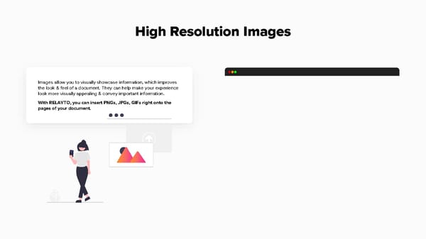
High Resolution Images Images allow you to visually showcase information, which improves the look & feel of a document. They can help make your experience look more visually appealing & convey important information. With RELAYTO, you can insert PNGs, JPGs, GIFs right onto the pages of your document.
This is a modal window.
Immersive Media There are other types of media to include in your RELAYTO experience. • Audio - MP3/4s, Spotify, Apple Podcasts • Blogs • Polls - Mentimeter, Pollsight • Add hyperlinks to videos, articles and other websites. RELAYTO will automatically create an immersive preview or full screen experience for select links
Gather Assets in a Hub Hubs provide shared context across different kinds of assetsー documents, presentations & videosー in a central, always up-to-date location. The hub solution allows documents to no longer be stand- alone experiences that lack context & reduces the time people take to search for content.
Hub Details After creating a hub, you will be able to customize your hub on the left side of your screen. These customizations will help viewers understand the context of the hub: • Hub name • Description of hub - mention number of documents or content type • Cover image - PNG, JPG or GIF
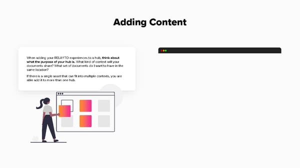
Adding Content When adding your RELAYTO experiences to a hub, think about what the purpose of your hub is. What kind of context will your documents share? What set of documents do I want to have in the same location? If there is a single asset that can fit into multiple contexts, you are able add it to more than one hub.
This is a modal window.
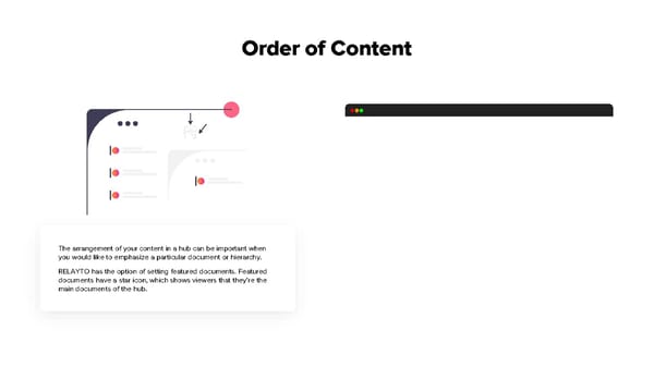
Order of Content The arrangement of your content in a hub can be important when you would like to emphasize a particular document or hierarchy. RELAYTO has the option of setting featured documents. Featured documents have a star icon, which shows viewers that they’re the main documents of the hub.
This is a modal window.
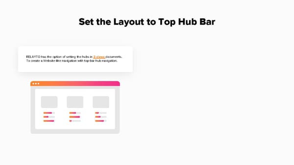
Set the Layout to Top Hub Bar RELAYTO has the option of setting the hubs in 3 views documents. To create a Website-like navigation with top-bar hub navigation.
