Relayto Design Principles
Using the acronym, B.O.R.D.E.R.


[ This is the second installment in a series of posts that we're doing as we read Walter Isaacson's Steve Jobs biography. Click here to read the first.--Ed.]
Everyone who cares, even modestly, about design can name a few decisive events that set them on that path. Steve Jobs was no different, but he was also extraordinarily lucky: The formative design lessons he got were so far ahead of their time that they would lay the groundwork for Apple's success with the Macintosh, the iMac, iPhone, and the iPad. Here's six of the defining design lessons that Jobs learned, and which imbued every product he created.
After all these decades, that memo is still Apple's DNA.
Under Jobs, Apple became famous for a level of craft that seemed almost gratuitous: For example, on the "Sunflower" Macintosh of a few years ago, there was an exquisitely fine, laser-etched Apple logo. As an owner, you might see that logo only once a year, when moving the computer. But it mattered, because that single time made an impression. In the same way, Jobs spent a lot of time making the circuit boards of the first Macintosh beautiful--he wanted their architecture to be clean and orderly. Who cared about that? But again, that level of detail would have made a deep impression on the few people that would have seen the inner guts.
So in a way, it's not a surprise that this level of craft was one of the first design lessons that Jobs ever got, and he learned at the hands of his father. Quoting Isaacson:
Fifty years later the fence still surrounds the back and side yards of the house in Mountain View. As Jobs showed it off to me, he caressed the stockade panels and recalled a lesson that his father implanted deeply in him. It was important, his father said, to craft the backs of cabinets and fences properly, even though they were hidden. ...In an interview a few years later, after the Macintosh came out, Jobs again reiterated that lesson from his father: "When you're a carpenter making a beautiful chest of drawers, you're not going to use a piece of plywood on the back, even though it faces the wall and nobody will ever see it. You'll know it's there, so you're going to use a beautiful piece of wood in the back. For you to sleep well at night, the aesthetic, the quality, has to be carried all the way through."
In the early 1980s, design was a niche profession, and "design thinking," a process that emphasized empathy with user needs, hadn't been fully articulated yet. But Mike Markkula--one of the first investors in Apple, one of the first grown-ups to work there, and another father figure to Jobs--managed to anticipate lessons that were decades away from being in common circulation. He was the one that wrote "The Apple Marketing Philosophy," a memo that you can think of as the fundamental DNA of Apple over three decades:
Markkula wrote his principles in a one-page paper titled "The Apple Marketing Philosophy" that stressed three points. The first was empathy, an intimate connection with the feelings of the customer: "We will truly understand their needs better than any other company." The second was focus: "In order to do a good job of those things that we decide to do, we must eliminate all of the unimportant opportunities." The third and equally important principle, awkwardly named, was impute. It emphasized that people form an opinion about a company or product based on the signals that it conveys. "People DO judge a book by its cover," he wrote. "We may have the best product, the highest quality, the most useful software, etc; if we present them in a slipshod manner, they will be perceived as slipshod; it we present them in a creative, professional manner, we will impute the desired qualities."
Markkula is talking about consumer empathy before Apple even has consumers.
In the context of the time, the idea of consumer empathy is truly remarkable. Keep in mind: If you wanted to find superb consumer electronics, you mostly looked to Japan. There, the attitude that prevailed for so many decades was that devices shouldn't be designed for consumers; if they didn't get them, it was their fault. It was that idea that led to so many bloated and weird Sony and Panasonic products over the years. Another thing to remember: Markkula is talking about consumer empathy before Apple even really has consumers! This is before the Macintosh, before the graphic user interface, and before the mouse. This was during a time when the people who used computers were freakishly engaged hobbyists. Their threshold for accepting a products quirks and flaws was enormous, and most computer makers took that for granted.
Not Markkula, not Apple, and not Jobs. The idea of understanding a consumer's needs before they actually needed what Apple was making has remained a hallmark of the company throughout its history. The idea of empathizing with a consumer before a market was even developed set Apple on the path of perpetually looking forward to find how people would behave.
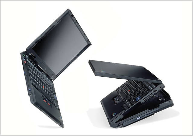
Maybe the biggest conceptual leap that Steve Jobs made in the early days of Apple was to recognize that high-tech devices could be friendly. Think back to the smiling Mac icon; compare it to the forbidding intensity of the IBM ThinkPad, which was designed by Richard Sapper for decades. Flash forward and compare the chipper polish of the iOS to the hard edges of Android. Throughout the years, Apple has made cutting-edge devices seem friendly, and that's a design strategy specifically intended to appeal to novice consumers and anyone overwhelmed by the capabilities of a computer.
The funny thing is, Jobs learned that lesson, apparently, from household appliances:
One weekend Jobs went to Macy's in Palo Alto and again spent time studying appliances, especially the Cuisinart. He came bounding into the Mac office that Monday, asked the design team to go buy one, and made a raft of new suggestions based on its lines, curves, and bevels.
Jobs kept insisting that the [first Macintosh] should look friendly. As a result, it evolved to resemble a human face. With the disk drive below the screen, the unit was taller and narrower than most computers, suggesting a head..."Even though Steve didn't draw any of the links, his ideas and inspiration made the design what it is," Oyama later said. "To be honest, we didn't know what it meant for a computer to be 'friendly' until Steve told us."
As Isaacson writes on p.127:
Jobs felt that design simplicity should be linked to making products easy to use. Those goals do not always go together. Sometimes a design can be so sleek and simple that a user finds it intimidating or unfriendly to navigate. "The main thing in our design is that we have to make things intuitively obvious," Jobs told [a] crowd of design mavens. For example, he extolled the desktop metaphor he was creating for the Macintosh. "People know how to deal with a desktop intuitively. If you walk into an office, there are papers on the desk. The one on top is the most important. People know how to switch priority. Part of the reason we model our computers on metaphors like the desktop is that we can leverage this experience that we already have."
Jobs realized that for computers to be intuitive, their UI's had to be based on metaphors.
There's so much going on in that passage that it's easy to skip over. The most obvious thing is that Jobs wanted his products to be simple above all else. But Jobs realized early on that for them to be simple and easy to use, they had to be based on things that people already understood. (Design geeks have since given this idea a clunky name: so-called skeuomorphic user interfaces.) What was true of the first Macintosh graphical interface is true of the iPhone and iPad--the range of physical metaphors, and, eventually, the physical gestures that control them, map directly with what we already do in the real world. That's the true key to creating an intuitive interface, and Jobs realized it before computers could really even render the real world with much fidelity at all.
**
Steve Jobs's talent lay in taking what he learned and absorbing it with a manic intensity, so that his principles didn't just inform him; they consumed him. Jobs was both lucky and smart in that all of the lessons he got were additive--that is, you could fit them all together in a single, coherent design philosophy. Compare that to what happens when you engage with someone who has definite opinions about design, but no real philosophy behind it: It's a maddening experience because the definition of what works and what doesn't, what's good and what's not, can change so often in different circumstances. I'd argue that this has been the chief failing of most consumer electronics makers: There's no deep-seated ideology behind their designs, so the products themselves never feel linked by what Jobs liked to call "soul."
In the coming years, I can't help but wonder what the next era's defining lessons of design will be. I can think of a few that might be worthwhile: For one, in the age of virtual design that's evaluated at a glance, first impressions matter even while the length of time given to first impressions grows ever shorter.
But I think that these lessons that Jobs intuited will always be with the profession. For example, take lesson #6, about creating simple UI's: Even today, Facebook keeps an analog printing lab, with the idea that they'll find the best metaphors for computer interactions in the real world. And design will always be about getting the details right while never forgetting how consumers actually live.
As I've said before, Steve Jobs was the most consequential figure in the history of design. The ideals laid out above, which he managed to join with unprecedented clarity and intensity, are the reasons why.
Aileen Lee and her team recently authored a great blog post about the key characteristics of unicorn IT companies (Unicorn = U.S. based software companies that are valued at over $1 billion by public or private investors). Evan Williams, who co-founded Blogger, Twitter and the venerable Medium, revealed his secret formula for getting rich online as such: "Take a human desire, preferably one that has been around for a really long time... Identify that desire and use modern technology to take out steps."
Building on Aileen's and Evan's thoughts (hard acts to follow), I would like to propose a simple framework for the shared characteristics of billion dollar+ consumer web products. The ingredients, if you will.
-
Help the the consumer make money (or help her save money)
Prime examples are eBay, Amazon and Airbnb, where consumers on the supply side can sell their merchandise to the demand side and potentially make a quite decent living. Consumers on the demand side can save a bunch of money by purchasing goods on these platforms, as the products cut out the middleman, enjoy huge economies of scale and/or network effects. -
Make the consumer feel good about himself
Apple's products have not only nailed this, but have also created armies of die-hard fan-boys thanks to their infectious "feel good" elements. Instagram makes everybody feel like an artsy professional photographer because of the magical superpowers of its filters. Uber makes people feel like they're indulging in a luxury every time they take a car ride. -
Help the consumer save time
Imagine how hard any kind of research work was before Google existed. Or can you fathom a modern world where one has to visit 10 or more airline websites in order to book a flight? We as consumers are lucky that Kayak led the meta-search revolution and saved us a lot of this time. Finally, when was the last time you left your home to go rent a movie? Thank you Netflix. -
Is simple to use
I don't know of anyone who's received any kind of formal training before learning how to use Skype, Google Maps and Gmail. These intuitive products help drive the sales of consumer electronics hardware, as everybody can easily switch to them from their offline-world alternatives. -
Make the user look smart in her social circles
Those who purchase goods/services on Amazon and Groupon often view their purchase as a "great deal" and boast about it to their friends. Folks who use Evernote hope to be perceived as highly organized by their peers. Yelp lets you pretend that you know a tasty brunch place. -
Easy to explain to others
Craiglist is online classifieds, Yelp is online reviews for restaurants (and other businesses), Tripadvisor is online hotel and flight reviews, Wikipedia is an online encyclopedia and the list goes on and on... My 91-year-old grandma can easily understand what these products do, whenever she asks me to explain them. -
Increase user's chances of getting laid (aka meeting members of the opposite sex)
Online dating is obviously a big category of consumer web. IAC has built an empire that includes Match.com, OkCupid, Tinder and many more online dating properties. That said, a plethora of mainstream consumer internet products outside the dating space can help their users meet, communicate with or impress members of the opposite sex. In its early days, Facebook was the single best resource to find out where the cool kids partied at your college campus. It also made it super easy to look up girls or guys you were "interested" in and upon adding them initiate a conversation. Even Uber makes you look good if you're picking up a date. -
Play the vanity card well
Now that everybody is on Facebook, some of its users often demonstrate a "peacocking" behavior through posting pics of their gorgeous selves in exotic places, their stunning significant others in catchy outfits and their most recent purchased possessions. Snapchat is leading the selfie revolution, taking vanity to the next level, and making communications via pictures (MMS) truly mainstream. Stickers, avatars and their ilk make the users of messaging services (Line, WeChat, KakaoTalk) seem like the cool kids. -
Solve a real problem (or caters to a human desire) that mainstream audiences have
Since the hunter-gatherer era, humans have been obsessed with collecting stuff; Pinterest makes the process of saving all the stuff one loves super easy. Everybody would like to save some money. Some people just google "promo code + whatever brand", scoring latent savings via RetailMeNot and Coupons.com whenever they see a discount code box on the checkout page. There is no need more mainstream than finding a home: Zillow helps consumers by providing them with price estimates of houses in their current (and future) neighborhoods. -
Is versatile enough so that various users can use it differently , but all get a lot of value out of it
Twitter is the prime example here; and perhaps because of this, it is often confusing when you first join. Where do I start? People can use Twitter for: a. consuming the news, b. communicating with others (including public figures), c. expressing themselves, d. promoting (aka branding) themselves and their services, etc. It's unique to the person. Folks use YouTube to: a. entertain themselves (infinite number of cat videos), b. learn about stuff (e.g. Khan Academy videos), c. upload their own videos online (easiest way to embed them on one's site), etc. -
Bonus: The business model helps accelerate (and not impede) user growth
It is inconceivable to pay Google for one's web searches; this would drastically limit daily usage. That said, it is a very profitable company; almost everybody wants their site to be more prominent on Google and that's how it makes money. Putting your resume online and connecting with your professional contacts is free and that's partly why everybody does it on LinkedIn. But recruiters, and others who want to reach individuals of all sorts, pay hefty fees and make the service more valuable for the entire community by providing jobs. Dropbox is free for up to five gigabytes of data, but one can get more space for free if she invites her friends to the Dropbox party, alleviating the need for paid user acquisition.
As we are in the early phases of enormous wealth creation in the online world, the above framework is still work-in-progress. I would love to receive your ingredients, especially as more one billion dollar products are getting built over the next few years... Please email me here.