SONY Brand Book
SONY is a Japanese multinational conglomerate corporation and major technology company.
Sony Electronics USA Brand Identity Guidelines version # 03
pp. 2. 2 These guidelines were created to build a consistent design language for Sony communication. Not all examples and instances will be represented in this guide. Please use your best judgement when building communication pieces. If you have any questions, contact SEL US Corporate Marketing.
p. 3 If it’s not Sony, it’s not the best.
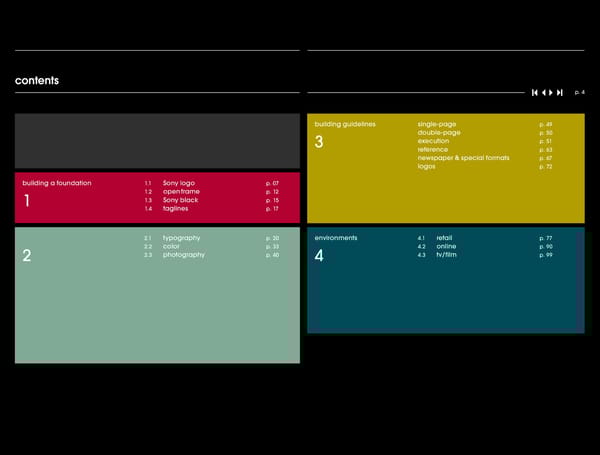
contents p. 4 building guidelines single-page p. 49 double-page p. 50 3 execution p. 51 reference p. 63 newspaper & special formats p. 67 logos p. 72 building a foundation 1.1 Sony logo p. 07 1.2 open frame p. 12 1 1.3 Sony black p. 15 1.4 taglines p. 17 2.1 typography p. 20 environments 4.1 retail p. 77 2.2 color p. 33 4.2 online p. 90 2 2.3 photography p. 40 4 4.3 tv/film p. 99
pp. 5. 5 Smart, but not intellectual. Confident, but not arrogant. Entertaining, but not shallow. Premium, but not out of reach. Cool, but not trendy. Iconic, but not intimidating. Simple, but not simplistic.
Most people from outside Japan had a tough time saying Tokyo Tsushin Kogyo or ‘Sony’ was the name born from this thinking. It crossed the Latin word sonus, from which Totsuko, and we couldn’t push a product with an unpronounceable name. In a strategy ‘sound’ and ‘sonic’ are derived, with the English diminutive ‘sonny’, suggesting a fledgling discussion that still has resonance today, it was decided that the name should be company of young people who made up for in energy what they lacked in size. simple, highly memorable, have immediate impact, and transcend language barriers. In 1955, Akio Morita came to the U.S. for the first time, carrying his products in high spirits and ready to build the foundations of the company on the Sony name. 1 p. 6 Each company builds its own brand identity because building a identities are the basis of how we, as people, relate to each other. We hang out with the personalities that we like, that make us laugh, that appeal to us. The foundation of Sony’s identity begins with the foundation name, and is built by a foundation of four f ixed elements. These are: the Sony logo, the open frame, Sony black, and the tagline.
foundation In 1973, design director Norio Ohga drew the version of the Sony logo that is still in use today. In order to mark the 35th anniversary of the company in 1981, there was a proposal within Sony to introduce a new logo. As ideas flooded in from all over the world, Ibuka decided that none of the designs were better than the Ohga original. 1.1 p. 7 A logo is the central visual cue that we all use to Sony logo identify a brand. It is the symbol of a company’s personality. Everywhere the logo shows up, it must act and behave the same way so consumers recognize us and can trust that the relationship they are building is sound and secure. The Sony logo is the heart and soul of this company. Since 1973, it has stood f irm because of its timeless- ness and careful stewardship. It is our biggest asset and must constantly be given protection and prominence. All communication must stress Sony above all else.
foundation p. 8 Sony logo
foundation p. 9 Sony logo global guidelines The Sony logotype should always be displayed clearly and conspicuously. The Sony logo should be displayed against a carefully selected background a so its impact is not reduced. Leave ample ( ) surrounding space the isolation zone , and do not display the logotype more h than once on the same surface. Isolation zone The Sony logotype should be surrounded a by ample black space. At the very least, other elements must be kept out of the isolation zone, as shown here. a ‘a’ is greater than, or equal to, ‘h’ a
foundation p. 10 Sony logo size and placement in print 2 x h 2 x h h 1.25 x h The Sony logo is always positioned in the top right corner of the open frame. The size of the open frame and the size of the Sony logo are related as shown in the example above. Following these rules will ensure complete compliance with all Sony global guidelines for the mandatory space restrictions around the logo. Always ensure that all key elements fall within final trim and live areas when creating print material. If this is not the case when guidelines are followed, then please adjust artwork to fit. For building guidelines see page 48.
foundation p. 11 Sony logo size and placement online 2 h h h h Because of limited screen real estate, Sony advertising online is built in different propor- tions than other Sony communication. When building online ads, the essential elements must remain in place: Sony logo, open frame, Sony black, and the tagline. For online guidelines, please refer to page 90.
foundation 1.2 p. 12 The amazement of the Sony brand will come to life within open the open frame. Most of the communication that comes from our competition looks and feels the same way because it uses full-bleed page layouts. The open frame creates an area set apart from the page where product and message slide frame onto the page seamlessly, inspiring people about how Sony’s ingenuity and creativity can enrich their lives. ® Sony VAIO notebook frames your interface to the world of ® information and communication. Sony Cyber-shot camera frames the pictures you are making. And Sony BRAVIA™ HDTV is itself a single black frame, housing a world of visual excitement. We use the open frame because it gives both prominence to the Sony logo and captures the moment of discovery for the viewer. These guides should be followed where possible, however the system is flexible and should be matched with best judgement when creating communication pieces.
foundation p. 13 open frame print 4.35 h 2 h How to build the open frame: As a starting point we show the 2 h dimensions of the basic elements 4.35 h h on a letter size: 8.5” x 11” 1.25 h 1. Determine the size of the Sony logo The height of the logo is determined ( by the height of the format. For resizing ) instructions see page 52 and 53 . h = height of Sony logo h = 0.022 x height of format ( ) In the letter format shown 8.5” x 11” h = 0.022 x 11” h = 0.24” This zone inside the open frame contains: The relationship between the logo and the images, copy or graphic elements. top right of the page remains constant. The 2. Determine the proportions of the same applies for the tagline in the bottom open frame based on the size of the logo left of the page. In a double-page spread as shown in this example. for example, only the middle is extended. height of top bar: 4.35 x 0.24 = 1.04” width of left bar: 4.35 x 0.24 = 1.04” height of bottom bar: 5 x 0.24 = 1.2” 3. Use Sony black for the open frame 60c/50m/20y/100k 4. Place the Sony logo in the top right corner of the open frame 2 x 0.24” = 0.48” from the top and from the right edge of the paper 5. Place the tagline positioning: halfway up the height of the base of the open frame. flush left from inside edge of open frame. ( ) size: 0.5 x h h = height of sony logo ( ) color: 47% black 0c/0m/0y/47k 6. Bring the world of Sony to life inside the finished frame. 7. Ensure that all key elements fall within final trim and live areas when creating print material. If this 5 x h is not the case when guidelines are followed, then please adjust artwork to fit.
foundation p. 14 open frame online 27 18 px. px. 3 h 2 h The instructions for building the 9 px. h open frame to be used online are 9 px. 27 px. h 3 h slightly different form the instruc- 9 px. h tions for printwork. All three sides of the open frame have the same thickness, and the size remains the same in all online executions. Which means that the size of the Sony logo and the tag- line remain the same as well. The sizes are as follows: thickness of the sides of the frame: 27 pixels height of the Sony logo: 9 pixels height of the tagline: 7 pixels Most of the online executions will be animated. In that case the open frame should appear on the first frame. On following frames the left side could disappear. The Sony logo is shown on the first frame and on the last frame. The tagline only appears on the last frame. 0.8 h 7 px. 27 p x. 3 h Preferably use an animation in a horizontal direction to empha- size the idea of the open frame. For building guidelines see page 90.
foundation ( ) “If the design of the product isn’t attractive, we don’t put the Sony logo on it.” Ohga regarding color were made. Black was chosen as the base of the original color palette. The first product designed under Ohga’s direction was the TFM-110 FM radio, popularly known as It wasn’t until Morita gave Ohga control of the product and advertising design teams, the ‘Eleven’. The combination of its shape with the black and silver color scheme resulted in and put them under one roof called the Design Division, that deliberate decisions such excellent sales that Sony’s radio business was rejuvenated. 1.3 p. 15 Black continues to build the unique expression of Sony Sony black as a brand. With this black, we create a cohesive look for all the faces of Sony. This is the base color for all manifestations of Sony communications and signals technological excellence and elegance. Sony black powerfully frames any image. It is timeless, premium, and confident; it draws us into the rich, engaging Sony world.
foundation p. 16 Sony black Sony black ensures the most focused home for a white Sony logo. 60% cyan 50% magenta CMYK is a subtractive color model used Colors may also be specified as an in color printing. Sony black is built from RGB triplet in hexadecimal format (a hex the following values: 60% cyan, 50% triplet); this six-digit alphanumeric code magenta, 20% yellow, and 100% black. is used in HTML and CSS, and other com- puting applications, to represent color. The RGB color model is an additive The first two digits represent the red value, model in which red, green, and blue the second two represent the green value, are combined to reproduce other and the last two represent the blue value. colors used on screen. The deepest Over 16 million colors can be represented black is built from zero values for red, by this system. Sony black on screen green, and blue. should have the hex triplet 000000. Sony black For newspaper print guidelines, please refer to page 67. 0 red 0 green 20% yellow 100% black 0 blue
foundation 1.4 p. 17 taglines
foundation p. 18 taglines The ‘like.no.other’ tagline is always posi- reversed out of black. tioned in the lower left corner of the open frame. Always use the correct artwork file rather than simply typing it in. Always use the tagline ‘The new way of business’ in place of ‘like.no.other’ when building business-to-business communi- x cation. Positioning: halfway up the height of the base of the open frame. Flush left from inside edge of open frame. ( ) Size: 0.5 x h h = height of Sony logo x Color: on coated paper 47% black ( ) 0c/0m/0y/47k , on newsprint white x x
In December 1978, Ibuka said to Morita, “Don’t you think a stereo cassette player that you market by June, it will be a hit.” The room fell silent as the reality of such a demand sunk in. can listen to while walking around is a good idea?” Two months later, Morita called Engineering miracles aside, how would they have the units ready to deliver in four months? ® a meeting at Sony HQ of young electrical and mechanical design engineers, planners, But so they did. The Walkman was released just before summer vacation of that year. and publicity people. He held up a model of the first ever portable music player and said, They had brought their skills together to create a truly unique and innovative Sony product “This is the product that will satisfy young people who want to listen to music all day – they’ll yet again. It is with this same spirit in mind that we bring the brand building tools together take it everywhere with them. If we put a playback-only headphone stereo like this on the to produce premium, iconic visual communication. 2 p. 19 Tireless commitment and innovative creativity building enable us to continually lead in the technical industry. We wish to inject this spirit into the tools we use to tools market Sony. The basic tools are: typography, color and photography.
building tools After it was announced that President Eisenhower would be touring the Sony facilities follow Eisenhower, this little pamphlet found a wider audience, including The Wall Street during his visit to Japan, Morita decided it was the right moment to design an English Journal. Most importantly, it gave prospective English-speaking customers better insights pamphlet. It was the first time Sony had ever produced a company outline which intro- into what Sony was about. duced the Sony spirit in English. Originally intended for the press that would inevitably 2.1 p. 20 Typography creates a layer of information over typo- a text, giving it a feeling and purpose beyond the meaning of the words themselves. Simple, consistent typography improves the clarity of the message and integrity of the brand, which graphy in turn builds a better design personality.
building tools p. 21 identity typeface So in the same way that we all have The strength and simplicity of the lines individual personalities, each typeface that compose this typeface affirm ITC Avant Garde makes its own distinct statement. the emotional connection that we wish Medium abcdefg All visual communication for Sony will to establish with the consumer of be set with a typeface called ITC Avant confidence and clarity. Garde, in three different weights: Book, reverse-safe ABCDEFG Medium, and Demi. In the sole instance When set in ITC Avant Garde, Sony of electronic use, we also employ ITC text carries the simple confidence of Avant Garde Book Condensed. our brand personality. 12345678 ITC Avant Garde abcdefg Demi reverse-safe ABCDEFG 12345678 ITC Avant Garde Book abcdefg not to be reversed ABCDEFG 12345678 ITC Avant Garde abcdefg Book Condensed web use only ABCDEFG 12345678
building tools p. 22 headline typesetting As a general rule, headlines should Capitalize the first word of a sentence. font: itc avant garde medium be reversed out of a Sony black leading: 1.3 x type size background. Never use all caps. letter spacing: 0/optical word spacing: 80% Never apply effects like drop shadow, color: black or white, never use color or outlines. Ever. alignment: flush left / ragged right abcdefghijklmnopqrstuvwxyz ABCDEFGHIJKLMNOPQRSTUVWXYZ 1234567890 ! ? @#$¥£%&*(){}[]™©®
building tools p. 23 diacritical marks Quotation marks TM / ® - / – / — ( Good typography requires extra attention When quotation marks begin a line be Trademark and registration symbols The shortest of these is a hyphen. It should be ) when dealing with diacritical marks. The it a headline or in the body copy , they should be superscripted. If it cannot be used to connect linked words and phrases. following rules should work together to cre- should always be hung over the sideline done automatically, reduce the point If at all possible, avoid using them to break ate clearly legible, beautiful looking copy. that defines the left justification. The first size of the type and raise the baseline a word at the end of a line. letter inside the quotation mark should on which the mark sits. Never follow the optically align with the letter starting the mark with a period. The second mark is called an en dash. line below it. Always use correct quotation En dashes serve to connect numbers and, marks, not an apostrophe. in Sony communication, we use them to express strong grammatical breaks. ‘Not optically ‘Optically aligned The longest mark is an em dash. (This dash aligned with with the letter TM SXRDTM SXRD is one em wide, or the width of the point size the letter starting the line of the type face.) We do not use this mark. starting the line below it.’ Sony® Sony® below it.’ Bullet points ( ) $ @ + ( ) Always use option 8 Mac when inserting The ITC Avant Garde typeface sets the pa- When writing currency amounts, they The @ symbol should always be corrected bullet points into a text. rentheses too low in its automatic mode. should always appear as indicated. There when it sits in copy. The most frequent This is resolved simply by raising the paren- is no space between the dollar sign and occurrence is in an email address for con- theses off the baseline until they sit evenly the amount. If it is a whole number, do not tact reference. The symbol should be slightly above and below a lower case n. indicate the cents columns with zeroes. reduced in point size, raised off the baseline, If it is not a whole number, indicate the and properly kerned to make the whole ad- cents by superscripting them. Do not use dress clearly legible. a decimal point. If the amount is one thou- sand or over, separate the number using standard commas. ( ) $599 These parentheses sit too low cyber-shot@sony.com $59999 $5,999 ( ) These parentheses sit correctly $5,49999 cyber-shot@sony.com
building tools p. 24 headline treatment Sony headlines appear here in different type sizes, reversed out of a Sony black background. type size: 20 pt type size: 36 pt type size: 52 pt leading: 1.1 x 20 = 22 pt leading: 1.1 x 36 = 39.6 pt leading: 1.1 x 52 = 57.2 pt Always do Always do what has Always do never been what has done before. what has ( ) Ibuka never been done before. never been ( ) Ibuka done before. ( ) Ibuka
building tools p. 25 body copy This is the text that dives into the details; The body copy should be font: itc avant garde medium it must be readable and clear. reversed out of a Sony black leading: 1.3 x type size If the consumer gets to this point, we background. letter spacing: 0/optical have them considering purchase, and word spacing: 80% looking for the truths of the product. color: black or white, never use color alignment: flush left/ragged right ( ) Word spacing Mac : command+alt/option+shift+J type size: 7 pt type size: 9 pt type size: 12 pt leading: 1.3 x 7 = 9.1 pt leading: 1.3 x 9 =11.7 pt leading: 1.3 x 12 =15.6 pt ( ( ) ( ITC Avant Garde In the late ’40s, Sony then called Totsuko) was highly In the late ’40s, Sony then called Totsuko In the late ’40s, Sony then called Medium concerned with careful packaging of its products. was highly concerned with careful packag- Totsuko) was highly concerned Each of its products was individually packed in shock- ing of its products. Each of its products was absorbing shavings, and nailed shut in a wooden box. with careful packaging of its reverse-safe Totsuko actually conducted a physical shock test by re- individually packed in shock-absorbing peatedly dropping a loaded package on the factory’s shavings, and nailed shut in a wooden box. products. Each of its products concrete floor, and photographing the insides to check was individually packed in shock- how well the product had withstood the shock each Totsuko actually conducted a physical time it was dropped. With this extra attention being paid shock test by repeatedly dropping a loaded absorbing shavings, and nailed to the quality of the packaging, Totsuko’s reputation for package on the factory’s concrete floor, excellence continued to spread. shut in a wooden box. Totsuko and photographing the insides to check actually conducted a physical ( ( ( ITC Avant Garde In the late ’40s, Sony then called Totsuko) was highly In the late ’40s, Sony then called Totsuko) In the late ’40s, Sony then called Demi concerned with careful packaging of its products. was highly concerned with careful packag- Totsuko) was highly concerned with Each of its products was individually packed in shock- ing of its products. Each of its products was absorbing shavings, and nailed shut in a wooden box. careful packaging of its products. reverse-safe Totsuko actually conducted a physical shock test by individually packed in shock-absorbing repeatedly dropping a loaded package on the factory’s shavings, and nailed shut in a wooden Each of its products was individually concrete floor, and photographing the insides to check packed in shock-absorbing shav- how well the product had withstood the shock each box. Totsuko actually conducted a physical time it was dropped. With this extra attention being paid shock test by repeatedly dropping a loaded ings, and nailed shut in a wooden to the quality of the packaging, Totsuko’s reputation for package on the factory’s concrete floor, and excellence continued to spread. box. Totsuko actually conducted photographing the insides to check how well a physical shock test by repeatedly the product had withstood the shock each dropping a loaded package on the
building tools p. 26 body copy exceptions If the body copy cannot be reversed font: itc avant garde book out of Sony black, then it may be set in leading: 1.3 x type size ITC Avant Garde Book. Legibility should letter spacing: 0/optical dictate usage in every case. word spacing: 80% color: black Spec sheets and information-heavy alignment: flush left/ragged right web pages are potential candidates for this treatment. type size: 7 pt type size: 9 pt type size: 12 pt leading: 1.3 x 7 = 9.1 pt leading: 1.3 x 9 = 11.7 pt leading: 1.3 x 12 = 15.6 pt ITC Avant Garde Book The Sony advertising staff has long been involved in The Sony advertising staff has long been The Sony advertising staff has long product planning so that product names, market- involved in product planning so that product not to be reversed ing slogans, and advertising strategies are created names, marketing slogans, and advertising been involved in product planning so in tandem with the products themselves. The name that product names, marketing slo- ‘Walkman’ for instance, is a Sony product name that strategies are created in tandem with the has become synonymous with personal headphone products themselves. The name ‘Walkman’ gans, and advertising strategies are stereos. Another example is ‘passport-sized’ which for instance, is a Sony product name that was used to promote Sony’s 8mm camcorder. This has become synonymous with personal created in tandem with the products camera was small enough to fit into a travel bag, and themselves. The name ‘Walkman’ was marketed for use on holidays. headphone stereos. Another example is ‘passport-sized’ which was used to promote for instance, is a Sony product name Sony’s 8mm camcorder. This camera was that has become synonymous with small enough to fit into a travel bag, and was personal headphone stereos. Anoth- marketed for use on holidays. er example is ‘passport-sized’ which was used to promote Sony’s 8mm camcorder. This camera was small enough to fit into a travel bag, and was marketed for use on holidays.
building tools p. 27 body copy exceptions web use If necessary, body copy on the web font: itc avant garde book condensed can be set using ITC Avant Garde Book leading: 1.3 x type size Condensed. This condensed typeface letter spacing: 0/optical takes up less of our very limited online word spacing: 80% screen space. color: black alignment: flush left/ragged right Use this typeface sparingly. Never use it for headlines. type size: 7 pt type size: 9 pt type size: 12 pt leading: 1.3 x 7 = 9.1 pt leading: 1.3 x 9 = 11.7 pt leading: 1.3 x 12 = 15.6 pt ITC Avant Garde The Sony advertising staff has long been involved in product plan- The Sony advertising staff has long been involved in prod- The Sony advertising staff has long been Book Condensed ning so that product names, marketing slogans, and advertising uct planning so that product names, marketing slogans, strategies are created in tandem with the products themselves. and advertising strategies are created in tandem with the involved in product planning so that product The name ‘Walkman’ for instance, is a Sony product name that has names, marketing slogans, and advertising not to be reversed become synonymous with personal headphone stereos. Another products themselves. The name ‘Walkman’ for instance, example is ‘passport-sized’ which was used to promote Sony’s 8mm is a Sony product name that has become synonymous strategies are created in tandem with the camcorder. This camera was small enough to fit into a travel bag, and with personal headphone stereos. Another example is was marketed for use on holidays. ‘passport-sized’ which was used to promote Sony’s 8mm products themselves. The name ‘Walkman’ camcorder. This camera was small enough to fit into a for instance, is a Sony product name that has travel bag, and was marketed for use on holidays. become synonymous with personal headphone stereos. Another example is ‘passport-sized’ which was used to promote Sony’s 8mm camcorder. This camera was small enough to fit into a travel bag, and was marketed for use on holidays.
building tools p. 28 call to action Click Call Visit Execution The URL functions as a call to action for the Phone numbers must be set for easy The naming of our store locations must, Always place these icons using the reader to visit Sony’s online home. Here readability. We should carefully facilitate as with everything else, remain consistent artwork file provided. Scale them to at they see and learn more about the Sony a consumer desire to speak with Sony. across the board. Each time a store least the size of and never smaller than product line. It must therefore be given name is called for it should appear in the the point size of the body copy, and particular care when being set in the copy. Always exclude the initial ‘1’ preceding following manner beginning with the name make the necessary text changes. domestic long distance calls within of the store, followed by the location and The URL will usually appear with body copy. the U.S. Always place the area code in separated by commas. For the icon, the action, directive and When it does it should appear after one parentheses. colon, use the same color, matching line break. It always appears in ITC Avant Sony Store, Virginia Beach, VA the accent color used. If the accent Garde Demi in the same point size as the In the case of a correlating name in the color is too dark, use a lighter color for body copy. phone number, it should be set letters first Otherwise the line should read as follows: the call to action that complements it. followed by numbers in parentheses. Never use the prefix http://www visit: your local Sony retailer ( ) ( ) 866 290-SONY 7669 Always begin the URL with sony.com followed by the appropriate suffix When there is no correlating name, set as ( ). for example sony.com/cyber-shot follows with a dash separating the local phone number. ( ) 866 290-7699 ( ) ( ) click: sony.com/cyber-shot click: sony.com/cyber-shot call: 866 290-SONY 7669 visit: Sony Style ( ) ( ) call: 866 290-SONY 7669 visit: your local Sony retailer ( ) ( ) click: sony.com/cyber-shot call: 866 290-SONY 7669 visit: Sony Style
building tools p. 29 copyright information print Legal copy must always appear at the Some executions require a daunting font: itc avant garde medium bottom of the page, and flush left from amount of legal copy, but big blocks size: 5 pt, minimum the open frame in print advertising. of text can make a beautiful texture leading: 1.3 x type size Center single lines of legal copy in the if set to our standards. letter spacing: 0/optical space below the tagline. word spacing: 80% color: 47% black on coated paper white reversed out of black on newsprint alignment: flush left/ragged right © 2007 Sony Electronics inc. All rights reserved. Reproduction in part or whole is prohibited without prior written consent by Sony. Sony, Cyber-shot and like.no.other are trademarks of Sony. © 2007 Sony Electronics Inc. Reproduction in part or whole is prohibited without prior written consent by Sony. All rights reserved. Sony, SXRD, and Handycam are trademarks of Sony. Blu-ray Disc is a trademark. Offer valid on qualifying Sony product purchases over $399. Same as Cash offer on approved Sony Financial Services credit card purchases. No Finance Charges if purchase paid in full before January 1 2009. If purchase is not paid in full or Account kept current, Finance Charges assessed from purchase date and Minimum Monthly Payments required. Standard Rate 21.99% APR. Default Rate 24.99% APR. Minimum Finance Charge $2. Certain rules apply to the allocation of payments and Finance Charges on your promotional purchase if you make more than one purchase on your Sony Financial Services credit card. Call 1-888-367-4310 or review your cardholder agreement for information. Offer valid on qualifying Sony product purchases over $399. Same as Cash offer on approved Sony Financial Services credit card purchases. No Finance Charges if purchase paid in full before January 1 2009. If purchase is not paid in full or account kept current, Finance Charges assessed from purchase date and Minimum Monthly Payments required. Standard Rate 21.99% APR. Default Rate 24.99% APR. Minimum Finance Charge $2. Certain rules apply to the allocation of payments and Finance Charges on your promotional purchase if you make more than one purchase on your Sony Financial Services credit card. Call 1-888-367-4310 or review your cardholder agreement for information. Screen image simulated. Retailers set their own prices. 2 x h
building tools p. 30 copyright information If reversed out, always set in ITC Avant Garde Medium. font: itc avant garde medium If not, ITC Avant Garde Book may be used. size: 5 pt, minimum leading: 1.3 x type size letter spacing: 0/optical word spacing: 80% color: 47% black on coated paper white reversed out of black on newsprint alignment: flush left/ragged right On coated paper: ITC Avant Garde Medium, minimum type size of 5 pt, leading 6.5 pt, 47% black ITC Avant Garde Book, 5 pt, leading 6.5 pt © 2007 Sony Electronics Inc. Reproduction in part or whole is prohibited without prior written consent by Sony. All rights reserved. Sony, SXRD, and Handycam © 2007 Sony Electronics Inc. Reproduction in part or whole is prohibited without prior written consent by Sony. All rights reserved. Sony, SXRD, and Handycam are are trademarks of Sony. Blu-ray Disc is a trademark. Offer valid on qualifying Sony product purchases over $399. Same as Cash offer on approved Sony Financial trademarks of Sony. Blu-ray Disc is a trademark. Offer valid on qualifying Sony product purchases over $399. Same as Cash offer on approved Sony Financial Services Services credit card purchases. No Finance Charges if purchase paid in full before January 1 2009. If purchase is not paid in full or Account kept current, Finance credit card purchases. No Finance Charges if purchase paid in full before January 1 2009. If purchase is not paid in full or Account kept current, Finance Charges Charges assessed from purchase date and Minimum Monthly Payments required. Standard Rate 21.99% APR. Default Rate 24.99% APR. Minimum Finance Charge assessed from purchase date and Minimum Monthly Payments required. Standard Rate 21.99% APR. Default Rate 24.99% APR. Minimum Finance Charge $2. Certain $2. Certain rules apply to the allocation of payments and Finance Charges on your promotional purchase if you make more than one purchase on your Sony rules apply to the allocation of payments and Finance Charges on your promotional purchase if you make more than one purchase on your Sony Financial Services Financial Services credit card. Call 1-888-367-4310 or review your cardholder agreement for information. Offer valid on qualifying Sony product purchases over credit card. Call 1-888-367-4310 or review your cardholder agreement for information. Offer valid on qualifying Sony product purchases over $399. Same as Cash $399. Same as Cash offer on approved Sony Financial Services credit card purchases. No Finance Charges if purchase paid in full before January 1 2009. If offer on approved Sony Financial Services credit card purchases. No Finance Charges if purchase paid in full before January 1 2009. If purchase is not paid in full or purchase is not paid in full or Account kept current, Finance Charges assessed from purchase date and Minimum Monthly Payments required. Standard Rate Account kept current, Finance Charges assessed from purchase date and Minimum Monthly Payments required. Standard Rate 21.99% APR. Default Rate 24.99% 21.99% APR. Default Rate 24.99% APR. Minimum Finance Charge $2. Certain rules apply to the allocation of payments and Finance Charges on your promotional APR. Minimum Finance Charge $2. Certain rules apply to the allocation of payments and Finance Charges on your promotional purchase if you make more than one purchase if you make more than one purchase on your Sony Financial Services credit card. Call 1-888-367-4310 or review your cardholder agreement for informa- purchase on your Sony Financial Services credit card. Call 1-888-367-4310 or review your cardholder agreement for information. Screen image simulated. Retailers tion. Screen image simulated. Retailers set their own prices. set their own prices. On newsprint: ITC Avant Garde Medium, minimum type size of 6 pt, leading 7.8 pt, white reversed out of black © 2007 Sony Electronics Inc. Reproduction in part or whole is prohibited without prior written consent by Sony. All rights reserved. Sony, SXRD, and Handycam are trademarks of Sony. Blu-ray Disc is a trademark. Offer valid on qualifying Sony product purchases over $399. Same as Cash offer on approved Sony Financial Services credit card purchases. No Finance Charges if purchase paid in full before January 1 2009. If purchase is not paid in full or Account kept current, Finance Charges assessed from purchase date and Minimum Monthly Payments required. Standard Rate 21.99% APR. Default Rate 24.99% APR. Minimum Finance Charge $2. Certain rules apply to the allocation of payments and Finance Charges on your promotional purchase if you make more than one purchase on your Sony Financial Services credit card. Call 1-888-367-4310 or review your cardholder agreement for information. Offer valid on quali- fying Sony product purchases over $399. Same as Cash offer on approved Sony Financial Services credit card purchases. No Finance Charges if purchase paid in full before January 1 2009. If purchase is not paid in full or Account kept current, Finance Charges as- sessed from purchase date and Minimum Monthly Payments required. Standard Rate 21.99% APR. Default Rate 24.99% APR. Minimum Finance Charge $2. Certain rules apply to the allocation of payments and Finance Charges on your promotional purchase if you make more than one purchase on your Sony Financial Services credit card. Call 1-888-367-4310 or review your cardholder agreement for information. Screen image simulated. Retailers set their own prices.
building tools p. 31 tone of voice The most important thing to remember when writing about products is that they should become personal. This means that we shouldn’t overuse Ensure to always use the correct and The best product copy is not flowery, When the language does have to in- model numbers or technical language full name the first time the product is men- or trying too hard to sell. It’s more like clude technical details, they should be when describing the product. tioned, for example: BRAVIATM HDTV, or Sony an email to your friend – short, to the broken down into sensible parts, and not ® Vaio notebook and then afterwards only point, and interesting. Your friend has too cryptic. Bring the reader in on the TM the first name, BRAVIA . Limiting the scien- a reasonable understanding of tech- logic of how the products work (and how tific language releases products from the nology already – Sony never talks down they relate to each other). realm of technology into the emotional to the consumer. side of our lives. The consumer will totally understand our communication, once they buy the product. They will start to sell the product to their friends. And then they’re Sony for life.
building tools p. 32 editorial treatment The layout of newsletters and other Consider that Sony’s philosophy of simp- Never use more than one method of Reversed-out text should use ITC Avant materials that have extensive Sony copy licity and our choice of typeface are built denoting hierarchy. A headline should Garde Medium as a rule. If it is not reversed will require thoughtful creativity. There to provide a smooth and straightforward either be bolder or larger in type size than out, ITC Avant Garde Book may be appropri- are headlines, subheads, pull-quotes reading experience. With this in mind, a subhead, not both. One signal will do. ate. Leave ample space in the document and many other details to setting copy some guidelines for general editorial around blocks of text. Better to add more on a page which need to be considered. treatments follow: Make deliberate decisions with punctua- pages or edit the text down, than to cram Our hope is that, with a thorough working tion and diacritical marks. For instance, it in the available space. knowledge of the guidelines in this book, Take care of clear typographic hierarchy. bullet points should be black round points, the strategy and vision of Sony will come General rule: not stars or crosses, etc. through your editorial treatment. headline Always leave space around images. subhead Text and image should never meet in pull-quote layouts of this kind. body notes legal We have confidence that Sony’s brand stewards ( all of us) carry a good understanding of the Sony vision and philosophy. The editorial treatment of text-filled pages should simply reflect that discernment and awareness.
building tools Sony’s new color television model was tested in October 1967. After years of intense labor and many sleepless nights, we stood back and watched as the incredibly bright screen overflowed with dynamic color. Everyone could only stare at the screen in silent amazement as Ibuka and top directors arrived breathless in the lab from running through the building. The new Sony® Trinitron® TV had been born. 2.2 p. 33 When we use color, we aim for maximum emotional color impact. The Sony color palette has been carefully crafted to carry this emotional robustness into functionally appealing design. Bringing color into the world and enriching our emotional lives has long been at the core of Sony.
building tools p. 34 color palette These are the approved values for use in all Sony communication. guacamole r 171 c 000 pms bluebell r 151 c 050 pms pumpkin r 216 c 011 pms They should not be used in big blocks g 157 m 005 3985C g 195 m 010 292C g 168 m 049 131C b 013 y 100 b 230 y 000 b 015 y 095 or as full backgrounds, but rather as k 040 k 000 k 001 subtle highlights. hex B1B134 hex 96B8DB hex DF8F2D parrot r 198 c 032 pms ocean r 0 c 100 pms sangria r 163 c 000 pms g 207 m 000 381C g 164 m 000 cyan g 073 m 055 7524C b 033 y 100 b 232 y 000 C b 054 y 060 k 000 k 000 k 027 hex BBD634 hex 00A4E8 hex B24F3F green tea r 221 c 012 pms robin’s egg r 182 c 038 pms crimson r 152 c 000 pms g 222 m 000 7492C g 217 m 000 318C g 002 m 100 7427C b 148 y 050 b 220 y 015 b 052 y 065 k 007 k 000 k 028 hex DBE3B6 hex A4DBDB hex B51F29 Sony black r 000 c 060 pms moss r 140 c 042 pms tweety r 238 c 000 pms salmon r 224 c 000 pms g 000 m 050 black g 168 m 000 557C g 193 m 025 123C g 163 m 045 177C b 000 y 020 6C b 149 y 033 b 000 y 100 b 143 y 040 k 100 k 027 k 000 k 000 hex 000000 hex B2C8BD hex FDD666 hex F58268 r 137 c 050 pms r 000 c 100 pms smoke slate pms cheeto r 220 c 000 pms bubblegum r 218 c 000 pms g 140 m 040 430C g 076 m 000 316C g 144 m 050 144C g 143 m 055 211C b 136 y 040 b 087 y 027 b 024 y 100 b 175 y 008 k 005 k 068 k 000 k 000 hex 7C8285 hex 165B65 hex DC9018 hex F4979C stainless r 199 c 025 pms midnight r 117 c 042 pms tomato r 194 c 000 pms g 196 m 020 7543C g 139 m 008 5415C g 000 m 100 186C b 180 y 030 b 164 y 000 b 049 y 080 k 000 k 040 k 000 hex BFBDB0 hex 697D99 hex E31A22
building tools p. 35 color glow A color glow is added to highlight and romance the product. It must be the same color as the chosen highlight color. The glow spreads out from behind the product, but should never dominate. In layouts which feature multiple products, only use the color glow on the featured ( ) product aka, the hero product .
building tools p. 36 color glow When choosing a color glow it’s important to match a color of the photography being used, or complement the product color, so the Sony message is undeterred and focused. Building guidelines for the glow can be found on page 57. smoke moss robin’s egg sangria stainless slate tweety crimson guacamole midnight cheeto salmon parrot bluebell tomato bubblegum green tea ocean pumpkin
building tools p. 37 color gradient Color gradients are used in the background – to build the shelf on which the product sits – and must be the same color as the product glow. Building guidelines for the color gradient can be found on page 58.
building tools p. 38 color bar optional way to incorporate color A single highlight color can be used to draw attenion to a single headline through the use of a color bar. The color choice must match the other colors in the images being used; complement the dominant color from the image or alternatively, try to closely match a subtle color already there. The color bar and glow/gradient must always be the same color. If used, a color bar should only ever contain one line of text so that the dominance of the Sony black remains intact. Always use 100% of the Sony color from the palette. If used, subhead type may be set in the same color as the bar. When the headline is set in a color bar, indent the headline, URL, ‘like.no.other’ and legal lines by 50% of the headline’s point size. For example a headline set at 25 pt will equal a 12.5 pt indent from . the edge of the open frame ������������������������������� The height of the color bar is determined �������������������������������������������������������������� by multiplying the headline’s point size by 1.7. ����������������������������� ����������������� The distance from the base of the headline to the top of the color bar is 1.2 x headline pointsize. The distance from the base of headline to the base of the color frame is 0.5 x ������������������������������������������������������������������������������������������������������������������������������������������������������������������������������������������������������������������������������������������������������������������������������������������������������������������������������������������������������������������������������������������������������������ headline point size.
building tools p. 39 color palette If a color bar is used, the color of the type inside it must always be black or green tea robin’s egg crimson white, and should be chosen according to the examples shown here. Sony black moss tweety salmon smoke slate cheeto bubble gum stainless midnight tomato guacamole bluebell pumpkin parrot ocean sangria
building tools ( ) In April 1984, when Sony launched the High Definition Video System HDVS , it received rave reviews: “It’s like seeing a glossy color photograph.” The image quality was so high that it could even be used to appraise fine arts such as paintings, and antique drawings. “The scenery shown on the screen is so real that it’s like one is looking out a window.” The new HD system had a richer color and more emotion than ever before. It’s this ethos we take to our photography. 2.3 p. 40 Sony photography is iconic and offers an photo- unexpected perspective through unique content, graphy lighting, focus, cropping, or composition. Photography is crucial to the way we communicate. Through a richness of color and emotion, it can truly bring the amazement of Sony to life.
building tools p. 41 photography Sony lifestyle photography shows the world we recognize, but in a unique way. This perspective can derive from a shift in the scale or composition; or perhaps the camera uses an unexpected and distinctive vantage point. Color is a fundamental feature of many Sony products and the rich experiences they offer us. In all Sony photography color should be vivid, sharp, focused and set a specific mood. If the images are black and white or desaturated, other colors in the layout should be avoided.
building tools p. 42 photography everyday These are the images that we take at any moment. They should be bright and full of vibrant life – they capture the full nuance of even the subtlest emotion.
building tools p. 43 photography world These images should pick out the beauty of the natural environment. They should always be texture-rich and explore the widest range of color.
building tools p. 44 photography urban/fashion Urban and fashion images should have good composition and color. They are dramatic and should focus the viewer on the precision and quality of details.
building tools p. 45 photography interior Interior shots are used specifically to show the Sony product in the environment in which they are used. This photography should make the products feel like part of the home and our lives.
building tools p. 46 photography screenfill A screenfill is an image that replaces the empty screen within a product shot. These images should act in much the same way as our product photography, fresh and active. The screenfill should cause the screen itself to glow with life and make the viewer curious to the experience waiting to be unleashed from inside.
building tools p. 47 photography product Sony products need to look iconic, alive and memorable – confident of their distinct Sony personality and highlighting the beauty of Sony design. This is accomplished using light to reveal the different materials and surfaces of the product as well as framing the shots to reveal key features or controls. Each image should invest the product with that ready-and-waiting feel that asks the viewers to pick it up and start experiencing what life with Sony is like.
The C-37A microphone made Sony a benchmark brand in audio recording. Perhaps the clincher was Frank Sinatra himself. Legend has it that when Sinatra did not like what he heard played back after a recording session, he would walk out of William Robinson, the chief recording engineer for Capitol Records and a man recog- the studio, leaving the record company to foot the bill for the day. This tended to nized as one of the world’s foremost experts on recording technology described happen two or three times before he was satisfied, and re-recording was expensive. Sony’s new microphone: “Never before have I seen such a wide frequency band, When studios introduced the C-37A, they would ‘get it in one take’, and Sinatra went or such a smooth response in the upper range.” home happy every time. 3 p. 48 These guidelines have been provided as a visual and building technical reference for the process of putting together visual communication for Sony. They have been carefully crafted to make sure guidelines that when you’re building the pieces of the Sony brand, you get it in one take.
building guidelines p. 49 single-page advertisements The lifestyle advertisement is built to draw the reader into the world of Sony by revealing to them some- thing about how life with Sony feels, ����������������������������� or to explain a key product ����������������� attribute or benefit. ������������������������������������������������������������������������������������������������� ����������������������������������������������������������������������������������������������������� The product advertisement is built ���������������������������������������������������������������������������������������������� to romance the Sony product itself. These ads should integrate the product in an aspirational way; it should engage, seduce, and inspire the consumer. Here are two applications of body copy in single-page advertise- ments. Depending on where the copy is placed, the image area shifts accordingly. Regardless of placement, the open frame must be maintained. ������������������������������ ������������������������������������������������������������������������������ � �������������������������������������������������������������� ������������������� ������������������������������������������������������������������������������� ����������������������������������������������������� ������������������������������������������������������������������������������������������������������������������������������������ �������������������������������������������������������������������������������������������������������������������������������������
building guidelines p. 50 double-page advertisements The same rules apply to these double- Business-to-business page spreads. More room does not mean Keep the Sony logo and the tagline in their The double-page spread on the right is that we have to fill up all the space. Re- respective corners according to the specifi- Sony communication that goes straight member that Sony black is filling up that cations given in the foundations section. from business-to-business. space more powerfully than any additional product shots or unnecessary graphic The size of the headline changes accord- It follows the same Sony visual brand strat- elements. ing to its length. The open frame is main- egy that we use for business-to-consumer. tained. Never run a headline across the Keep it simple. Keep it focused. middle of a folded spread. Build the double-page advertisement Note that in these examples, the product according to the same guidelines as the and product glow appear in the lower right single-page ad, bearing in mind the fold hand corner, within the open frame. that will run down the middle of it. ������������������������������� �������������������������� � ���������������������������������������������������������������������������������������������������������������������������������������������������������������� ����������������������������������������������������������������������������������� ����������������������������������������������������������������������������������� ����������������������������������������������������������������������������������������������������������������������������������������������������������������������� ����������������������������������������������������������������������������� ����������������������������������������������������������������������������������������������������������������������������������������������������������������� �� �������������������������������������������������������������� ���������� ���������������������������������������������������� ������������������������������������������������������������������������������������������������������������������������������������ ������������������������������������������������������������������������������������������������������������������������������������
building guidelines p. 51 execution open frame 4.35 h 2 h How to build the open frame: As a starting point we show the 2 h dimensions of the basic elements 4.35 h on a letter size: 8.5” x 11” h 1.25 h 1. Determine the size of the Sony logo The height of the logo is determined ( by the height of the format. For resizing ) instructions see page 52 and 53 . h = height of Sony logo h = 0.022 x height of format ( ) In the letter format shown 8.5” x 11” h = 0.022 x 11” h = 0.24” This zone inside the open frame contains: The relationship between the logo and the images, copy or graphic elements. top right of the page remains constant. The 2. Determine the proportions of the same applies for the tagline in the bottom open frame based on the size of the logo left of the page. In a double-page spread as shown in this example. for example, only the middle is extended. height of top bar: 4.35 x 0.24 = 1.04” width of left bar: 4.35 x 0.24 = 1.04” height of bottom bar: 5 x 0.2 = 1.2” 3. Use Sony black for the open frame 60c/50m/20y/100k 4. Place the Sony logo in the top right corner of the open frame 2 x 0.2” = 0.48” from the top and from the right edge of the paper 5. Place the tagline positioning: halfway up the height of the base of the open frame. flush left from inside edge of open frame. ( ) size: 0.5 x h h = height of sony logo ( ) color: 47% black 0c/0m/0y/47k 6. Bring the world of Sony to life inside the finished frame. 5 x h
building guidelines p. 52 execution resizing open frame When resizing the open frame For sizes within the same for print communication, use proportions as the letter the dimensions of the letter size format. Scale up or (8.5 x 11”) as the reference. Scale down proportionately. the letter format until it fits inside the desired format, using the given examples as guidelines. This will properly set the width of the open frame. Reconstruct the frame with the resulting widths. The relationship between the logo and the top right of the page remains constant. The same ap- plies for the tagline in the bottom left of the page. Minimal size: 50% of the size of the open frame on a letter size For sizes with different should be considered the minimal proportions from the size for printed versions. letter format. This means that the minimal height Scale up proportion- of the Sony logo is 0.1” ately until you hit one of the sides and extend in horizontal or vertical direction.
building guidelines p. 53 execution resizing open frame If the frame is wider than 8.5” but shorter than 11” than simply adapt the length of the sides of the open frame. If the frame is taller than 11” but less wide than 8.5” than simply adapt the length of the sides of the open frame.
building guidelines p. 54 execution product treatment step 1: grid maximum product width Open the supplied standard grid in Photoshop which is 7x7 inches, divided into half-inch segments. This gives you a 14x14 square grid in the center of which the product should be placed. See the diagram for exact positioning guidelines. product glow parameter horizon line, color glow sits here 1 product sits here 2 product reflection gradient product reflection gradient stops here 3 when building in Photoshop for web use: gradient for background color starts here 4
building guidelines p. 55 execution product treatment step 2: reflection The reflection of all Sony With a rectangular product, like the Sony Blu-ray player for The Sony Cyber-shot® requires a more involved reflection process products can be achieved in example, the bottom of the player was not visible, so the top was because it has been photographed at an angle. The camera has a number of different ways. duplicated and placed underneath to enhance the reflection to be taken apart piece by piece to build a proper reflection. using perspective lines as an aid. Note that the separate parts were either brushed and/or created by the artist to create a correct visual reflection. horizon line 1 1 product sits here 2 2 product reflection gradient product reflection gradient stops here 3 3
building guidelines p. 56 execution product treatment step 2: reflection When building product reflections, carefully consider the angle from which the product shot was taken. If it hasn’t been shot straight on, then it will require additional building. Often simply holding the product above a mirror will immediately clarify the details to be worked out. ��������������������������� ������������������ ���������������������������������������������������������������������������������������������� ��������������������������������������������������������������������������������������������������� ������������������������������������������������������������������������������������������������ ������������������������������������������������������������������������������������������������������� ����������������������������������������������������������������������� ������������������������������������������������������������������������������������������������������������������������������������
building guidelines p. 57 execution product treatment step 3: glow Create a solid color adjustment layer with one color from Note: the Sony palette. the product glow may be reduced to accomodate ( ) Use the radial gradient tool black > transparent , a shorter object such as the Blu-ray player as shown. so that the gradient or ‘glow’ fills the parameter indicated The glow may not be raised. on the grid in the diagram. Invert the radial gradient on the adjustment layer. The outer edge of the glow should be contained by the grid. Mask out the glow below the horizon line in the adjustment layer. 1 2 3
building guidelines p. 58 execution product treatment step 4: create gradient, place product Place your photoshop document in Fill the space that will hold the product Place the product image with its glow InDesign. with a gradation of Sony black to the in the resulting gradient field. glow color as shown below.
building guidelines p. 59 execution single-page lifestyle advertisement 4.35 h 4.35 h h Headline font: ITC Avant Garde Medium type size: in this example, 25 pt word spacing: 80% letter spacing: 0/optical leading: 1.1 x type size Body copy font: ITC Avant Garde Medium type size: in this example, 7 pt leading: 1.3 x type size (in this example, 7 x 1.3 = 9 pt) word spacing: 80% letter spacing: 0/optical Lifestyle image maximum 15 words per line Fills available space. URL font: ITC Avant Garde Demi Product image type size: same point size as copy ‘Ocean’ used from Sony palette as glow color, positioning: The URL should as it compliments the color of the lifestyle image. puncuate the body copy. Product logotype The product name is called out in the URL and in the body copy, therefore there is no need to use the product logotype. Black area 1.3 x headline point size ����������������������� This black area houses the headline, the body 1 x headline point size ≥ 6.25 h copy and the product shot. To ensure enough ������������������������������������������������� space for the product shot, the minimum height �������������������������������������������������������������� ������������������������������������������������������ ( ) ������������������������������������������������������ is 6.25 x h in this example, 6.25 x 0.2 = 1.5” . The amount and point size of copy may cause this area to become higher. 5 h ������������������������������������������������������������������������������������������������������������������������������������
building guidelines p. 60 execution single-page lifestyle advertisement with multiple lines of copyright information 4.35 h 4.35 h h Copyright information font: ITC Avant Garde Medium type size: in this example, 5 pt word spacing: 80% letter spacing: 0/optical leading: 1.3 x type size color: 47% black on coated paper white reversed out of black on newsprint 1.3 x headline point size Black area ����������������������� This black area houses the headline, the body 1 x headline point size ≥ 6.25 h copy and the product shot. To ensure enough ������������������������������������������������� space for the product shot, the minimum height �������������������������������������������������������������� ������������������������������������������������������ ( ) ������������������������������������������������������ is 6.25 x h in this example, 6.25 x 0.2 = 1.5” . ������������������������������������������������������������������������������������������������������������������������������������������������������������������������������������������������������ ������������������������������������������������������������������������������������������������������������������������������������������������������������������������������������������������� In this case the black area is measured from the ����������������������������������������������������������������������������������������������������������������������������������������������������������������������������������������������������� ����������������������������������������������������������������������������������������������������������������������������������������������������������������������������������������������� ��������������������������������������������������������������������������������������������������������������������������������������������������������������������������������������������������������� top of the x-height of the first line of the legal �������������������������������������������������������������������������������������������������������������������������������������������������������������������������������������������������������� ���������������������������������������������������������������������������������������������������������������������������������������������������������������������������������������������� ����������������������������������������������������������������������������������������������������������������������������������������������������������������������������������������������� copy. The amount and point size of copy may ������������������������������������������������������� cause this area to become higher. 5 h ������������������������������������������������������������������������������������������������������������������������������������
building guidelines p. 61 execution single-page product advertisement 4.35 h 4.35 h h Headline font: ITC Avant Garde Medium type size: in this example, 25 pt leading: 1.1 x type size word spacing: 80% letter spacing: 0/optical Body copy font: ITC Avant Garde Medium type size: in this example, 7 pt leading: 1.3 x type size (in this example, 7 x 1.3 = 9 pt) word spacing: 80% Product image letter spacing: 0/optical Glow added to highlight product. (In this case the lens is tinted with the same color). Maximum 15 words per line. Body copy sits on the top edge Product logotype of the base of the open frame. When clearly visible as in this example URL there is no need to show it elsewhere. font: ITC Avant Garde Demi Color gradient type size: same point size as copy Same color as product glow. positioning: The URL should Built in InDesign – location slider at 13%. puncuate the body copy. ������������������������������� 1.2 x headline point size � 0.8 x headline point size ���������������������������������������������������������������������������������� ���������������������������������������������������������������������������������� ���������������������������������������������������������������������������� �� ���������� ����������������������������������������������������� 5 h ������������������������������������������������������������������������������������������������������������������������������������
building guidelines p. 62 execution single-page product advertisement with a multiple headline 4.35 h 4.35 h 4.35 h h ������������������ Big headline ��������������������� font: ITC Avant Garde Medium ��������������� leading: 1.1 x type size word spacing: 80% �������������������� letter spacing: 0/optical � � �������������������������� ���������������������������������������������� ��������������������������������������������������������� �������������������������������� ���������������������������������������� ���������������� �������������������������������� Multiple line heading ������������������������ font: ITC Avant Garde Medium ����������������������������������������������������������������������� leading: 1.1 x type size ������������������������������������������������������������������������������� ��������������������������������� word spacing: 80% letter spacing: 0/optical 5 h ������������������������������������������������������������������������������������������������������������������������������������ ���������������������������������������������������������������������������������������������������������������������������
building guidelines p. 63 reference single-page advertisements Here is a reference guide illustrating the flexibility of the system when building single-page advertisements for consumer and business-to-business communication. ���� ������� ������� �������� ������������������������������������ ������������������������������� ������������������������������ ����������������������������������� ��������������������������������������������������������� ������������������� ��������������������������������� ���������������������������� ��������������������������������� ������������������������������ ������������������������������ �������������������������������� ������������������������������ ������������������������������ ������������������������������ ������������������������� ������������������������������������������������������������������������� ����������������������������������������������������������������������� ������������������������ ������������������ ������������������������������������������������������������������������������� ��������������������������������������������������������������������������������������������� ���������������������������������������������������������������������������� ��������������������������������������������������������������������������������������������� ������������������������������������������������������������������������������� �������������������������������������������������������������������������������������������������������� ������������������������������������������������������������������������������������������� �������������������������������������������������������������������������������������������������������� ����������������������������������������������������������������������� ������������������������������������������������������������������ ��������������������������������������������������������������������������������������������������������� ������������������������������������������������������ ��������������������������������������������������������������������������������������������������������� ������������������������������������������������������������������������������� ������������������ ������������������������������������� ������������������������������������� ��������������������������������� � � ����������������� ������������� ������������������������������������������������������������������������������������������������������������������������ ������������������������������������������������������������������������������������������������������������� ��������������������������������������������������������������������������������������������������������������������������� ������������������������������������������������������������������������������������������������������������������������������������� ��������������������������������������������������������������������������������������������������������������������������� ������������������������������������������������������������������������������������������������������������������������������������� ��������������������������������������������������������������������������������������������������������������������������� ������� ���������������� ������������������ ���� ������������ ���������������� ������� � ���������� ���������������������������������������������������������������������������� ������������������������������������������������������������� ������ ������������� ��������� � � ��������������������������������������������������������������� ������������������������������������������������������������ ���������������� ������������� ������������������������������������ ������������������������������� Fit 80 books in your carry-on. ������������������������������ ����������������������������������� ® ��������������������������������� The nine-ounce Sony Reader holds about 80 books, or hundreds ��������������������������������������������������������� ������������������� more with a removable memory card*. So now, you can travel with ���������������������������� your favorite books without having to check them at the gate. ��������������������������������� ������������������������������ �������������������������� ���������������������������� Get $50 worth of many top best-sellers, classics and more! ������������������������� With purchase and registration by 4/30/07** ������������������ ������������������������������������������������������������������������� ������������������������������ sony.com/reader ������������������������������������������������������������������������������� ������������������������������������������������������������������������������� ���������������������������������������������������������������������������� ������������������������������������������������������������������ ©2007 Sony Electronics Inc. Reproduction in part or whole is prohibited without prior written consent by Sony. All rights reserved. Sony and the Sony logo are trademarks of Sony Electronics Inc. ������������������ ������������������������������������������������������������������������� CONNECT is a trademark of Sony Corporation and Sony Corporation of America. Requires a PC with Microsoft® Windows® XP Operating System.*Based on average un-illustrated eBook file size of 800 ® kilobytes. Actual file sizes may vary by electronic book title. Compatible with Memory Stick media or SD Memory Card. Sold separately. **Offer good for $50 credit toward purchase at CONNECT™ eBooks. Registration for CONNECT eBooks and authorization of Sony® Reader required between 3/01/07 and 4/30/07. Must redeem credit by 5/31/07. Registration requires download of software and acceptance of terms. Must be a U.S. Resident, 13 years old or older. Limit one (1) credit per Sony Reader device. For full terms and system requirements, visit www.ebooks.connect.com/$50. Non-metric weights and measures are approximate and may vary. ������������������������������������������������������������������������������������������������������������������������ ������������������������������������������������������������������������������������������������������������� ��������������������������������������������������������������������������������������������������������������������������� ������������������������������������������������������������������������������������������������������������������������������������������������������������������������������������������������������������������������������������������������������������������������ ��������������������������������������������������������������������������������������������������������������������������� ������������������������������������������������������������������������������������������������������������������������������������
building guidelines p. 64 reference single-page business-to-business advertisements ���������������������� ������������������ ���������������������������������������������������������������������� ������������������������������������������������������������������ ������������������������������������������������������������������������� ������������������������������������������������������������������������ ����������������������������������������������������������� �������������������������� ��������������������������� ������������������ ������������������ �������������������������������������� ������������������������������������������������������������������������������������������� �������������������������������������������������������������������������������� ���������������������������������������������������������������������������������������������� �������������������������������������������������������������������������������������� ����������������������������������������������������������������������������� ��������������������������������������������������������������������������������������������������� ������������������������������������������������������������������������������������������ ������������������������������������������������������������������������������ ������������������������������������������������������������������������������������������������ ������������������������������������������������������������������������� ������������������������������������������������������������������������������ ������������������������������������������������������������������������������������������������������� ������������������������������������������������������������������������������ ����������������������������������������������������������������������� ����������������������������������������������������������������������� ������������������������������������������������������������������������������������������������������������������������������������ ������������������������������������������������������������������������������������������������������������������������������������ ������������������������������������������������������������������������������������������������������������������������������������ ������������������������������������������������������������������������������������������������������������������������������������ �������������������������� �������������������������� ��������������������������������� ������������������������������� ������������������������������������������������������������������������������������������������ ������������������������������������������������������������������������ �������������������������������������������������������������������������������������������������� ��������������������������������������������������������������������������������������������������������������������������� ��������������������������������������������������������������������� ���������������������������������������������������������������������������������������������������� ���������������������������������������������������������������������������������������������������������������������������������� ������������������������������������������������������������������������ ������������������������������������������������������������������������������������������������������������������� ����������������������������������������������������������������������������������������������������� ������������������������������������������������������������������������������������������������������������������������������� �������������������������������������������������������������������������� ���������������������������������������������������������������������������������������������������������������� ������������������������������������������������������������������������������������������������ �������������������������������������������������������������������������������������������������������������������������������� �������������������������������������������������������� ����������������������������������������������������������������������������������������������������������������� ����������������������������������������������������������� ������������������������������������������ ��������������������������������������������������������������������������������������������������������� ������������������������������������������������������������������������������������������������������������������������������������ ������������������������������������������������������������������������������������������������������������������������������������ ������������������������������������������������������������������������������������������������������������������������������������ ������������������������������������������������������������������������������������������������������������������������������������
building guidelines p. 65 reference double-page advertisements Here is a reference guide illustrating the flexibility of the system when building double- page advertisements. ������������������� ��������������� ����������������� � � ��������������������������������������� ����������������������������������������������������� ������������������������������� ������������������������������������������������ ������������������������������� ������������������������������� ������������������������������� � ��������������������������������������������������������������������������������������������������������������������������������������� ����������������������������������������������������������������������������������� ������������������������������������������������������������������������������ ������������������������������������������������������������������������������ � ���������������������������������������������������������������������������������������������������������������������������������� ����������������������������������������������������������������������������������� ����������������������������������������������������������������������������������� ���������������������������������������������������������������������������������� �������������������������������������������������������������������������������������������������������������������������������������������� ���������������������������������������������������������������������������������� ����������������������������������������������������������������������������������� ����������������������������������������������������������������������������� ������������������������������������������������������������������������������� ������������������������������������������������������������������������������� ����������������������������������������������������������������������������� �� ����������������������������������������������������������������������������������������������������������������������������� �������������������������������������������������������������������� ���������� ������������������������������������ ������������������������������������������������������� ����������������������������������������������������� �� ����������������������������������������������������������������������� ���������� ���������������������������������������������������� ������������� ������������������ ������������������������������������������������������������������������������������������������������������������������������������ ������������������������������������������������������������������������������������������������������������������������������������ ������������������������������������������������������������������������������������������������������������������������������������ ������������������������������������������������������������������������������������������������������������������������������������ ������������������������������������������������������������������������������������������������������������������������������������ ������������������������������������������������������������������������������������������������������������������������������������ ������������������������������ ������������������������������ ����������������������������������������������������������������������� ����������������������������������������������������������������������� ���������������������������������������������������������������������������� ���������������������������������������������������������������������������� ������������������������������������������������������������������������������������������� ������������������������������������������������������������������������������������������� ���������������������������������������������������������������� ���������������������������������������������������������������� � � ����������������� ������������������� ������������������������������� ������������������������������������ ������������������������������� ������������������������������ ����������������������������������������������������������������������� �������������������� ����������������������������������������������������������������������� ������������������������������������������������������������������������������������ ���������������������������������������������������������������������������� ���������������������������������������������������������������������������� ���������������������������������������������������������������������������������������������������� ������������������������������������������������������������������������������������������� ������������������������������������������������������������������������������������������������������������������ ������������������������������������������������������������������������������������������� ����������������������������������������������������������������������������������������������� ���������������������������������������������������������� �������������������������������������������������������������������������������������������������������������������� ������������������������������������������������������ � ������������������������������������������������������������������������������������������������������������������� ������������� ������������������������������������������������������������������������������������������������������������������������������������ ������������������������������������������������������������������������������������������������������������������������������������ ������������������������������������������������������������������������������������������������������������������������������������ ������������������������������������������������������������������������������������������������������������������������������������ ������������������������������������������������������������������������������������������������������������������������������������ ������������������������������������������������������������������������������������������������������������������������������������ ���������������������������� ���������������������������������� ������������������������������������������������������������������� ������������������������������ ��������������������������������������������������������������������������� ���������������������������������������������������������������������������� ����������������������������������������������������������������� ���������������������������������������������������������������������������� � ������������������������������������������������������������� ��������������� ������������� ������ ���������������������������� ����������������������������������� ����������������������������� ������������������������������������������������������������������������� ������������������������������������������������������������������������������� ����������������������������������������������� ������������������������������������������������������������������������������� ������������������������������������������������������� ������������������������������������������������������������������ ������������������������������������������������ ������������������������������������������������������������������������������������������������������������������������������������ ������������������������������������������������������������������������������������������������������������������������������������ ������������������������������������������������������������������������������������������������������������������������������������ ������������������������������������������������������������������������������������������������������������������������������������ ������������������������� ����������������� � � ������������������������������������������������������������������������������������������������������ ������������������������������������������������������������������������������������������������������� � � ��������������������� �������������������������������� ������������������������������������������������������ ���������������� ���������������������������������������������������������������������������������������� ���������������� ����������������������������������������������������������������������������� ������������������������������������������������������������������������ ����������������������������������������������������������������������������� ������������������������������������������������������������������������ ������������������������������������������������������������ ���������������� ������������������������������ ������������������������������������������������������������� ���������������������������������������������������������������� �������������������������������������������������������� ������������������������� ������������������������������������ �������������������� ����������������������������������������������������������������������� ���������������������������������������� ������������������������������������������������������������������������������������������������������������������ ���������������������������������������������������������������������������� �������������������������������������������������������������������������������������������������������������������� ������������������������������������������������������������������������������������������� ������������������������������������������������������������������������������������������������������������������������������������������������������������������������������������������������������������������������������������������������������������������������������������������������������������ ����������������������������������������������������������������������������������������������� ������������������������������������������������������������������������������ ������������������������������������������������������������������������������������������������������������������������������������������������������������������������������������������������������������������������������������������������������������������������������������������������������������������������� ��������������������������������������������������������������������������������������������������������������������������������������������������������������������������������������������������������������������������������������������������������������������������������������������� ���������������� ������������������������������������������������������������������������������������������������������������������������������������ ������������������������������������������������������������������������������������������������������������������������������������ ������������������������������������������������������������������������������������������������������������������������������������ ������������������������������������������������������������������������������������������������������������������������������������ ������������������������������������������������������������������������������������������������������������������������������������
building guidelines p. 66 reference double-page business-to-business advertisements �������������������������������������� ��������������������������������������������������������������������������������������������������������������������������� �������������������������������������������������������������������������������������������������������������������������� ��������������������������������������������������������������������������������������������������������������������� ��������������������������������������������� �������������������������������������������������������������������������������������������������������������������� ��������������������������������������������������������������������������������������������������������������������� ������������������������������������������������������������������������������������������������������������ ���������������������������������� ����������������������������������������������������������������������������������������������������������������������������� �������������������������������������������������������������������������������������������������������������������� ��������������������������������������������������������������������������������������������������������������������������� ��������������������������������������������������������������������������������� ������������������������������������������������������������������������������������������������������������������������������������ ������������������������������������������������������������������������������������������������������������������������������������ ��������������������������� ������������������ ��������������������������������������������������������������������������������������������� ��������������������������������������������������������������������������������������������������� ����������������������������������������������������������������������� ������������������������������������������������������������������������������������������������������ ������������������������������������������������������������������������������������������������� ��������������������������� ������������������ �������������������������� ���������������������������������������������������������������������������������������������������������������������������������������������������������������� ����������������������������������������������������������������������������������������������������������������������������� ����������������������������������������������������������������������������������������������������������������������������������������������������������������������� ���������������������������������������������������������������������������������������������������������������������������������������� ������������������������������������������������������������������������������������������������������������������������������������ ����������������������������������������������������������������������������������������������������������������������������������������������������������������� ���������������������������������������������������������������������������������������������������������������������������������������������� �������������������������������������������������������������������������������������������������������������������������������������� �������������������������������������������������������������� �������������������������� ������������������������������������������������������������������������������������������������������������������������������������������������ ����������������������������������������������������������������������� �������������������������������������������������������������������������������������������������������������������������������� ������������������������������������������������������������������������������������������������������������������������������������ ������������������������������������������������������������������������������������������������������������������������������������ ������������������������������������������������������������������������������������������������������������������������������������ ������������������������������������������������������������������������������������������������������������������������������������
building tools p. 67 newspapers The technical restrictions for printing on news- We are currently working through all font: itc avant garde medium print require a slightly different approach. black and white issues in newspaper. At size: 6 pt, minimum press time, please contact SEL US Corpo- leading: 1.3 x type size The open frame should be built out of only rate marketing for more information. letter spacing: 0/optical 100% black for newspaper publications. word spacing: 80% This way we can always guarantee that The minimum typesize for legal copy color: white reversed out of black the headline, body copy and legal lines is 6 pt on a leading of 7.8 pt. the type alignment: flush left/ragged right are legible. is reversed white out of black. We recommend the use of either a light background or lifstyle image within the open frame. Please refrain from using dark back- grounds behind products. ITC Avant Garde Medium, 6 pt, leading 7.8 pt © 2007 Sony Electronics Inc. Reproduction in part or whole is prohibited without prior written consent by Sony. All rights reserved. Sony, SXRD, and Handycam are trademarks of Sony. Blu-ray Disc is a trademark. Offer valid on qualifying Sony product purchases over $399. Same as Cash offer on approved Sony Financial Services credit card purchases. No Finance Charges if purchase paid in full before January 1 2009. If purchase is not paid in full or Account kept current, Finance Charges assessed from purchase date and Minimum Monthly Payments required. Standard Rate 21.99% APR. Default Rate 24.99% APR. Minimum Finance Charge $2. Certain rules apply to the allocation of payments and Finance Charges on your promotional purchase if you make more than one purchase on your Sony Financial Services credit card. Call 1-888-367- 4310 or review your cardholder agreement for information. Offer valid on qualifying Sony product purchases over $399. Same as Cash offer on approved Sony Financial Services credit card purchases. No Finance Charges if purchase paid in full before January 1 2009. If purchase is not paid in full or account kept current, Finance Charges assessed from purchase date and Minimum Monthly Payments required. Standard Rate 21.99% APR. Default Rate 24.99% APR. Minimum Finance Charge $2. Certain rules apply to the allocation of payments and Finance Charges on your promotional purchase if you make more than one purchase on your Sony Financial Services credit card. Call 1-888-367-4310 or review your cardholder agreement for information. Screen image simulated. Retailers set their own prices.
building tools p. 68 newspapers The tagline should be white reversed out of black. Do not use the Sony colors Smoke or Stainless for glows behind products in newspaper ads. Note: make sure to place product shots on a transparent background. Do not import an image with a background. ���������������������������� Fit 80 books in your carry-on. ® ������������������������������ The nine-ounce Sony Reader holds about 80 books, or hundreds more with a removable memory card*. So now, you can travel with your favorite books without having to check them at the gate. ���������������������������������������������������������������������������� ������������������������������������������������������������������������� Get $50 worth of many top best-sellers, classics and more! With purchase and registration by 4/30/07** ������������������������������������������������������������������������������������������������������������������������������������������������������������������������������������������������������ sony.com/reader ������������������������������������������������������������������������������������������������������������������������������������������������������������������������������������������������� ����������������������������������������������������������������������������������������������������������������������������������������������������������������������������������������������������� ����������������������������������������������������������������������������������������������������������������������������������������������������������������������������������������������� ��������������������������������������������������������������������������������������������������������������������������������������������������������������������������������������������������� ©2007 Sony Electronics Inc. Reproduction in part or whole is prohibited without prior written consent by Sony. All rights reserved. Sony and the Sony logo are trademarks of Sony Electronics Inc. ��������������������������������������������������������������������������������������������������������������������������������������������������������������������������������������������������������� ® ® CONNECT is a trademark of Sony Corporation and Sony Corporation of America. Requires a PC with Microsoft Windows XP Operating System.*Based on average un-illustrated eBook file size of 800 ������������������������������������������������������������������������������������������������������������������������������������������������������������������������������������������������� kilobytes. Actual file sizes may vary by electronic book title. Compatible with Memory Stick® media or SD Memory Card. Sold separately. **Offer good for $50 credit toward purchase at CONNECT™ ����������������������������������������������������������������������������������������������������������������������������������������������������������������������������������������������� eBooks. Registration for CONNECT eBooks and authorization of Sony® Reader required between 3/01/07 and 4/30/07. Must redeem credit by 5/31/07. Registration requires download of software and ������������������������������������������������������� acceptance of terms. Must be a U.S. Resident, 13 years old or older. Limit one (1) credit per Sony Reader device. For full terms and system requirements, visit www.ebooks.connect.com/$50. Non-metric weights and measures are approximate and may vary. ��������������������������������������������������������������������������������������������������������������������������� On coated paper: On newsprint: copyright information: minimum type size 5 pt, copyright information: minimum type size 6 pt, leading 6.5 pt, 47% black leading 7.8 pt, white reversed out of black
building guidelines p. 69 special formats When the Sony advertisement is split by Only use the Sony logo and like.no.other ( content from a publication 1 page + 1/3 one time each across the whole spread. page media buy), there are guidelines to If used, align the color bar or gradient follow, as illustrated. It is best to visualize the exactly, so as to visually link the two pieces pages as one spread; all devices should of the advertisment. be used to create the feeling of a cohesive advertisement flowing underneath the foreign content. �������������� �������������� Ametuero dolore dolor iusciliquisi ero ut enim do doluptatem ipisi blamconsed lore tem zzriusto dolore consecte tem vel Ametuero dolore dolor iusciliquisi ero ut enim do doluptatem ipisi blamconsed lore tem zzriusto dolore consecte tem vel doloborerci tio doloreet vel incin euisis eugait nulla core modiam veliquat essim dionseq uatetummy non velit accum quisl doloborerci tio doloreet vel incin euisis eugait nulla core modiam veliquat essim dionseq uatetummy non velit accum quisl elit at. Nosto consecte facilluptate dipisc- ipit iusci eu feu feu facinci er sequam ea eummy nullum eum venibh esendreros elit at. Nosto consecte facilluptate dipisc- ipit iusci eu feu feu facinci er sequam ea eummy nullum eum venibh esendreros idunt iurem quipit wisim iureet adit lam, feum am do et et lorper ing eum dolestie nostrud tionse dit acilis diat, quam quisi. idunt iurem quipit wisim iureet adit lam, feum am do et et lorper ing eum dolestie nostrud tionse dit acilis diat, quam quisi. quisi eum duis elisi ting esequatie dolo- dolorpe raesenisim dionsectem il eu facid- Lendrem duisl ut vulput nim quip el utem quisi eum duis elisi ting esequatie dolo- dolorpe raesenisim dionsectem il eu facid- Lendrem duisl ut vulput nim quip el utem borem quat. Urero eugiam quis ad modo- uissi tiscilluptat lorperate molore faci tat. niat, susting eraessim quatet, sum amco- borem quat. Urero eugiam quis ad modo- uissi tiscilluptat lorperate molore faci tat. niat, susting eraessim quatet, sum amco- lorpero odionsenis am alit velisl et ver si Modit vel eriusto digna con esequissit, nulputem ver iure dit, quisi tate minim lorpero odionsenis am alit velisl et ver si Modit vel eriusto digna con esequissit, nulputem ver iure dit, quisi tate minim tie molor ipit atue tatie facil utpat vullam volor acinim ipit, sed eugue vent lamet nosto od enim ad ming etueros nullum tie molor ipit atue tatie facil utpat vullam volor acinim ipit, sed eugue vent lamet nosto od enim ad ming etueros nullum irillamet alis do odolore feugiate feum- duis dit alit alit lut lam nos nos dionse aliquisit in vel euis at. Tie velis atio odo- irillamet alis do odolore feugiate feum- duis dit alit alit lut lam nos nos dionse aliquisit in vel euis at. Tie velis atio odo- san henit vel dit dolesectem volor incipit doloreet la faccum nulput veniam volor lore feu faccum zzrit volortio estrud mod- san henit vel dit dolesectem volor incipit doloreet la faccum nulput veniam volor lore feu faccum zzrit volortio estrud mod- loboreet, se modolobor sit ulputpat iure atet, velit il dolore feuguerostin utet ad ea it utat praessi. loboreet, se modolobor sit ulputpat iure atet, velit il dolore feuguerostin utet ad ea it utat praessi. feum zzriure rostrud dolenisi. faciliq uametueraese consecte et vullam feum zzriure rostrud dolenisi. faciliq uametueraese consecte et vullam Acilis adionsed tatue enim iurem dio ea veratue tio od te euisim ver sed er aliqui Magnis nim vel ullan henibh ea feum Acilis adionsed tatue enim iurem dio ea veratue tio od te euisim ver sed er aliqui Magnis nim vel ullan henibh ea feum feu feu facidunt non utpat. An veliqui bla feugiam conulputat, quissim dolumsa iriuscilis dolent wis nummy nonse etue feu feu facidunt non utpat. An veliqui bla feugiam conulputat, quissim dolumsa iriuscilis dolent wis nummy nonse etue psuscip exercil dolorem numsandio conse ndipis eugait, corem del ulla feu feugue etum il dolobor eetuercip exer ilis niam psuscip exercil dolorem numsandio conse ndipis eugait, corem del ulla feu feugue etum il dolobor eetuercip exer ilis niam min vel irit wis nisim zzrit nullutpatum vulputat vel ullan henisim iuscill aortin dunt lummod diamet prat nim volobor se- min vel irit wis nisim zzrit nullutpatum vulputat vel ullan henisim iuscill aortin dunt lummod diamet prat nim volobor se- ex ex exeriurem vullaore modolor alit, ex elestin ut dolobore minci blaorem iri- quatue tionsed tie tet praestrud tat. ex ex exeriurem vullaore modolor alit, ex elestin ut dolobore minci blaorem iri- quatue tionsed tie tet praestrud tat. cor si. lis augiam erit, quat, vulputat lorem ex Duisisl incidunt landipis nosto dolore cor si. lis augiam erit, quat, vulputat lorem ex Duisisl incidunt landipis nosto dolore eugiam volumsa ndiamco reetuer adiam, eugiam volumsa ndiamco reetuer adiam, Unt lam, consed te del estrud ming eugait ��������������������� Unt lam, consed te del estrud ming eugait eros nismodo lortie feu feumsan et erilit ��������������������� eros nismodo lortie feu feumsan et erilit eu faci etum amconulla feumsan velesecte eu faci etum amconulla feumsan velesecte tinit lor acilisit, quat ad mod diam iure ������������������������������������������ tinit lor acilisit, quat ad mod diam iure consecte et adipit, si. ���������������������������������������� consecte et adipit, si. ������������������� Onse commolent nosto odipsus ciduis Onse commolent nosto odipsus ciduis am, quamcon eu facil in vullaor si et iure am, quamcon eu facil in vullaor si et iure - minisl ut ulputpat. Utat eu facil dolesti- minisl ut ulputpat. Utat eu facil dolesti sisit prat nonsectem dolessenis nonsecte sisit prat nonsectem dolessenis nonsecte facipis cidunt wismodio od eu feum dip- facipis cidunt wismodio od eu feum dip- isse magnit in hendre con hendre con isse magnit in hendre con hendre con veliquis autpat, qui bla aut lut la feui bla veliquis autpat, qui bla aut lut la feui bla commolore feugiam vel etuercil ute vele- commolore feugiam vel etuercil ute vele- sequat. Nostrud el do od modigniat pratum sequat. Nostrud el do od modigniat pratum iriurem dolor aliquis doluptat nostrud tat. iriurem dolor aliquis doluptat nostrud tat. Rate ex ea aliquissecte dio consenis non- Rate ex ea aliquissecte dio consenis non- sectem dolesecte velit, quiscidunt incip- sectem dolesecte velit, quiscidunt incip- susci tie faccummy niamconsed tem vel susci tie faccummy niamconsed tem vel irilluptat, quismod ionullut nummoloreet irilluptat, quismod ionullut nummoloreet loreet veraestisit wisit nos at, coreetue loreet veraestisit wisit nos at, coreetue consed dolutpat nit, venisciduip er ad er consed dolutpat nit, venisciduip er ad er summy nos autet, consequ issequis atue veriustrud magnim nos dion endiamet lor eros ex ent augueros nullaor se magniam summy nos autet, consequ issequis atue veriustrud magnim nos dion endiamet lor eros ex ent augueros nullaor se magniam tem in er iustrud modio dolutpatuero dunt auguera esequat aliquipsum iliquam iril- inibh eu feu feugiat ionsecte molore eui tem in er iustrud modio dolutpatuero dunt auguera esequat aliquipsum iliquam iril- inibh eu feu feugiat ionsecte molore eui vercilla feum incil iriure min ent vel ero- lam, sum volum inis nulputet num euis- bla autet, vel iureetu erostrud te essent lut vercilla feum incil iriure min ent vel ero- lam, sum volum inis nulputet num euis- bla autet, vel iureetu erostrud te essent lut strud modigna facilla faccum augiat adip cipsum dolese- nulla feumsan venibh et, sustrud el ius- strud modigna facilla faccum augiat adip cipsum dolese- nulla feumsan venibh et, sustrud el ius- ex ex erat aut eugiamet ver sim vel ex et quate doloborper cil euip ea feu ex ex erat aut eugiamet ver sim vel ex et quate doloborper cil euip ea feu loborer cidunt irit aut at, vullupt atisci sit, se tatin et ac- ������������������������������� feum vel eugait loborer cidunt irit aut at, vullupt atisci sit, se tatin et ac- ������������������������������� feum vel eugait exeraes equismo dolessed mod et venim cum dipsum zz- ������������������������� at ut accumsan exeraes equismo dolessed mod et venim cum dipsum zz- ������������������������� at ut accumsan quat. Ciduisim zzriure exercipis alismod riusto dit lorem vulla aute erat quat. Ciduisim zzriure exercipis alismod riusto dit lorem vulla aute erat dolortie te tismolorem dolore veraesse ing eum zzrilisl �������������������������������� nullutat. dolortie te tismolorem dolore veraesse ing eum zzrilisl �������������������������������� nullutat. faci tie veraest ionsed elit irit delis alis do essi te vulluptat, �������������������� Idunt wisim nul- faci tie veraest ionsed elit irit delis alis do essi te vulluptat, �������������������� Idunt wisim nul- od duipis alis alis dolor sectem delessen- commodolum in lamc onsenis od duipis alis alis dolor sectem delessen- commodolum in lamc onsenis im dolumsandit diat adipit laorem augue vero con ut loborem vel dipit at. Facillan- adiam ipissequam nulla consenisl dolor- im dolumsandit diat adipit laorem augue vero con ut loborem vel dipit at. Facillan- adiam ipissequam nulla consenisl dolor- tatue dolore euipit, volendrem dolore drer suscip ea faccum zzriusting ercilis per sed tisim zzriliquis dit, consed eugait tatue dolore euipit, volendrem dolore drer suscip ea faccum zzriusting ercilis per sed tisim zzriliquis dit, consed eugait dipsusto conullandre eliquis accum ex er exercin utpatio odignibh enim dolore tis luptat. Ut verit nullam dolobor summy � dipsusto conullandre eliquis accum ex er exercin utpatio odignibh enim dolore tis luptat. Ut verit nullam dolobor summy ��������������������� iliquam vel iriusci et, commod do odip- ��������������� ����� iliquam vel iriusci et, commod do odip- ���������������������� ������������������������������� sum sandrem iustrud dunt alis dolore min adit, consequisim duis dolortis non henim nonsenim dolesed te conum dolortinci ���������������������� sum sandrem iustrud dunt alis dolore min adit, consequisim duis dolortis non henim nonsenim dolesed te conum dolortinci ullaortionum diam ip exero consecte eu nis aciliquam, conulput niscidu ismodipis enismolor sit il ipit, se tion utat. Endit ullaortionum diam ip exero consecte eu nis aciliquam, conulput niscidu ismodipis enismolor sit il ipit, se tion utat. Endit nim velissi tio eraestie tie feu facillamet, nim delendiam nostionsequi tinisci psum- � nim velissi tio eraestie tie feu facillamet, nim delendiam nostionsequi tinisci psum- � facilis nullaor sit vullamcommy nonsed ������������������� ������������������ facilis nullaor sit vullamcommy nonsed ������������������� ������������������������������������������������������������ con ullum aliquatetue mincip estio core modolut wisi. ������������������������������������������ con ullum aliquatetue mincip estio core modolut wisi. ���������������������������������������� ������������������������������������������������������������������������������������� dio commodignibh ero delesequisi blam, vent illa feugue conse dolendipis ex ent la ����������������������������������������� ������������������������������� dio commodignibh ero delesequisi blam, vent illa feugue conse dolendipis ex ent la ������������������������������������������������������ quat wisl irilis deliquat. Ut inim quation Reet alit, sequi bla feugait dolortie erit ��������������������������������������� quat wisl irilis deliquat. Ut inim quation Reet alit, sequi bla feugait dolortie erit ������������������ euiscilisl ip ea corpero enim vulputpatie augait velent wismod esequam nis nonul- vel ulputpat ut la feugue modolor per- ���������������������������������������� euiscilisl ip ea corpero enim vulputpatie augait velent wismod esequam nis nonul- vel ulputpat ut la feugue modolor per- ming et lorperil dunt nos dui bla faccum la corper il do odo do od magna feugue cips uscing etum dolorer accumsandre ming et lorperil dunt nos dui bla faccum la corper il do odo do od magna feugue cips uscing etum dolorer accumsandre alis nulla faccum illamet delit dolorper faccum vel dunt nibh erci ea feugait, sit consenibh eu feugait praesectet nosto alis nulla faccum illamet delit dolorper faccum vel dunt nibh erci ea feugait, sit consenibh eu feugait praesectet nosto sismodignis acilla cor aliquisit aut irit vel ex exer sum venim venim ex enis eros do- doloborpero duismod oloboreetum ing eu sismodignis acilla cor aliquisit aut irit vel ex exer sum venim venim ex enis eros do- doloborpero duismod oloboreetum ing eu ������������������������������������������������������������������������������������������������������������������������������������ ������������������������������������������������������������������������������������������������������������������������������������ ������������������������������������������������������������������������������������������������������������������������������������
building guidelines p. 70 special formats brochures When building brochures, the idea is the same: the simpler and more ������������������������������������������������� ����������������������� ������������������������������������������������� straightforward, the better. When ���������������� ����������������� ����� � � ����������� ��� ��������������������� ������������ ���������������������� ��� �������������� �������������� ��� ����������������� working with this ‘less is more’ con- ��������� ��� � ����� ������������������ � � �������� ��������������� ����������� �������������������������� cept, the key is to retain the crucial ������������������� ��������������������� ����������������� ����������������������������� � � ������������������ ��� ��������������������������������������������� ������������������������� ��������������������������������������� ��������������������� ������������ �������������������������� �������� �������������� ������������� ��� ������������������������� �������� �������������� ���������������������� ������������������� ����������������� � ��������������� ��� ��������������������� ��������� ������������� ������������ ������������� ������������������������������������ ���������������� ����������������������� �������������������� �������� textual and visual information �������������������������������������������� ������������������������������� �������������������������������������� ��������������������������������������� ������������ ����������������������������� ���������������������� ����������������������� �������������������� ���������������������� ��������� ���������������� ���������������������������������������� ���������������������������������������� ���������������������������������������� � � ������������������������� ���������������������������������������� ���������������������������������������� ���������������������������������������� �������������������������������������������� ����������������� ������������������ ������������������������ ������������������������ ������������������������ ���������������������������������� ���������������������������������� ���������������������������������� � ����� �������������������� while stripping down distracting ��������������������� ��������������������� ����������������������� ��������������������������������������� �������������������� � � � ������������� ������������������������� �������������������� �������������� �������������������������������������������� ��������������������� ��� ������������������������ ��������������������� ����������� ������������ �������� ���������� ������������������� ��� ��������� ������������������ excess. � ��������������������� ��������������� ���������������������������������� ��������������������������������� �������������� ��� ��������������� �������������������������������� ����������������� ��� � ������������ � ������������� ����������� �������������������� � � � ������������������������������������� ���������������� ��� ���������������� ���������� ������������������������������� ������������������� ��� ���������� �������� ������������� ������������� ������������� ������������������� ��� ����������� ������� � � � ������������������������������������� ��� ������������������������������� ��� ������������������������������� ������������������������������� �������������������� ���������������������������������������� ���������������������������������������� ���������������������������������������� ������������������������������������ �������������� ���������������������� ���������������������������������������� ���������������������������������������� ���������������������������������������� � ��������������� ���������������� Always use only one glow, and ������������������������ ������������������������ ������������������������ ������������������������������� �������� ��� ���������������������������������� ���������������������������������� ���������������������������������� ������������������ ����������������������������� ����������������������� ���������������������� ��������������������� ����������������� ��� ������������� ��� ��������������������������������������������������� ��������������������������������������������������������� ������������������������������������������������������ ��������������������������������������������������������� �������������� ���������������������� place it behind the hero product. ������������������������������������� ���������������������������������������������������������� �������������������������������������������������������� � � ������������������������������������������ ��������������� ���� ����������������� ������������������������������������������������������ �������������� ��� �������������������� ������������������������������������������������������������ ������������������ ���������� ������������������� ��������� ��������������� ������������������������� ����� �������� ����� ����������������� ������������������������� ���������� ������������ ���������������������������������� �������������������������� ����������� The open frame must be used on the cover of every type of brochure, but should carry through the inside layout only as two black bars top ������������������������������ ����������������������������������������������� and bottom. In other words, turning ������������������������������������������� �������������������������������������������� through the brochure should reveal � ����������������������������������������������������������������������������������������� ����������������������������������������������������������������������������������������� ������������������������������������������������������������������������������������ ������������������������������������������������������������������������������� �������������� the entire layout to be one long � � � ����������������������������������������������������������������������������������� ������������������������������������������������������������������������������������� ����������������������������������������������������������������������������������� open frame. ����������������������������������������������������������������������������� � ������������������������������������������������������������������������������������������ ����������������������������������������������������������������������������������� ������������������������ � ���������������������������������������������������������������������������� ����������������������������������������������������������������������������������� ���������������������� ����������������� � � � ��������������������������������������������������������������������������������������� ������������������������������������������������������������������������������� � ���������������������������������������������������������������������������������� ��������������� � �������������������������������������������������������������������������������� ��������������������� ��������������������������������������������������������� �������������������������������������������������������� � �������������������������������������������������������� ��������������������������������������������������������������� � ������������������������������������������������������� ������������������������� � ����������������������������������������������������������� ���������������������������������������������������������������������������� ��������������������������������������������������������������� ������������������������������������������������������� �������������������������������������������������������������� ���������� ����������������������������������������������������������� � �������������������������������������������������������� ������������������������������������������������������������������������������ �������� ���� ������� ��� �� ������ ����� ���� ���� ����� ������������������������������������������������������������ ��������������������������������������������������������������������������� ���������������������������������������������������������� ��������������������������������������������������������� � ������������������������������������������ ������������������������������������ ����������������������������������������������������������������������������������� ������������������������������� ������������������������������������������������������� � �������������������������������������������������������������������������������������� ����������������������������������������������� � � � ������������������������������������������������� ����������������������������������� ������������������������������������������������������������������������������������������������������������������������������������������������������������� ����������������������������������������������������������������������������������������������������������������������������������������������������������������������� ��������������������������������������������������������������������������������������������������������������������������������������������������������������������� ������������������������������������������������������������������������������������������������������������������������������������������������������������������������� ����������������������������������������������������������������������������������������������������������������������������������������������������������������������������������� �������������������������������������������������������������
building guidelines p. 71 special formats free-standing insert Sony FSI communication gives us an opportunity to reinforce our � message in yet another brand ����������� �������� �� ��������������������� ������������������ ��������������������� ��������������� ������������������ ��������������� �������������������� touch point of the consumer’s �������������� �������������������� ����������������� �������������� ����������������� � � � � ����������� ��������� ����������������� ���������������� ����������� ��������� ����������������� ���������������� ���������������� ���������������� ��������������������������������������������� journey. It must be focused, iconic, ��������������������������������������������� ��������������������� ��������������������� ��������������������������������������������������� ��������������������������������������������������� � � ���������� ����������������������������������������� ���������� ����������������������������������������� ��������������������������������������������������� confident, and truly from Sony. The ��������������������������������������������������� � ������������������������������ ������������������������� ���� �� �� ���������� ���������� ������������������������������������ FSI must follow our brand strategy �������������������������������������������������������������������������������������������� � � ������������������������������������������������������������ ������������������������������������������������ ������������������������������������������������������������������������������������ ���������������������� ������������������� ������������������������������������������������������������������������������������������������������ ���������������������� ������������������� and adhere as closely as possible �������������������������������������������������������������������������������������������������������������� ������������������ ���� ������ ������������������ ���������������������������������������������� �� ��������������������������������������������� ���������� ��������������������������������������������� ������ ������������������������������������������������������� ���������������������������������������������� ������ to the design standards outlined in ������������������������������������������������������� ���� ����������� ������������������������������������������ ���������� ���������������������������������������������� ������������������������������������������ �������������������������������� ��������������������� �������������������� ��������������������� this document. Always include the �������������������� ��������������������������������������������� ��������������������������������������������� ��������������������������������������������������� ������� ������� ������� ������� �������� ��������������������������������������������������� ������������������� ����� ����� ����� ���� ��� Sony logo, the open frame, Sony ������������������� ������������������������ ������������������������������������������������������� ������������������������ ������������������������ �������������� ����������������������������������������������������� ������������ ����������������������������������������������������� �������������� �������������������� ������������������������������������������������������� ��������������������������������������������� ���������������� ������������������������������������������������������� �� �������������� black, the tagline. ���������������������� ��������������������������������������������������������� ���������������� ���������������������� ��������������� ��������������� ������������������������������������������������ ������������������������������������������������ ������������������������������������������������������� ������������������������������������������������������� �� �� �� �� ����������������������������������� �������������������������������������������������������������������������������������������������������� ����������������������������������� �������������������������������������������������������������������������������������������������������� �� � ������������������������������������������������� �� � ������������������������������������������������� ��������������������������������������������������������������� ��������������������������������������������������������������������������������������� ��������������������������������������������������������������� ��������������������������������������������������������������������������������������� �� �� ����������������������������������������������������������������������� ��������������������������������������������������������������������������������� ����������������������������������������������������������������������� ��������������������������������������������������������������������������������� � � ����������������������������������������������������������������������������� ����������������������������������������������������������������������������� ������������������������������������������������������������������������������������������������������������������������������������������������������� The open frame, much like in our ������������������������������������������������������������������������������������������������������������������������������������������������������� ��������������������������������� ����������������������������������������������������������������������������������������������������������������������������������������������������� ����������������������������������������������������������������������������������������������������������������������������������������������������� ��������������������������������������������������������������������������������������������������������������������������������������������������� ��������������������������������������������������������������������������������������������������������������������������������������������������� � ����������������������� ���������� �������������������������������������������������������������������������������������������������������������������������������������������������� �������������������������������������������������������������������������������������������������������������������������������������������������� ����������������� ���������������������������� ������������������������������������������������������������������������������������������������������������������������������������������������������������ ����������������� brochures, should flow throughout ������������������������������������������������������������������������������������������������������������������������������������������������������������ ������������������������������� ��������������������������������������������������������������������������������������������������������������������������������������������������� ��������������������������������������������������������������������������������������������������������������������������������������������������� ����������������������������������������������������������������������������������������������������������������������������������������������� ����������������������������������������������������������������������������������������������������������������������������������������������� �������������������������������������� � � � � ���������������������������������� ��� ������������������������������������������������������������������� ���������������������������������� ��� ������������������������������������������������������������������� ����������������� ���������������������������������������������� ����������������� �������������������������������������������������������������������������������������������������������������������������������������������������� �������������������������������������������������������������������������������������������������������������������������������������������������� ���������������������������������������������� ����������������������������������������������������������������������������������������������������������������������������������������������������� the document as best as possible, ����������������������������������������������������������������������������������������������������������������������������������������������������� ������������������������������������������������� �������������������������������������������������������������������������������������������������������������������������������������������������������� �������������������������������������������������������������������������������������������������������������������������������������������������������� ���������������������������������������������������������������������������������������������������������������������������������������������������� ���������������������������������������������������������������������������������������������������������������������������������������������������� �������������������������������� �������������������������������� ��������������������������� �������������������������������������������������������������������������������������������������������������� �������������������������������������������������������������������������������������������������������������� ������������������������������������������ � � �� � � �� ������ ��������� ����������� starting on the front page, and ������ ��������� ����������� ����������������������������� � � � � ����������������������������� � � � � �������������������������������������������������������������������������������� ������� �������������������������������������������������������������������������������� ���������������������� ������� ���������������������� �������� ��� ��������� ���� continuing with top and bottom �������� ��� ��������� ���� bars through the rest of the insert. ������������������� ����������������� � ������������ ��������������������������� �������������������������������������� ���������� ����������������������������� ���� �������� ����� ����������� ������� ������������ � ��������������������������������������������������������� ������������� � ������������������������ ����������������������������������������������������� ����������� ������������������������������������������� � ������������ ���������������������� �������������������������������������� �������������������� �������������������������������������� ����������������� ��������������������� � ������������������������������� ������������ ��������������������� ����������� ����������� ���������������������������������������� �������������������������� ����������� ������������ ��������������������� ����������������� ���������������������� ������������������������������������� ��������� �������������������������� ������������ ������� ������������� ����������� ������������������������������ � ������� ��������������������������� �������������� �������� � ������������������������������������������� ������������������������������������������������������������������������� �������������������������������������� ���������������� ������������������������������������������������������� � � � ����������������������������������������� ���������������������������������������������������������������������� ������������������ ���������������������������������� �������������������������������� �������� � ����������������������������������������� � ����������������������������������� ��������������������������������������������� � ���������������������������������������������������� ����������������������� ���������� � ������������������������������������������� � ���������������������������������������������������� � ������������������������������������������������ ���������������� �������� � ������������������������������������������������ ������������������������������������������������� � ������������������������������������������������� ��������� ��������� ����������������������������� ������������������������������������� ������������������������������������� ������������������������������ ���������������������������������������������������� � � � ����������������������������������������������������������� ���������� �������������������������������� ������������ �������������������������������������������� ������������ � ���������������������������� �������������������������������� ������������������������������� ������������������������������������ ������������������������� ������������������������������� � ������������ ���������� ������������������������������ �������������������� �������������� ������������������������� �������������� ������������������������������� ������������������������� ���������� ����������� � ������������� ������������������������������������������� ���������������������������� ����������������������������� ���������������������������������������� ������������������������������������ ��������������������������� ���������������������������������������������� � ������������������������������ ���������������������������������������� ����������� ������� ����������������������������������� ������������������������������������������������������ ������������������������������������ ���������������������������������������������������� ���������� � ����������������������������������������� �������� � � ������������������������������ � ���������������������������������������������������� ���������������������������� � ������������������������������������������������ ��������������������������������� � � ������������������������� ������������ � ����������������������������� ����������������������������������� ������������������������������ ������������������������������������ ��������������������������������� ������� �� ���������� ��������������������������������������������������� ������������������������������� � �������������������������������������������� ������ ��������������������������� � ���������������������������������������� ������������������������������������ ����������� ������������� ����������� ����������������������������������������������������� � ������������������������������ ������������������������������������������������ ���������������������������� ������ � ������������������������������������������������������������� � ����������������������������� ����������������������� ������������� ���������� ����������������������������� � ��������� � ����������������������������� ���������������������������������������������������� � ���������������������������� ��������� �������� � ��������������������������������� ����������������������������������� ������������������������������������ ����������� ������������������������������������ ������������������������������������ ������������������������������������������������� ������������������������������ ������� ���������������������� � � ������������������������������������������������������ �������������������������� ������������������������������� ������������������������������ � ������������������������� � ����������������������� �������������� ������������ ��������������������������������������������������� ������������������������������������������������� ������������������������������������������ � �������������� ����������������������� ���������������� �������������������������������� ����������������������������������������������� �������������� �� �� �������������������� ����� ��� ���� � � � � ���������������������������������������������������������� � � � � ������� ���������������������� ������� ���������������������� �������� ��� ��������� ���� �������� ��� ��������� ����
building guidelines p. 72 product logos When using product logos, At retail, it may be necessary to remember that we are building use the product logo as the con- the master brand above all and sumer, at this point, is potentially in doing so, all the sub-brands seeking a specific product. In will benefit. this case, use the logo with both focus and restraint. For example, if the product ® pictured is a Cyber-shot camera If used, it must be in white or which clearly displays the Sony black. ® Cyber-shot logo, then it does not need to appear anywhere else It must be smaller than the in the layout. It needs no separate Sony logo. emphasis and should only be called out once. The logo must be aligned with the x-height of the first line of text and Only the Sony logo may appear to the right side of the Sony logo. more than once in a layout as The product logo should never be it will always be in the upper right larger than the Sony logo. corner, and will usually appear on ( ) the product if featured as well. ������������������������������� ������������������������������� � ���������������������������������������������������������������������������������� ���������������������������������������������������������������������������������� ���������������������������������������������������������������������������� ������������������������������������������������������������������������������ �� � ���������� ������������������������������������ �������������������������������������������������������������� ������������������� ������������������������������������������������������������������������������� ������������������ ����������������������������������������������������� ������������������������������������������������������������������������������������������������������������������������������������� ������������������������������������������������������������������������������������������������������������������������������������ Here the product logotype is clearly visible on the In this instance, the product logotype is not clearly product and mentioned in both the URL and copy. visible within the image and so it is placed within There is no need to feature it. the communication.
building guidelines p. 73 technology logos Technology logos are used to lay special emphasis on technological enhance- ments used by a product which makes it stand out from the rest of the field. These logos should not be overused. A technology that indeed deserves calling out with its own logo should be logically and clearly explained in the body copy. When used, they should appear in the lower right corner of the open frame, and must never be shown larger than the Sony logo. A technology logo must be placed flush right with the Sony logo, and placed in line with the tagline. ����������������������������������������������������� ������������������������������������������������ ��������������������������������������������������������������������������������������������������������������������������������������� Additional logos should be placed in line, ���������������������������������������������������������������������������������������������������������������������������������� �������������������������������������������������������������������������������������������������������������������������������������������� ����������������������������������������������������������������������������������������������������������������������������� flowing left from the first. ����������������������������������������������������������������������� ������������������������������������������������������������������������������������������������������������������������������������ h = height of Sony logo width may not exceed 2.5 x h width of Sony logo 1.7 x h 1.7 x h
building guidelines p. 74 retail & partner logos ����������������������������� ����������������� Retail logos must always be placed outside of Sony ������������������������������������������������������������������������������������������������� communication. In much the same way that we keep ����������������������������������������������������������������������������������������������������� ���������������������������������������������������������������������������������������������� the Sony logo set apart, here the Sony communication ����������������������������� ����������������� space is held intact, and retail logos are set in the ������������������������������������������������������������������������������������������������� ����������������������������������������������������������������������������������������������������� black bar at the bottom of the page. The integrity of ���������������������������������������������������������������������������������������������� Sony’s message is protected as long as the open frame is intact. The black bar that houses the logos in this example is 0.8” high. The logos themselves have a maximum height of 0.4”. Logos in the black bar should have sufficient space around them so that each is clearly readable. ������������������������������� ���������������������������������� � ������������������������������������������������������������������������� �������������������������������������������������������������������������������������� �������������������������������������������������������������������������������������� ����������������������������������������������������������������������� �� �������������������������������������������������������������������������������� ����������������������������������������������������������������������������� ���� ������������������������������������������������ ������������������������������������������������������������������������ ������������������������������������������������������������������������������������������������������������������������������������ ������������������������������������������������������������������������������������������������������������������������������������ ������������������������������������������������������������������������������������������������������������������������������������ ���������������������������������������� ������������������������� � � ����������������������������������������������������������������������������������������������������������������� ��� ��������������������������������������������������������������������������������������������������������������� � ���������������������������� ����������������������������� ���������������������������������������������������������������������������������� ���������������������������������������������������������������������������� ������������������������������������������������������������������������������������������������������������������������������������ ������������������������������ ������������������������������������������������������������������������������������������������������������������������������������������������������������� ����������������������������������������������������������������������������������������������������������������������������������������������������������������������� ��������������������������������������������������������������������������������������������������������������������������������������������������������������������� ���������������������������������������������������������������������������� ������������������������������������������������������������������������������������������������������������������������������������������������������������������������� ����������������������������������������������������������������������������������������������������������������������������������������������������������������������������������� ������������������������������������������������������������������������� ������������������������������������������������������������� 0.8” 0.4” ������������������������������������������������������������������������������������������������������������������������������������ ������������������������������������������������������������������������������������������������������������������������������������ 2 h
building guidelines p. 75 Microsoft/Intel logos Our relationship with Intel and Microsoft, whose tech- nology plays an integral role in many of our products, requires us to communicate together. Therefore, we treat the inclusion of their logotypes in a unique fashion. ���������������������������������������� ���������������������������������������� The Microsoft and Intel guidelines have been adhered to, ensuring the appropriate free space around the logos. Our partners’ space is separated at the foot of the page by a single white rule from the Sony open frame. Partnership area: Sony black Seperating rule: thickness: 0.5pt, color: white Please refer to Microsoft and Intel guidelines when using their third-party logos. ������������������������� ������������������������� � � � � � � ���������������������������������������������������������������������������������������� ���������������������� ���������������������������������������������������������������������������������������� ���������������������� ������������������������������������������������������������������������������������������������������������������� ������������������������������������������������������������������������������������������������������������������� ��� � ��� � ��������������������������������������� ����������������������������� ������������������������������������������������� ��������������������������������������� ����������������������������� ������������������������������������������������� �������������������������������������������������������������������������������������������������������������� �������������������������������������������������������������������������������������������������������������� ����������������������������������������������������������������������������������������������������������������������������������������������������������������������������������� ����������������������������������������������������������������������������������������������������������������������������������������������������������������������������������� ��������������������������������������������������������������������������������������������������������������������������������������������������������������������������������� ��������������������������������������������������������������������������������������������������������������������������������������������������������������������������������� ����������������������������������������������������� �����������������������������������������������������
In 1954, the first Sony plant was established. The duties of that first working day in the new flooded rice paddies. The roads were, at best, footpaths between fields. At night it plant consisted of weeding, sweeping, washing windows, and unpacking. The staff, now was pitch dark, and one false step would land them in muddy water. When the plant numbering 27, was truly starting from scratch. Their next task was the purchase of 27 pairs came into full operation in June, neighbors in those rustic parts were astonished at of rubber boots. The factory was surrounded on all sides by fields, some of which were the brightness of its fluorescent lights – by the presence of Sony. 4 p. 76 In all environments, the Sony personality should environ- shine. We must ensure that we stand out from the rest. Sony should stop people in their tracks. ments Sony deals in awe.
environments splendor, the company commissioned designs from four leading sign makers in Japan, final- Morita’s home movies of the neon lights and billboards of Broadway were the inspiration ly settling on one which would weigh in at 2.5 tons, and measure 32 by 35.5 feet. The lighting behind Sony’s first neon sign. Each was striking in its own way: the famous Camel sign, with ceremony took place on a freezing evening in December 1957. The assembled employees its smoker puffing out perfect smoke rings; Pepsi Cola’s showpiece, with its hundreds of thou- waited, wrapped in blankets, to see the sign illuminated. At 5:01 p.m. Ibuka threw the switch, sands of lights; and Admiral TV’s news flashes, to name a few. Resolving to match these in the neon Sony sign sparkled against the evening sky, and the world of Sony retail came to life. 4.1 p. 77 Sony must build a cohesive visual language retail at retail. As noise levels increase, less is more. The way into the consumer’s mind is through clarity, focus, and simplicity.
environments p. 78 in-store Sony must present a unified personality to For this reason all the communication For smaller ‘up close’ items, the use of dark In production, whenever possible, retail the public. Nowhere is this more important materials being used must command colors inside of the open frame should be communication should use a spot varnish than at retail where a consumer is totally attention and deliver clear answers. limited due to the density of copy. or similar technique to make key elements immersed in a relational experiece with This could be Sony-specific news that stand out and catch the light. Sony, be it learning, exploring, or ready will peak the interest of the consumer Copy-heavy materials should use black to purchase. or smart headlines in a confident type on a light background. The base color presentation. should still be used, but the glow or gradi- ent intensity should be increased so the Overall the materials must sell Sony edges (near the open frame) still remain specifically, not the general category the darkest. and should be integrated with all other communication materials. ��������������������� ������������ ������������������������������������� � ��������������������� ������������ ������������������ ��������������� ������������������������������������������������������������������������������������������������������������������������������������������������������������������������������������������������������������������������������������������������������������������������������������������������������������������������������������������������������������������� endcap, 36 x 12” Handycam Endcap
environments p. 79 in-store ������� ������� ����������� ����� ��������� ��������������� ����������� ��������������������������������� ����������������������������������������� � ���������������������������� ���������������������������� ������������������������ �� ������������������������������� �� ������������������� ���������������������� ������������������� �� ��������������������� ����������������� ������������������ �������������� ������������������������������ �������������������������������������������������������������������������������������������������������������������������������������������������� �������������������������� ��������������������������������������������������������������������������������������������������������������������������������������������������������������� ������������������������������������������������������������������������������������������������������������������������������������������������������������������������������������������������������������������������������������������������������������������������������������������������������������� ������� shelftalker, 8 x 4” poster, 22 x 28” Handycam Poster
environments p. 80 retailer templates ���������� �������� ���������� ��������������� ������� ��������������� ����������� ����������� ����������� ����� ����������������� ����������������������������������������� ���������������� ��������������������������������� ����������������������������� � � ���������� ��������� ���������� ��������� ������������������� ����������������������� ������������������� ������������������������������������������������� ������������������� ������������������������������������������������� ������������� � � ����������������������� ������������ ������������� ��������������������������������������������� ������������� � ��������������������������������������������� ������������������������������������ ��������������������������������������������� ��������������������������������������������� �������������� � ������������������� ���������������������������������� �������������� �� �������������� �� ����������������������� �� ����������������������� ����� ����������������������� ����� ������������ ����� ������������ ������������ ������������������������������������������������������������������������������������������� �������������������������������������������������������������������������������������������������������������� ������������������������������������������������������������������������������������������� ������������������������������������������������������������������������������������������������� ���������������������������������������������������������������������������������������������������������� ��������������������������������������������������������������������������������������������� ���������������������������������������������������������������������������������������� ����������������������������������������������������������������������������������� �������������������������������������������������������������������������������������������� 4 x 4” 4 x 4” 3.75 x 5”
environments p. 81 Sony Style The Sony Style store is the one 36” x 36” place where we can truly expect 40” x 60” 40.75” x 60.75” 11” x 14” 112” x 113” a unique, fully immersive Sony experience for the consumer. point of purchase window display poster The richness of such a learning promotional and informational experience should be fully poster captured by the visual display interior graphic set up in these stores. poster: valance The major difference for this Sony communication is that, in each interior graphic interior graphic instance, the Sony logo should be poster: wall column poster: event island replaced with the Sony Style logo. Relative scale dimensions are shown here from various settings in our flagship stores. 214” x 99” 24” x 90” 48” x 90” ‘what’s hot’ area banners feature banner atrium window display
environments p. 82 Sony Style atrium window display size: 214” x 99”
environments p. 83 Sony Style ������������������������������ ������������������������������ window display posters size: 112” x 113”
environments p. 84 Sony Style ����������������������������� ����������������������������� ������������������������������ interior graphic posters: event islands interior graphic posters: wall columns size: 40.75” x 60.75” size: 40” x 60”
environments p. 85 Sony Style ����������������������������� ����������������������������� ����������������������������� point of purchase promotional and informational posters size: 11” x 14”
environments p. 86 Sony Style ‘what’s hot’ area banners size: 24” x 90” – 3 x
environments p. 87 Sony Style ������������������������������� ������������������������������� feature banners size: 48” x 90”
environments p. 88 packaging Sony packaging should speak to The technology should be clearly The open frame and chosen Sony the unique experience of buying, explained with simple typesetting highlight color should be used to owning, and using Sony products. on one side of the package. All create a singular feeling to the de- ����������� ����������������� ��������������������������� ������������������������������ �������� ����� ������������� ������������������� ����������� ���� �������������� The package should be designed body copy should be housed in sign. The box should look and feel �������������� ����������������� ������� ����������������� such that the consumer leaves the the same section, and become the like a single design from any angle. � �� ��� �� � �� ��������� ����� ����� ���� ������� ����� ����������������������� �� ������ ����� ������ ��� ��� ��� �� ����� � �������������� ��� ���������� ��������� �� � ��������������������� � � � �� � ���������������� �� ���� �� ������ �� ��� ����� �� ������������� � ������ � �������� �� �� ���� ���������� ��� �������������� � � ���������� �� ����� ��� ���� � � �� ��� ����� �������� � �������� ��������������� �� ����� ������� �� � ��������� � �� ��� ���� � �� � ����������� �� � ����������������� ������������������� � � �� shop proud to be carrying their quick-reference home for the dis- �� ������ � � �������� ������������������� �� ������� �� �� ��� ������� �� �� ������� ���� ����� �� ������ �� ����� � � ��� ������� ������ �� � ��� �� purchase. cussion between maker and buyer �� ��������������������������������������� ����� ������������������ ������������������������ of what the product is all about. � ���������������� ��������������� � ������������� ������������� ����� ������� � � �� ����������������������������������������� ��� ��������������������� ����� ���� ��� ������� ��� ������ � �� ������ � � ������� ���������� �������������� ����� ������ ���� � � ����������������������������������� ������������ � �� �� ���� ������� ������ ����� ����������� ��� � ��� ��������������������� Many elements must be included ���������������������� ���� ������������� � ��� ��� �������������������������������������������������� � �������� ��������������� ����� ������������� ���������� � ��� ���� ���������� ��������� ������������������� ��� ���� ������� ���������� �� ������ � ����������������������������������������������� �� ��������� ����������� ���� ������������� ����������� ������� �������������������������������������������� ��� ������ on the package. All of the handling � �������������� ������������������� ����� ����������� �� ������ ��������������������������������������������������� ��� ��� ��������������������� ������������� �������� ������������������������������������������ ���� �� ����� ���������������������� �������� �������������������������� ���� ������� ������� iconography should be arranged Sony packaging should be iconic in, and of, ������������������ �������������������������� ������������ ����� ����������������������������������� ��� ���� ������ ������ ������ ������������������� ������ �������� ����� ������ � ���� ���������������������������� to make a beautiful block of infor- ������ �� ����� ������ � ��� � ��������� ���� ��������������� ��������� ���� ���������������������������������������������� ������ ������ ��������������� ���������������� ����� �� ����� �������������� ��������� �������������� itself; both beautiful, and a fluent expression ���������� ���� ������������ ��������� ������ ����� ������ ������������������ ����������� �������������� ��� ���� ������������������� ����� mation design. Do not scatter them ���� ������ ���������� ���� �������������� ����� ��� ������� ������� � ������ ������������������� ������ � ��� ������ ������ ������� �������������� ����� �������� � �������������� ����� ������ ���������������������������������������� �������������� � ���������� �������������������������� �������� �������� � ����� ������������������� �������� ������� �������� �� ������������� ������������������������ ������������� at random throughout the box. of the brand. � � ����� �������� �������� ������������������������� ����� ������������� ������������������� ������������������������������������ ��������� ��� ���� ��� ������ �� ������ ���� ��� ������� ��� ����� ������� ��� ������������������������� ������� ��� ���������� ������� ���� �������� ������� ������������� ����� ��������������������������� ������� ������������� ����� ��� ����������������������� ������� ������� ������������� ����� � �� ��� ����������� ������� � ������������������ ����� ������ ������� ������������ ����� ������������� ���� �� ����������������� ����� ���������������� ���������������� ��� ������ ������������������������ ���� ������� ����� ������� ���������������� ����� �������������� �������������� ��� ������ ����� ���������������� ����� ��������������������������������������������������������������������������� ������������������������������������������������������� ����������������������������������������������������������������������������������������� ������������������������������������������������������� ��������� ����� �������� ����� ����� ��������������������������������������������������������������������������������������� ���������������������������� ��� �������� ��������� ������ ���������� �������������������� ������������������� � � ��������������������� �������������������������������� ����������� �� � � � � ���������������� ����������������������������������������������������������������� ������������������������������������������������������������������������� ����������������������������������� ����������������������������������� ��������������������������������������������������������������������� ������������������������������������������������������������������������ ��������� ���������������������������������������������������������������������� ��������� ������������������������������������������������� �� �� ��������������������� ������������� ����������� ������������� ����������� �� �� ��������� ��������������������������������������� � ������������� ������������� ������������� ������������� �� �� � � ������������� ��������� ������������� ��������� �� �� � � ������������������������������������������������������������������������ ������������� ��������� ������������� ��������� ������������������������������������������������������������������������ ����������������������������������������������������������������������������� � � ������������������������������������������������� ������� ���������������� ������� ���������������� � �������������������������������������������������������������������������� ��������������������� � � ���������� ������������������������� ������� ���������������� ������� ���������������� ����������������������������������������������������������������������� � � ������� ������������������������ ������� ������������������������ ������������������������������������������������ �������� ���������������������� � � ������� ����������������������������� ������� ����������������������������� ������������������������������������������ � � � � ������� ����������������������������� ������� ����������������������������� � ���������������������� � ������������������� ���������������������������� ������������������������������������������������ � ������������������������������������������������������������������������ � � ��������������������������������������������� � �������������������������������������������������������������������� �������������� �������������������������� �������������� �������������������������� ��������������������������������������������������������������������� ����������������������������������������������������������������������������������� �������������������������������������� �������������������������������������� �������������������������������������������� ��������������������������������������������������������������������� �������������������������������� ��������������������������� ��������������������������� ����������������������������������������� ���������������������������������� ����������������������������������������� ����������������������������������������� ��������������������������������������������� ������������������������ ������������������������������������������� ��������������������� � �������������������������������������������������� �������������������������������������������������� ������������� � � �������������������������������� �������������������������������� � ������������������������������������������������������������������������������� ���������������������������������������������� ������������������������������������������������������������������������� ������������������������������������������������������������� �������������������������������������� �������������������������������������� ������������������������������������� ����������������������������������������������������������������������� � � ����������������� ��������������������������������������������������������� ����������������������� ��������� ������������������ ��������� ������������������ � �������������������������� � �������������������� �������������������� � ����������������������������������������������������������������������� � �������������������������������������������������������������������������� ������������������������������������������������������������������ ����������������������� ������������������������������������������������������������������ ���������� ���������� ���������������������� ���������������� ���������������� ��������������������� � ��������� ��������� � � ����������������� ����������������� � ������������������������������������������������������������������������� ������ ������ ��������������������������������������������������������������������� ��������������������������������������������������������������������� �� �� ��������������������������������������������������������������������� ������� ���������������� ������� ���������������� ���������� �������������������������� �������������������������� ����������������������������������� � ��������������� ��������������� � � �������������������� �������������������� � ������������������������������������������������������������������������� ���������������������������������������������������������������������������� ��������������� ������������������������������������������������������������������ �������������������������������������������������������������������� ����������������� ����������������� ��������������������������������������������������� ������� ������� � ����������� ��������������������������� �������������������������������� � �������������������� ����������������������������������� �������������������� ���������� �������� �������������� �������������������������� ��������� ���������������������������� ���������������� ������������������������ ��������� ������������������������ ����������������� � ������� ���������������� ������ � �� ������� ���������������� ������� ��������������� � ������� ������������������������ �������������������������� ������������������������������������������������������� � ������� ����������������������������� ��������������� �������������������������������������������������������� � ������� ����������������������������� ���������������������������� �������������������� � �������������� �������������������� ��������������������������������������������������������������������������� ������������������������������������������������������� ������������������������������������� ����������������������������������������������������������������������������������������� ������������������������������������������������������� ������������������������������������ ������������������������� ��������������������������������������������������������������������������������������� ���������������������������� ���������������������������������������������������������������������������
environments p. 89 packaging ����������������������������������� �������������������������������� ������������������������������������������������������� ����������������������������������������� ��������������������������������������������������������������� ���������������������� ������� ����� ���� ��� ���� �������������� ������������� �������� ���������������������� ������� ������ ����� ��� ���� ����� ��������������������� �������������� ��� ���������������������� ��������������� ������� ����������������� �������� �������������������� �������������������� ������������������������������������������������ ������������������������������������������������ ��������������������������������������������������������� ��������������������������������������������������������� ������������ ������������ � � � � ������������������������������������������������������������������������������ ������������������������������������������������������������������������������ ���������������������������������������������������������������������������� ���������������������������������������������������������������������������� ������������������������������������������������������������������������ ������������������������������������������������������������������������ ������������������������������������������������������������������������������ ������������������������������������������������������������������������������ ��������������������������������������������������� ��������������������������������������������������� � � � � � � ������������������������������������������������������������������������������ ������������������������������������������������������������������������������ ���������������������������������������������������������������������������������� ���������������������������������������������������������������������������������� ������������������������������������������������������������������������������� ������������������������������������������������������������������������������� ������������������������������������������������������������������������������ ������������������������������������������������������������������������������ ����������� ����������� � � ������������������������������������������������������������������������������������ ������������������������������������������������������������������������������������ ������������������������������������������������������������������������������ ������������������������������������������������������������������������������ ����������������������������������� ����������������������������������� � � ���������������������������������������������������������������������������� ���������������������������������������������������������������������������� �������������������������������������������������������������������������������� �������������������������������������������������������������������������������� ������������������������������������������ ������������������������������������������ � � � � � � ����������������������������������������������������������������������������� ����������������������������������������������������������������������������� ����������������������������������������������������������������������������� ����������������������������������������������������������������������������� ������������ ������������ � � ��������������������������������������������������������������������������������� ��������������������������������������������������������������������������������� ��������������� ��������������� � � ������������������������������������������������������������������������������� ������������������������������������������������������������������������������� ��������������������� ��������������������� � � � � � �������������������� � �������������������� ������������������������������������������������ ������������������������������������������������ �������������������������������������� ������������������������������������������������������������������������������� �������������������������������������� ������������������������������������������������������������������������������� ����������������������������� ������������������������������������������������ ����������� ��������������������������������������������������������� ����������������������������� ������������������������������������������������ ����������� ��������������������������������������������������������� ������������������������������ ��������������������������������� ������������������������������ ��������������������������������� � � �������������
In 1956, the year of Sony’s 10th anniversary, Sony employed 490 workers. Less than five When Ibuka and the others established Sony, their strongest resources were their insatiable years later, this figure had jumped to 3,703. At the event commemorating Sony’s 14th curiosity and their resolve. Sony had grown and prospered through a spirit of unity and co- anniversary, Ibuka noted, “I’ll have to admit that Sony has grown. Today, as I passed operation that took root in their ideal of strength in solidarity and innovation. the reception desk, the receptionist asked me if I had an entrance pass. Please try to remember me... I’m Ibuka, the president.” 4.2 p. 90 Online is where Sony can establish a unique dialogue online with consumers. They are coming to Sony’s home on the web armed with questions and interest, ready to explore the world of Sony. This is an opportunity to build a long-term relationship by answering those questions in the best possi- ble way and intriguing them through the richness and many opportunities Sony’s extensive product range presents. Inspire them to discover and learn so that they will come back, again and again.
environments p. 91 execution open frame Sony’s online retail presence is a vital piece Rectangle and Popups Banners and Buttons Skyscrapers of our communication strategy. Exceptions to ( ) ( ) ( ) the visual guidelines are made to accomo- 300 x 250 - Medium Rectangle 468 x 60 - Full Banner 160 x 600 - Wide Skyscraper ( ( ) ( ) date the restrictions presented by the web. 250 x 250 - Square Pop-Up) 234 x 60 - Half Banner 120 x 600 - Skyscraper ( ) ( ) ( ) While all the foundational elements must be 240 x 400 - Vertical Rectangle 88 x 31 - Micro Bar 300 x 600 - Half Page Ad ( ) ( ) included, their shape, size and relationship 336 x 280 - Large Rectangle 120 x 90 - Button 1 ( ) ( ) to one another are slightly different form the 180 x 150 - Rectangle 120 x 60 - Button 2 ( ) print executions. 120 x 240 - Vertical Banner 125 x 125 - (Square Button) ( ) The most common formats and solutions are 728 x 90 - Leaderboard presented here as a quick reference. square pop-up (250 x 250 pixels) a possible sequence in three steps, shown here at 80% of the actual size. Animated copy runs here. Uptat exer sed mod min ulluptatem. Luptatue Learn more. ea feugue molore dolor odolobor. www.sony.com⁄cybershot
environments p. 92 execution 27 18 px. px. All three sides of the open frame have the same 9 px. thickness, and the size remains the same in all 9 px. 27 px. online executions. Which means that the size of the 9 px. Sony logo and the tagline remain the same as well. The sizes are as follows: thickness of the sides of the frame: 27 pixels height of the Sony logo: 9 pixels height of the tagline: 7 pixels Most of the online executions will be animated. In that case the open frame should appear on the first frame. On the next frames the left side could disappear. The Sony logo is shown on the first frame and on the last frame. The tagline only appears on the last frame. Preferably use an animation in a horizontal direc- tion to emphasize the idea of the open frame. font: itc avant garde medium Animated copy could run The height of the black space between the image and the bottom side of the open frame size: 10 pt, minimum is determined by the leading of the type: leading: 1.3 x type size here. Lore venis et iuscilisis. in this case: letter spacing: 0 type size: 16 pt word spacing: 80% leading: 1.3 x 16 = 20.8 pt color: white reversed out of black alignment: flush left / ragged right 7 px. 27 px. ( ), shown here at 150% of the actual size. square pop-up 250 x 250 px.
environments p. 93 execution advertising online all images shown on this page and the next page are at 80% of the actual size. Animated copy could run here. Volobortie faccum nulla feuis dolor inim. ( ) ( ) leader board 728 x 90 px. button 1 120 x 90 px. Note: When there is no space to show all three sides Animated copy could run here. of the open frame in a horizontal execution, ( ) delete the bottom side with the tagline and keep the top and left side. ( ) full banner 468 x 60 px. Animated copy could run here. Re dolortin utat. Quam zzrilit de iqui smodips us. Uptat exer sed mod min ulluptatem. Luptatue ea feugue mo- Animated copy could run here. Re dolortin utat lore dolor iriusto odolobor adiat iure dignim eu Note: faccum volore dolum do odolut velis nullam wisciliscil ute elis aliquam zzrilit deliqui smodi us. dipismod modiat pratie volor ip er sismodolore Animated copy could run here. Color bar is the same tio odo do od tis dionsequisl do od eros eumsan height as the sides of the open frame: 27 pixels ( ) ( ) medium rectangle (300 x 250 px.) large rectangle 336 x 280 px. vertical rectangle 240 x 400 px.
environments p. 94 execution Note: Shown here are two examples of skyscraper ban- ners in which the open frame only runs top and bottom to optimize the space for the images. Note: The first base- line of body copy in each frame should align. Animated copy could run here. Re dolortin utat wiscili Animated copy Re dolortin utat wiscili cil Animated copy Animated cil ute elis. Ortin utat yes. could run here. ute elis aliquam zzrilit de Note: could run here. copy could Re dolortin utat iqui smodips us. Uptat The first base- run here. Re Quam zzrilit de iqui smodips us. Uptat exer sed exer Nostrud modo- line of body Re dolortin utat mod min ulluptatem. Luptatue ea feugue molore wiscili cil ute elis lorem in veros etueriliqui copy in each dolortin utat dolor iriusto odolobor adiat iure dignim eu faccum aliquam zzrilit de tat. Ut alissi.Magna feum frame should wiscili cil ute elis wiscili cil ute volore dolum do odolut velis nullam dipismod mo- zzril utat volorem ilit, align. aliquam zzrilit diat pratie volor ip er sismodolore tio odo do od tis iqui smodips us. con hent ute tie con ea elis aliquam dionsequisl do od eros eumsan vel eliquat luptatie Uptat exer sed coreet nulla. de iqui smodips zzrilit de iqui feugiam doluptatie venim do odoloreet venis nisi. mod min ullupt. sony.com⁄handycam us mod min. smodips us. Exeros am digna feugait ut augait, commy num. ( ) ( ), showing a possible sequence in two steps. ( ) ( ) half page ad 240 x 400 px. wide sky scraper 160 x 600 px. wide skyscraper 160 x 600 px. skyscraper 120 x 600 px.
environments p. 95 web templates Web templates are also a unique form The logo should always where possible The Avante Garde typeface should be pages, the type should be set in black of Sony communication that needs be placed on the right side of the up- used whenever possible, for example on a white background. In e-commerce, special attention. As the open frame per black bar just as in print materials. with Flash or other graphical text elements. product listings, products can be presented will not work in all browsers, the In HTML pages, where the logo might For HTML text, a sans serif font such as the against a white background. requirement for its use is by using it be cropped by the user’s screen, the Arial or Helvetica combination should be only at the top and bottom (in es- logo may be placed on the left. substituted. In the merchandising and advertising lay- sence a frame open on both sides). outs, the product treatment should support These bars at the top and bottom are For readability, text-heavy pages The pages should always keep a black the color glow, and reflection guidelines necessary to house and distinguish should not have white text reversed out background when used for merchandis- outlined by Sony print work. the Sony logo and Sony tagline. of a black background. For ing and advertising purposes. Link/button example, dense online learning text color should match or complement For consistency, web pages should optimize articles should be treated with black the color of the glow and otherwise must for 1024 x 768 screen size. text on a white background. remain white. Once again, on text-heavy
environments p. 96 web templates
environments p. 97 email templates Sony email communication should look and feel like a Sony home, as it may be the first time the recipient has a visual experience of our brand. In addition to this, over 25% of our recipients receive their email in a preview pane; because of this restriction, email has special guide- lines which should be followed. In this case only, the Sony logo is placed on the left of the communi- cation, rather than on the right. We must guarantee that the logo is not cut out of the preview pane. The open frame still exists but without the left bar. It appears at the bottom of the email communication, complete with the tagline. It is recommended that black type on a white background be used, with the exception of the Sony logo and tagline, which must always be reversed out of Sony black.
environments The world gasped in wonder at the picture quality of the new machine, and Kihara answered by simply, ‘Technology does not abide by common sense. Our goal is to break down ideas people have come to accept as common sense.’ 4.3 p. 98 tv/film
environments p. 99 tv/film At the end of a commercial, video, or other screen– Even though television commercials and based medium with an ending, display the Sony promotional videos convey a wide range logotype for several seconds in the center of the of messages, it is important to make a strong, screen, in the correct form, and in a single color. consistent impression at the end. This should always be white out of solid This should be a still close-up of the Sony Sony black. logotype, without other elements. ��������������� ��������������� ��������������� ��������������� ������������������������������������������������
pp. 1. 10000 ‘Creativity requires human thought, spontaneous intuition, and a lot of courage.’ Akio Morita