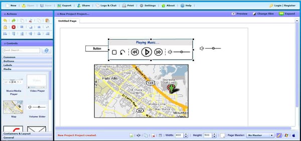
Startup Tools: Wireframing Tools
I recently taught a seminar on digital product design at UC Davis and included an introduction to user experience as part of the class - I agree with all those that said you can't just add UX later (whether intentional or not, every app already represents the user experience philosophy of the creators), and great user experiences happen because when considered as an integral part of building the company and the product.
My personal belief is that for most startups, the best way to tackle this is to have the product manager/product owner also own the UX philosophy - a good product manager is the keeper of a great user experience and is the last line of defense against shipping something that sucks. Often this is the CEO in early stage startups, and later someone else when the company can afford to have a dedicated product manager position.
Here are lessons that have helped me over the years:
Think in Flows, Not Screens
Web and mobile applications are primarily about making it as fast and easy as possible for a user to complete a desired task or series of tasks. Unless you're still at the most basic MVP stage, your application probably helps users complete at least several tasks, and each one of these tasks has a series of steps that the user must go through to be succesful. This series of steps is called a task flow, and when striving for a great user experience it's important to think about how to make this task flow as easy as possible.
In my design process, the very first iterations of a new feature happen entirely at the most basic level of outlining the task flow in a text editor. When drafting a task flow for a new feature, I try to remember that it's not just about describing the task I'm focusing on, but also how the new task flow relates to the existing application and the other features (task flows) it contains. How the user accesses this new feature (the start of the flow) and where they end up after they complete it (the end of the flow) are as important as the steps in between.
Additional info: Chapter 3 in Robert Hoekman, Jr.'s excellent Designing the Obvious - A Common Sense Approach to Web & Mobile Application Design and Jason Putorti's 10 Things You Need to Know About Design.
Understanding Mental Models
If you're a technical founder or product lead, remind yourself that your users don't see the source code of your application. This may sound obvious, but it's easy to forget that your users don'tknow why you designed a feature a particular way, they don't have the benefit of understanding how all the pieces of your app fit together, and they don't really care about the functional processes going on behind the scenes, except when things don't work the way they expect.
Real users understand products through a process of discovery and trial and error, and as they use your application they slowly develop a mental model of how they think it works. A mental model is effectively their internalized understanding of the task flows in your app. The process of building a mental model can be artificially supplemented through tutorials, tooltips and other learning aids, but the best user experiences are designed so that the application itself helps the user quickly build an effective mental model, without relying on additional learning aids to convey key information.
Additional info: Chapter 5 in Designing the Obvious - A Common Sense Approach to Web & Mobile Application Design.
Don't Re-Invent the Wheel
When designing the experience for a feature, think about how other applications address similar task flows. Humans are natural pattern matchers, a trait you can leverage to accelerate the construction of effective mental models by relying on existing design patterns that many users will already recognize from their previous experiences.
Design patterns are often platform-specific (especially on mobile) so it's important to build and maintain familiarity with platform standards and design patterns used in popular applications (apps shipped with the OS are a great place to start).
The same point applies internally to your own application. If you have two features that are related in terms of similarity of task flow or the goal achieved upon completion, try not to re-invent the wheel. In the common case where you're adding a 2nd feature where the flow is similar to an existing feature, consider refactoring the UI of the first feature to accomodate the needs of the new feature, keeping the interface harmonious and consistent. Just like your codebase, the user experience of your app will accumulate cruft over time - you will have to go back and rework things as you iterate.
Additional info: Theresa Neil's Mobile Design Pattern Gallery - UI Patterns for Mobile Applications - skim it once, then try to refer to it when specing new features or refactoring old features. See also Google's official design patterns for Android and Apple's iOS Human Interface Guidelines.
Finally, as a founder or employee of a company building a product, you need to know that you are not your average user. Even if you started your company to scratch your own itch or solve a problem you have and you're trying to serve a target market of people similar to yourself, you spend at least 100x more time thinking about your product than any of your users do.
The difference in your level of understanding vs your users is often a source of angst (especially for technical people), and is commonly surfaced in you or your team's negative reactions to user support requests. If you find yourself dismayed at the apparent lack of intellegence of your users, you're guilty of falling into this trap.
Building and maintaining empathy with your users is key to a great user experience. When you're deeply involved with the creation of a product, you can no longer depend on your own intuition to maintain this empathy. Talking to real users is an effective solution, and it doesn't need to be costly or time consuming. If you've never done it, you will be astounded by how much you'll learn in a half day, informal usability testing session where you spend time with 3 actual users who don't work at your company.
Start running your own quick and dirty usability tests: skim Rocket Surgery Made Easy: The Do-It-Yourself Guide to Finding and Fixing Usability Problems, watch the example usability test video, hire testers on TaskRabbit, and get to it!
As a designer & founder, Brad Feld's recent post Who Owns Your UX Philosophy? asks about an area I've spent quite a bit of time working on. User experience is a a tricky skill set to build or hire for, as it requires a mix of traditional design and product management skills that I think are best learned through apprenticeship rather than traditional academic design education.
I recently taught a seminar on digital product design at UC Davis and included an introduction to user experience as part of the class - I agree with all of the commenters on Brad's post who said you can't just add UX later (whether intentional or not, every app already represents the user experience philosophy of the creators), and great user experiences happen when considered as an integral part of building the company and the product.
My personal belief is that for most startups, the best way to tackle UX is to have the product manager/product owner also own the UX philosophy - a good product manager is the keeper of a great user experience and is the last line of defense against shipping something that sucks. Often this is the CEO in early stage startups, and later someone else when the company can afford to have a dedicated product manager position.
Here are some UX lessons that have helped me over the years:
Think in Flows, Not ScreensWeb and mobile applications are primarily about making it as fast and easy as possible for a user to complete a desired task or series of tasks. Unless you're still at the most basic MVP stage, your application probably helps users complete at least several tasks, and each one of these tasks has a series of steps that the user must go through to be succesful. This series of steps is called a task flow, and when striving for a great user experience it's important to think about how to make the task flow as easy as possible.
In my design process, the very first iterations of a new feature happen entirely at the most basic level of outlining the task flow in a text editor. When drafting a task flow for a new feature, I try to remember that it's not just about describing the task I'm focusing on, but also how the new task flow relates to the existing application and the other features (task flows) it contains. How the user accesses this new feature (the start of the flow) and where they end up after they complete it (the end of the flow) are as important as the steps in between.
Additional info: Chapter 3 in Robert Hoekman, Jr.'s excellent Designing the Obvious - A Common Sense Approach to Web & Mobile Application Design and Jason Putorti's 10 Things CEOs Need to Know About Design.
Understanding Mental ModelsIf you're a technical founder or product lead, remind yourself that your users don't see the source code of your application. This may sound obvious, but it's easy to forget that your users don'tknow why you designed a feature a particular way, they don't have the benefit of understanding how all the pieces of your app fit together, and they don't really care about the functional processes going on behind the scenes, except when things don't work the way they expect.
Real users understand products through a process of discovery and trial and error, and as they use your application they slowly develop a mental model of how they think it works. A mental model is effectively their internalized understanding of the task flows in your app. The process of building a mental model can be artificially supplemented through tutorials, tooltips and other learning aids, but the best user experiences are designed so that the application itself helps the user quickly build an effective mental model, without relying on additional learning aids to convey key information.
Additional info: Chapter 5 in Designing the Obvious - A Common Sense Approach to Web & Mobile Application Design.
Don't Re-Invent the WheelWhen designing the experience for a feature, think about how other applications address similar task flows. Humans are natural pattern matchers, a trait you can leverage to accelerate the construction of effective mental models by relying on existing design patterns that many users will already recognize from their previous experiences.
Design patterns are often platform-specific (especially on mobile) so it's important to build and maintain familiarity with platform standards and design patterns used in popular applications (apps shipped with the OS are a great place to start).
The same point applies internally to your own application. If you have two features that are related in terms of similarity of task flow or the goal achieved upon completion, try not to re-invent the wheel and maintain two similar but slightly different patterns. In the common case where you're adding a 2nd feature where the flow is similar to an existing feature, consider refactoring the UI of the first feature to accomodate the needs of the new feature, keeping the interface harmonious and consistent. Just like your codebase, the user experience of your app will accumulate cruft over time - you will have to go back and rework things as you iterate.
Additional info: Theresa Neil's Mobile Design Pattern Gallery - UI Patterns for Mobile Applications - skim it once, then refer to it when specing new features or refactoring old features. See also Google's official design patterns for Android and Apple's iOS Human Interface Guidelines.
You Are Not Your UserFinally, as a founder or employee of a company building a product, you need to know that you are not your average user. Even if you started your company to scratch your own itch or solve a problem you have and you're trying to serve a target market of people similar to yourself, you spend at least 100x more time thinking about your product than any of your users do.
The difference in your level of understanding vs your users is often a source of angst (especially for technical people), and is commonly surfaced in you or your team's negative reactions to user support requests. If you find yourself dismayed at the apparent lack of intellegence of your users, you're guilty of falling into this trap.
Building and maintaining empathy with your users is key to a great user experience. When you're deeply involved with the creation of a product, you can no longer depend on your own intuition to maintain this empathy. Talking to real users is an effective solution, and it doesn't need to be costly or time consuming. If you've never done it, you will be astounded by how much you'll learn in a half day, informal usability testing session where you spend time with 3 actual users who don't work at your company.
Start running your own quick and dirty usability tests: skim Rocket Surgery Made Easy: The Do-It-Yourself Guide to Finding and Fixing Usability Problems, watch the example usability test video, hire testers on TaskRabbit, and get to it!
More UX Resources- Jesse James Garret's The Elements of User Experience will help you understand how UX relates to other design disciplines and think through the layers to be considered from user needs/task completion all the way through to the presentation layer.
- The personality your product expresses can have a big impact on how users perceive the experience of using it. Designing for Emotion is a great place to start thinking about this facet.
- If you're working on mobile UX specifically, Tapworthy provides a concise intro to some of the common issues and pitfalls you should think through.

Hi, I'm Brad Feld, a managing director at the Foundry Group who lives in Boulder, Colorado. I invest in software and Internet companies around the US, run marathons and read a lot.
I've been in three board meetings in the last month where it was painfully apparent that there wasn't a person in the company who owned the UX philosophy of the product. I'm explicitly saying "UX" (user experience) rather than "UI" (user interface) as each company had an excellent designer and the application looked great. But the UX broke down quickly, especially as you went from novice first time user to experienced user.
Now, it's not that the apps sucks. In each case, the apps ranged from good to great. They had huge amount of functionality, did unique things that other apps didn't do, and solved a clear set of problems in a compelling way. They were fast, pretty, used nice fonts, and had good screen layouts.
But each had a jumble of different ways of doing things. As you went from one set of activities to another, the approach quickly became inconsistent. I kept noticing that my when I was doing a different set of things in the app, the user flow would change. Or when I switched modalities, I would have different ways to do things that were dependent on where in the app I was.
Sometimes I'd click on a label to take an action; other times I'd click on a text description of the action. In some places I cared a lot about the Tab key; in others it was the Enter key. In some screens data was automatically saved after I exited a field; in others I had to take an explicit action. In some situations all the actions I could take were exposed; in others I had to search a menu tree for them. Orientation of the iPhone mattered in some cases and didn't in others. Sometimes the key set of data that I was working on was the focus on the screen; in others it was only part of the screen.
When I start feeling uncomfortable with UX, I start counting extra key and mouse actions. When I think I should be able to do something with one action and it takes three or more, there's a problem. When I realize in one part of the app that I can do something with one action, but in the other it takes four, there's a problem.
In each of the companies, there is an excellent VP of Engineering. They each have a strong design / UI person. Two of the three had founder/CTOs. And the CEOs in each are excellent. They are each obsessed about the product, but they are approaching it from an engineering perspective. What are the features that the user needs? What is the feedback we are getting about what individuals want to do? Each of these things ends up being a story or a task - a feature - but there is no unifying UX philosophy.
In each case, when asked, no one in the company owned the UX. In one case, no one felt qualified. In one case, no one really knew what I meant and kept conflating UX with UI. And in one case it was a revelation that users were struggling with a chaotic and inconsistent UX.
I'm noticing this more and more in the different apps I use, especially at the early stage. Some are crafted beautifully from a UI perspective, but once I start using them on a daily basis I want to scream. Others have acceptable UIs and a layer of UX consistency that breaks down immediately when I become an advanced user. And others are radically different UX experiences across devices.
I've come to appreciate the important of a single person in the company owning the UX with this person being the arbiter of discussion around how to implement the UX. There's nothing wrong with lots of different perspectives, but a single mind has to own it, synthesize it, and dictate the philosophy. But first, they have to understand the difference between UI and UX, and - more importantly - the product-oriented execs who approach things from an engineering perspective need to understand this.
I've decided it times to up our game significantly on this. I'm curious about what resources you rely on, thing are amazing, and would give to an executive team that is struggling with this.
Keynotopia transforms your favorite presentation application into the best rapid prototyping tool for creating mobile, web and desktop app mockups
Keynotopia lets users design quick and easy interfaces and interactive mockups for web, mobile and desktop apps without touching a line of code.

It's Finally Possible to Create Interactive High Fidelity Prototypes Quickly and Cheaply!
Traditionally, only designers could create high fidelity user interfaces using complex and expensive design tools. Even then, they needed developers to make the UI interactive. With Keynotopia, this is no longer the case!
Design Elegant User Interfaces Without Messing With Colors, Pixels Or Layers
Create a new slide for each application screen, then copy elements from Keynotopia templates and paste them into your slides to create a great looking user interface in minutes!
Customize And Edit Any Component Without Needing Additional Design Tools.
All components are vector shapes designed from scratch in Keynote, PowerPoint and OpenOffice. You can edit labels, change colors and resize without leaving your favorite presentation tool.
Enable User Interaction And Animations In Seconds, Without Writing Code.
Make the prototype clickable and interactive by enabling hyperlinks on buttons and controls to navigate to different screens. Then use slide transitions and builds to animate the interface.
Export and Test Your Prototypes on iPhone and iPad Without Doing Any Extra Work
Export the slides as clickable PDF, then send the presentation to your favorite device, and test it with users as if it were a functional prototype, or share it to your team to get feedback.
Annotate & Share Prototypes With Your Team, Instead of Long Spec Documents
Add comments and slide notes to annotate your interface, then share it via email, DropBox, or upload the prototype to iWork.com for free to get feedback and iterate on your designs.
Transform your wireframes and mockups into high fidelity designs almost instantly
Instead of re-creating your design from a wireframe, simply apply high fidelity styles from Keynotopia templates onto your wireframe to transform it into high fidelity screen designs in minutes.
Use Your Prototype Screens in Your Final App and Save On Production Expenses
Keynotopia templates include thousands of pixel perfect royalty free vector components and icons created in Keynote and PowerPoint that you can use directly in your final apps.
Don't throw away your prototype when you're done with it. Instead, export your final prototype screens as PNG images and open them in Photoshop or Fireworks for production. You can also copy components and icons from Keynote or PowerPoint, and paste them directly into your favorite design tool.
It Works With Most Versions of Keynote, PowerPoint and OpenOffice
Including Keynote on Mac and iPad, PowerPoint on Mac and PC, and OpenOffice on Mac, PC and Linux.
And It Comes With 100% Money Back Guarantee, And Free Updates Forever
Ever have an awesome idea for an iPhone app but don't have the graphic design skills to build a good mockup to show off to potential partners? Well, put away your pencils and napkins and go check out Keynotopia.
 The Unofficial Apple Weblog
Here is how to use Keynotopia to prototype and test an iPhone app in 19 minutes!
Join thousands of designers, developers and entrepreneurs who use Keynotopia
Use PowerPoint or Keynote to create web and mobile apps - Cool!
We love prototyping for the iPad.
What do we use?Interactive iPad prototyping using Keynote
I love Keynotopia prototyping templates. Used them to rapidly develop a fitness app as part of Phoenix Startup Weekend, and ended up winning the people's choice and best presentation!
-Matt Clower, iOS developer