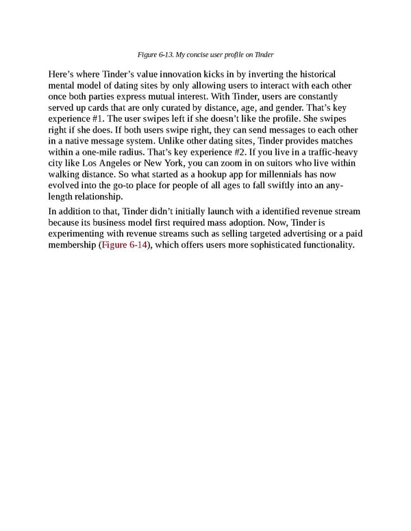
Figure 6-13. My concise user profile on Tinder Here’s where Tinder’s value innovation kicks in by inverting the historical mental model of dating sites by only allowing users to interact with each other once both parties express mutual interest. With Tinder, users are constantly served up cards that are only curated by distance, age, and gender. That’s key experience #1. The user swipes left if she doesn’t like the profile. She swipes right if she does. If both users swipe right, they can send messages to each other in a native message system. Unlike other dating sites, Tinder provides matches within a one-mile radius. That’s key experience #2. If you live in a traffic-heavy city like Los Angeles or New York, you can zoom in on suitors who live within walking distance. So what started as a hookup app for millennials has now evolved into the go-to place for people of all ages to fall swiftly into an any- length relationship. In addition to that, Tinder didn’t initially launch with a identified revenue stream because its business model first required mass adoption. Now, Tinder is experimenting with revenue streams such as selling targeted advertising or a paid membership (Figure 6-14), which offers users more sophisticated functionality.
 UX Strategy: How to Devise Innovative Digital Products that People Want Page 166 Page 168