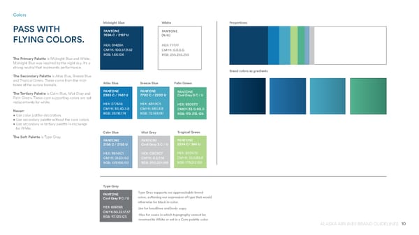
10 ALASKA AIRLINES BRAND GUIDELINES Colors PASS WITH FLYING COLORS. The Primary Palette is Midnight Blue and White. Midnight Blue was inspired by the night sky. It’s a strong neutral that represents performance. The Secondary Palette is Atlas Blue, Breeze Blue and Tropical Green. These come from the mid- tones of the aurora borealis. The Tertiary Palette is Calm Blue, Mist Gray and Palm Green. These core supporting colors are not replacements for white. Never: • Use color just for decoration. • Use secondary palette without the core colors. • Use secondary or tertiary palette in exchange for White. The Soft Palette is Type Gray. PANTONE 7694 C / 2187 U HEX: 01426A CMYK: 100.57.9.52 RGB: 1.66.106 PANTONE (N/A) HEX: FFFFF CMYK: 0.0.0.0. RGB: 255.255.255 Midnight Blue White PANTONE 2383 C / 7461 U HEX: 2774AE CMYK: 83.40.3.6 RGB: 39.116.174 PANTONE 7702 C / 2200 U HEX: 48A9C5 CMYK: 68.1.8.8 RGB: 72.169.197 Atlas Blue Breeze Blue PANTONE 2284 C/ 366 U HEX: B3D57D CMYK: 33.0.60.0 RGB: 179.213.125 Tropical Green PANTONE 2156 C / 2155 U HEX: 8BA6C1 CMYK: 51.23.11.0 RGB: 139.166.193 Calm Blue Mist Gray Type Gray PANTONE Cool Gray 3 C / U HEX: C8C9C7 CMYK: 8.5.7.16 RGB: 200.201.199 PANTONE Cool Gray 9 C / U HEX: 656565 CMYK:30.22.17.57 RGB: 117.120.123 Palm Green PANTONE Cool Gray 9 C / U HEX: B3D57D CMKY: 33. 0. 60. 0 RGB: 179. 213. 125 Type Gray supports our approachable brand voice, softening our expression of type that would otherwise be black in color. Use for headlines and body copy. Also for cases in which typography cannot be reversed to White or set in a Core palette color. Proportions Brand colors as gradients
 Alaska Airlines Brand Book Page 9 Page 11