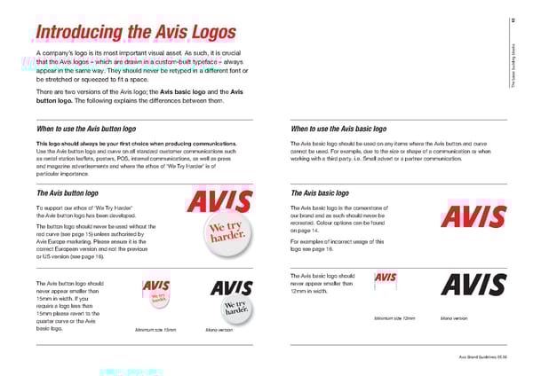
13 Introducing the Avis Logos s k c o l A company’s logo is its most important visual asset. As such, it is crucial b g n i that the Avis logos – which are drawn in a custom-built typeface – always d l i u b appear in the same way. They should never be retyped in a different font or c i s a b be stretched or squeezed to fi t a space. e h T There are two versions of the Avis logo; the Avis basic logo and the Avis button logo. The following explains the differences between them. When to use the Avis button logo When to use the Avis basic logo This logo should always be your fi rst choice when producing communications. The Avis basic logo should be used on any items where the Avis button and curve Use the Avis button logo and curve on all standard customer communications such cannot be used. For example, due to the size or shape of a communication or when as rental station leafl ets, posters, POS, internal communications, as well as press working with a third party. i.e. Small advert or a partner communication. and magazine advertisements and where the ethos of ‘We Try Harder’ is of particular importance. The Avis button logo The Avis basic logo To support our ethos of ‘We Try Harder’ The Avis basic logo is the cornerstone of the Avis button logo has been developed. our brand and as such should never be The button logo should never be used without the recreated. Colour options can be found red curve (see page 15) unless authorised by on page 14. Avis Europe marketing. Please ensure it is the For examples of incorrect usage of this correct European version and not the previous logo see page 16. or US version (see page 16). The Avis basic logo should The Avis button logo should never appear smaller than never appear smaller than 12mm in width. 15mm in width. If you require a logo less than 15mm please revert to the quarter curve or the Avis Minimum size 12mm Mono version basic logo. Minimum size 15mm Mono version Avis Brand Guidelines 05.08
 Avis Brand Book Page 2 Page 4