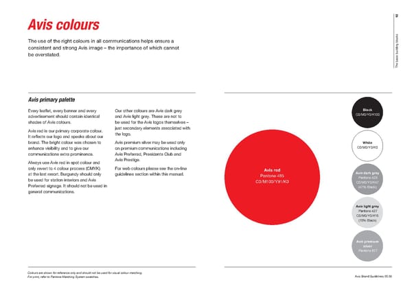
12 Avis colours s k c o l The use of the right colours in all communications helps ensure a b g n i consistent and strong Avis image – the importance of which cannot d l i u b be overstated. c i s a b e h T Avis primary palette Every leafl et, every banner and every Our other colours are Avis dark grey Black advertisement should contain identical and Avis light grey. These are not to C0/M0/Y0/K100 shades of Avis colours. be used for the Avis logos themselves – Avis red is our primary corporate colour. just secondary elements associated with It refl ects our logo and speaks about our the logo. brand. The bright colour was chosen to Avis premium silver may be used only White enhance visibility and to give our on premium communications including C0/M0/Y0/K0 communications extra prominence. Avis Preferred, Presidents Club and Always use Avis red in spot colour and Avis Prestige. only revert to 4 colour process (CMYK) For web colours please see the on-line Avis red at the last resort. Burgundy should only guidelines section within this manual. Avis dark grey Pantone 485 Pantone 423 be used for station interiors and Avis C0/M100/Y91/K0 C0/M0/Y0/K47 Preferred signage. It should not be used in (47% Black) general communications. Avis light grey Pantone 427 C0/M0/Y0/K15 (15% Black) Avis premium silver Pantone 877 Colours are shown for reference only and should not be used for visual colour matching. For print, refer to Pantone Matching System swatches. Avis Brand Guidelines 05.08
 Avis Brand Book Page 1 Page 3