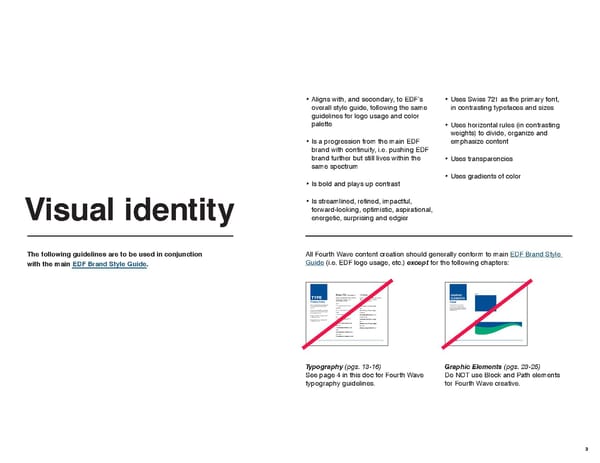
• Aligns with, and secondary, to EDF’s • Uses Swiss 721 as the primary font, overall style guide, following the same in contrasting typefaces and sizes guidelines for logo usage and color palette • Uses horizontal rules (in contrasting weights) to divide, organize and • Is a progression from the main EDF emphasize content brand with continuity, i.e. pushing EDF brand further but still lives within the • Uses transparencies same spectrum • Uses gradients of color • Is bold and plays up contrast • Is streamlined, refined, impactful, forward-looking, optimistic, aspirational, Visual identity energetic, surprising and edgier The following guidelines are to be used in conjunction All Fourth Wave content creation should generally conform to main EDF Brand Style with the main EDF Brand Style Guide. Guide (i.e. EDF logo usage, etc.) except for the following chapters: Typography (pgs. 13-16) Graphic Elements (pgs. 23-25) See page 4 in this doc for Fourth Wave Do NOT use Block and Path elements typography guidelines. for Fourth Wave creative. 3
 EDF Brand Book Page 2 Page 4