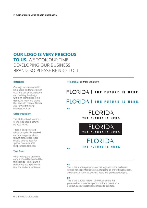
FLORIDA’S BUSINESS BRAND CAMPAIGN OUR LOGO IS VERY PRECIOUS TO US. WE TOOK OUR TIME DEVELOPING OUR BUSINESS BRAND, SO PLEASE BE NICE TO IT. Rationale THE LOGO, it’s from the future. Our logo was developed to be modern and future-proof, updating our public persona and realizing the design with new techniques. It is a distinctive mark and brand that seeks to present Florida as a forward-thinking business location. 01 Color treatment The white or black versions of the logo should always be used in ads. There is one preferred full-color option for stacked and landscape variations shown here. These logos should only be used for special circumstances like promotional items. 02 Text form When writing the tagline in copy, it should be treated like this: Florida – The Future is Here. Only use a period if it 01 is at the end of a sentence. This is the landscape version of the logo and is the preferred version for all printed collateral, including all printed publications, advertising, billboards, posters, flyers and product packaging. 02 This is the stacked version of the logo and is the preferred version when space is not at a premium in a layout, such as website graphics and banners. 4 | BRAND GUIDELINES
 Florida Future Is Here Brand Book Page 3 Page 5