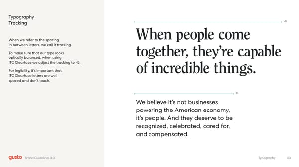
Typography Tracking When we refer to the spacing in between letters, we call it tracking. To make sure that our type looks optically balanced, when using ITC Clearface we adjust the tracking to -5. For legibility, it’s important that ITC Clearface letters are well spaced and don’t touch. -5 0 When people come together, they’re capable of incredible things. We believe it’s not businesses powering the American economy, it’s people. And they deserve to be recognized, celebrated, cared for, and compensated. 53 Typography Brand Guidelines 3.0
 Gusto Brand Book Page 52 Page 54