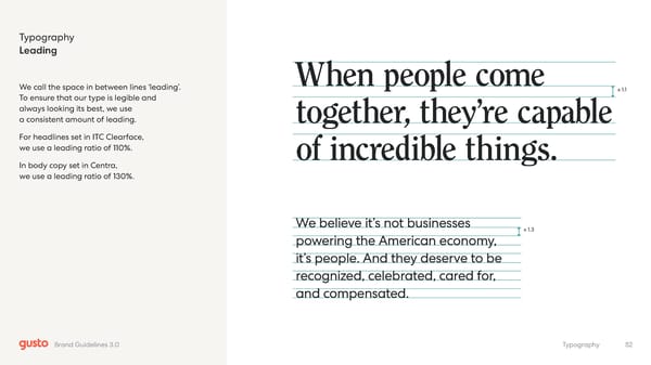
Typography Leading We call the space in between lines ‘leading’. To ensure that our type is legible and always looking its best, we use a consistent amount of leading. For headlines set in ITC Clearface, we use a leading ratio of 110%. In body copy set in Centra, we use a leading ratio of 130%. x 1.1 x 1.3 When people come together, they’re capable of incredible things. We believe it’s not businesses powering the American economy, it’s people. And they deserve to be recognized, celebrated, cared for, and compensated. 52 Typography Brand Guidelines 3.0
 Gusto Brand Book Page 51 Page 53