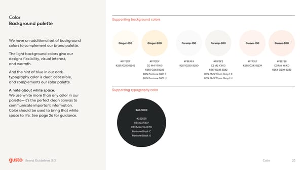
Color Background palette We have an additional set of background colors to complement our brand palette. The light background colors give our designs flexibility, visual interest, and warmth. And the hint of blue in our dark typography color is clear, accessible, and complements our color palette. A note about white space. We use white more than any color in our palette—it’s the perfect clean canvas to communicate important information. Color should be used to bring that white space to life. See page 26 for guidance. Supporting background colors Salt-1000 #222525 R34 G37 B37 C73 M64 Y64 K70 Pantone Black C Pantone Black U Supporting typography color Ginger-100 Ginger-200 #FFF2DF R255 G250 B242 #FFF2DF C0 M4 Y11 K0 R255 G243 B222 80% Pantone 7401 C 80% Pantone 7401 U Guava-100 Guava-200 #FFF3EF R255 G243 B239 #FEEFE8 C0 M6 Y6 K0 R254 G239 B232 Parsnip-100 Parsnip-200 #FBFAFA R251 G250 B250 #F8F5F2 C2 M2 Y3 K0 R247 G245 B242 80% PMS Warm Gray 1 C 80% PMS Warm Gray 1 U 23 Color Brand Guidelines 3.0
 Gusto Brand Book Page 22 Page 24