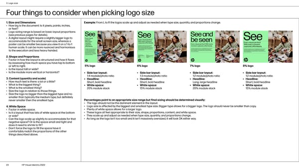
3. Logo size Four things to consider when picking logo size 1. Size and Dimensions Example: From L to R the logos scale up and adjust as needed when type size, quantity, and proportions change. • How big is the document: Is it pixels, points, inches, or feet? • Logo sizing range is based on basic layout proportions (see previous pages for details). • A digital layout might require a slightly bigger logo to accommodate for the small screen size, whereas a poster can be smaller because you view it on a 1-to-1 human scale. It can be more nuanced and harmonious to the execution and less heavy handed. 2. Shape and Proportions • Factor in how the layout is structured and how it flows by assessing how much space you have top to bottom or left to right. 5% logo 6% logo 7% logo 8% logo • Is the layout tall or wide? • Is the module more vertical or horizontal? • Side bar layout: • Side bar layout: • Side bar layout: • Side bar layout: 1:4 module/photo ratio 1:3 module/photo ratio 1:2 module/photo ratio 1:2 module/photo ratio 3. Content (quantity and scale) • Headline: • Headline: • Headline: • Headline: • How much text is there: a lot or a little? Short, bold headline Short, bold headline Long, large headline Short, bold headline • What is the biggest thing? • White space: • White space: • White space: • White space: • What is the smallest thing? 20% module stack 15% module stack 20% module stack 15% module stack • Size the logo in relation to those things. • Size the logo no bigger than the biggest type and no smaller than typically the medium type, but definitely never smaller then the smallest type. Percentages point to an appropriate size range but final sizing should be determined visually: • The logo should not be the dominant element in the layout. 4. White Space • Logo size is affected by the biggest and smallest type size. Bigger type allows for a bigger logo. The logo should never be smaller than copy. • Factor in white space. • Plenty of white space allows for a larger logo. • Is it a layout that has lots of white space at the bottom • These logos all feel appropriate to their size, shape, proportions, content, and white space. or side? • They scale up and adjust as needed when type size, quantity, and proportions change. • Can the logo scale up slightly to accommodate for that • As long as the logo isn’t too small and it isn’t massively oversized, it will look OK either way. negative space? Or is the space small and tight and does it need to shrink to fit? • Don’t force the logo to fill the space have it comfortably match the proportions of the other things described above. 23 HP Visual Identity 2022
 HP Brand Book Page 22 Page 24