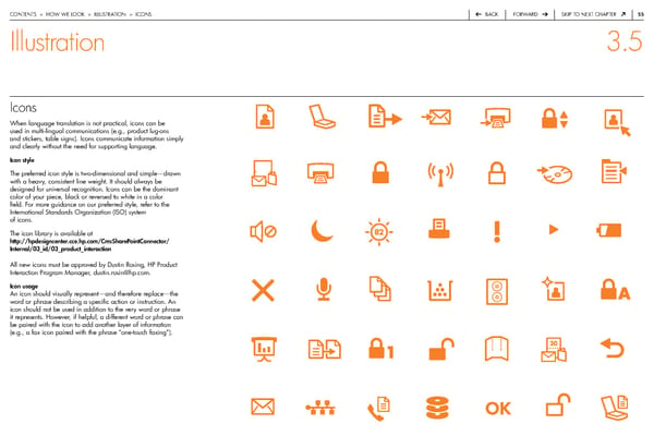
contentS > how we Look > iLLuStration > iconS back forward Skip to next chapter 55 Illustration 3.5 Icons when language translation is not practical, icons can be used in multi-lingual communications (e.g., product lug-ons and stickers, table signs). icons communicate information simply and clearly without the need for supporting language. Icon style the preferred icon style is two-dimensional and simple—drawn with a heavy, consistent line weight. it should always be designed for universal recognition. icons can be the dominant color of your piece, black or reversed to white in a color field. for more guidance on our preferred style, refer to the international Standards organization (iSo) system of icons. the icon library is available at http://hpdesigncenter.cce.hp.com/CmsSharePointConnector/ Internal/03_id/03_product_interaction all new icons must be approved by dustin rosing, hp product interaction program Manager, dustin.rosin@hp.com. Icon usage an icon should visually represent—and therefore replace—the word or phrase describing a specific action or instruction. an icon should not be used in addition to the very word or phrase it represents. however, if helpful, a different word or phrase can be paired with the icon to add another layer of information (e.g., a fax icon paired with the phrase “one-touch faxing”).
 HP Brand Book Page 55 Page 57