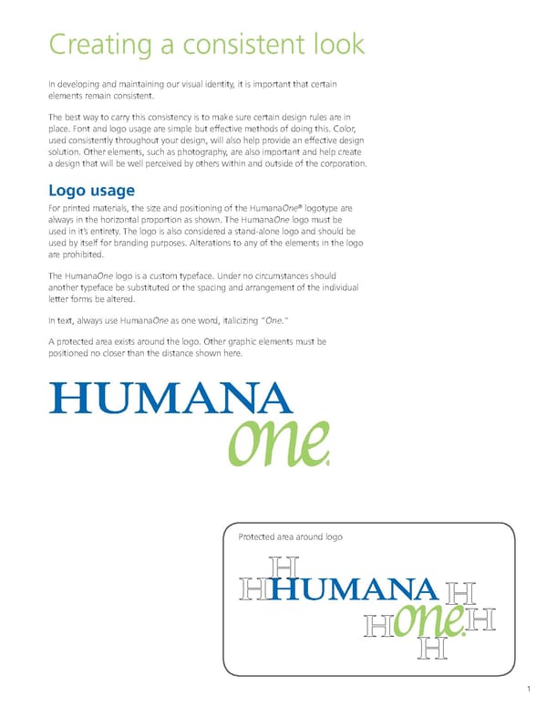
Creating a consistent look In developing and maintaining our visual identity, it is important that certain elements remain consistent. The best way to carry this consistency is to make sure certain design rules are in place. Font and logo usage are simple but effective methods of doing this. Color, used consistently throughout your design, will also help provide an effective design solution. Other elements, such as photography, are also important and help create a design that will be well perceived by others within and outside of the corporation. Logo usage For printed materials, the size and positioning of the HumanaOne® logotype are always in the horizontal proportion as shown. The HumanaOne logo must be used in it’s entirety. The logo is also considered a stand-alone logo and should be used by itself for branding purposes. Alterations to any of the elements in the logo are prohibited. The HumanaOne logo is a custom typeface. Under no circumstances should another typeface be substituted or the spacing and arrangement of the individual letter forms be altered. In text, always use HumanaOne as one word, italicizing “One.” A protected area exists around the logo. Other graphic elements must be positioned no closer than the distance shown here. Protected area around logo 1
 HumanaOne Brand Book Page 1 Page 3