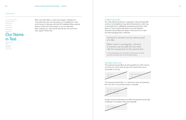
30 JOHNSON & JOHNSON CORPORATE DESIGN STANDARDS VERSION 2.1 31 Corporate Signature Our Corporate Signature When used within text, our name should appear unstylized, and CORRECT USE IN TEXT Signature Elements in the same font, color, and size as the surrounding text. Our name Our name, Johnson & Johnson, must appear in the same type style Configurations should be set in initial caps, with both “J’s” capitalized. When possible, as the surrounding text and may not be emphasized by underlining, Staging Area “Johnson & Johnson” should appear on one line within text. increasing its size, or setting the font appearance to bold or italic. Color Variations When necessary, our name may be split into two lines, but should When our name must be split into two lines within text, the Backgrounds never appear in three lines. ampersand symbol (&) should appear on the second line, unless Minimum Size this seems typographically unbalanced. Our Name in Text Johnson & Johnson can be used as part of a title. Abbreviating Our Name When used in a paragraph, Johnson International Executions & Johnson can be split into two lines Incorrect Use with the ampersand on the second line. IF THE SURROUNDING TEXT APPEARS IN UPPERCASE LETTERING, JOHNSON & JOHNSON MAY BE CAPITALIZED AS WELL. INCORRECT USE IN TEXT The ampersand symbol (&) must not hang at the end of the first line, and “Johnson” should never be split in the middle of the word or hyphenated in any way. Johnson & Johnson & John- Johnson son The ampersand symbol (&) in our name should never be replaced by the word “and,” or by any other symbol or character. Johnson and Johnson Johnson + Johnson Johnson~Johnson A space must be present before and after the ampersand symbol (&) so that each word appears distinct and separate. Johnson&Johnson
 Johnsons & Johnsons Brand Book Page 19 Page 21