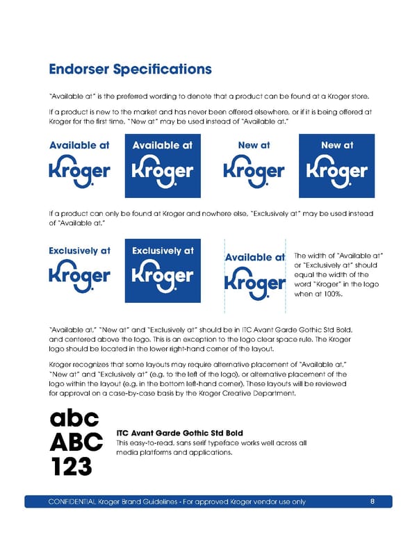
CONFIDENTIAL Kroger Brand Guidelines - For approved Kroger vendor use only 8 “Available at” is the preferred wording to denote that a product can be found at a Kroger store. If a product is new to the market and has never been offered elsewhere, or if it is being offered at Kroger for the first time, “New at” may be used instead of “Available at.” If a product can only be found at Kroger and nowhere else, “Exclusively at” may be used instead of “Available at.” abc ABC 123 ITC Avant Garde Gothic Std Bold This easy-to-read, sans serif typeface works well across all media platforms and applications. “Available at,” “New at” and “Exclusively at” should be in ITC Avant Garde Gothic Std Bold, and centered above the logo. This is an exception to the logo clear space rule. The Kroger logo should be located in the lower right-hand corner of the layout. Kroger recognizes that some layouts may require alternative placement of “Available at,” “New at” and “Exclusively at” (e.g. to the left of the logo), or alternative placement of the logo within the layout (e.g. in the bottom left-hand corner). These layouts will be reviewed for approval on a case-by-case basis by the Kroger Creative Department. The width of “Available at” or “Exclusively at” should equal the width of the word “Kroger” in the logo when at 100%. Available at Available at Available at Exclusively at Exclusively at New at New at Endorser Specifications
 Kroger Brand Book Page 7 Page 9