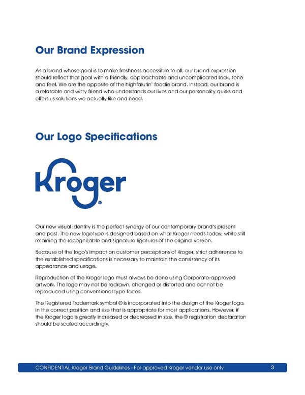
CONFIDENTIAL Kroger Brand Guidelines - For approved Kroger vendor use only 3 Our Brand Expression As a brand whose goal is to make freshness accessible to all, our brand expression should reflect that goal with a friendly, approachable and uncomplicated look, tone and feel. We are the opposite of the highfalutin’ foodie brand. Instead, our brand is a relatable and witty friend who understands our lives and our personality quirks and offers us solutions we actually like and need. Our new visual identity is the perfect synergy of our contemporary brand’s present and past. The new logotype is designed based on what Kroger needs today, while still retaining the recognizable and signature ligatures of the original version. Because of the logo’s impact on customer perceptions of Kroger, strict adherence to the established specifications is necessary to maintain the consistency of its appearance and usage. Reproduction of the Kroger logo must always be done using Corporate-approved artwork. The logo may not be redrawn, changed or distorted and cannot be reproduced using conventional type faces. The Registered Trademark symbol ® is incorporated into the design of the Kroger logo, in the correct position and size that is appropriate for most applications. However, if the Kroger logo is greatly increased or decreased in size, the ® registration declaration should be scaled accordingly. Our Logo Specifications
 Kroger Brand Book Page 2 Page 4