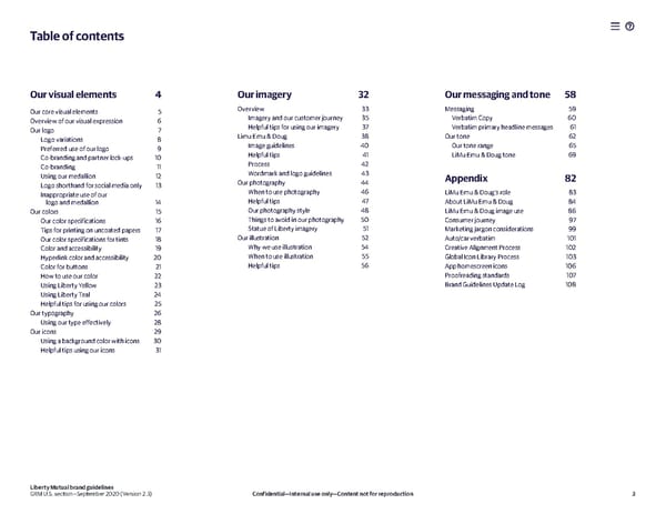
Table of contents Our visual elements 4 Our imagery 32 Our messaging and tone 58 Our core visual elements 5 Overview 33 Messaging 59 Overview of our visual expression 6 Imagery and our customer journey 35 Verbatim Copy 60 Our logo 7 Helpful tips for using our imagery 37 Verbatim primary headline messages 61 Logo variations 8 Limu Emu & Doug 38 Our tone 62 Preferred use of our logo 9 Image guidelines 40 Our tone range 65 Co-branding and partner lock-ups 10 Helpful tips 41 LiMu Emu & Doug tone 69 Co-branding 11 Process 42 Using our medallion 12 Wordmark and logo guidelines 43 Appendix 82 Logo shorthand for social media only 13 Our photography 44 In appropriate use of our When to use photography 46 LiMu Emu & Doug’s role 83 logo and medallion 14 Helpful tips 47 About LiMu Emu & Doug 84 Our colors 15 Our photography style 48 LiMu Emu & Doug image use 86 Our color specifications 16 Things to avoid in our photography 50 Consumer journey 97 Tips for printing on uncoated papers 17 Statue of Liberty imagery 51 Marketing jargon considerations 99 Our color specifications for tints 18 Our illustration 52 Auto/car verbatim 101 Color and accessibility 19 Why we use illustration 54 Creative Alignment Process 102 Hyperlink color and accessibility 20 When to use illustration 55 Global Icon Library Process 103 Color for buttons 21 Helpful tips 56 App homescreen icons 106 How to use our color 22 Proofreading standards 107 Using Liberty Yellow 23 Brand Guidelines Update Log 108 Using Liberty Teal 24 Helpful tips for using our colors 25 Our typography 26 Using our type effectively 28 Our icons 29 Using a background color with icons 30 Helpful tips using our icons 31 Liberty Mutual brand guidelines GRM U.S. section—September 2020 (Version 2.3) Confidential—Internal use only—Content not for reproduction 3
 Liberty Mutual Brand Book Page 2 Page 4